Complex Gallery Layouts
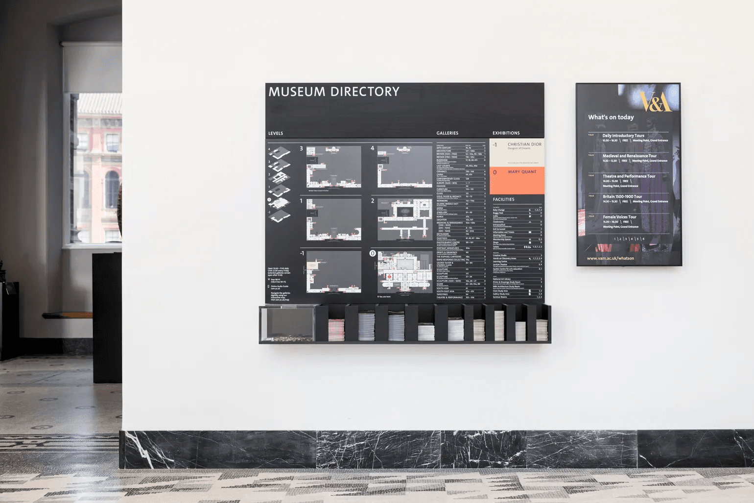
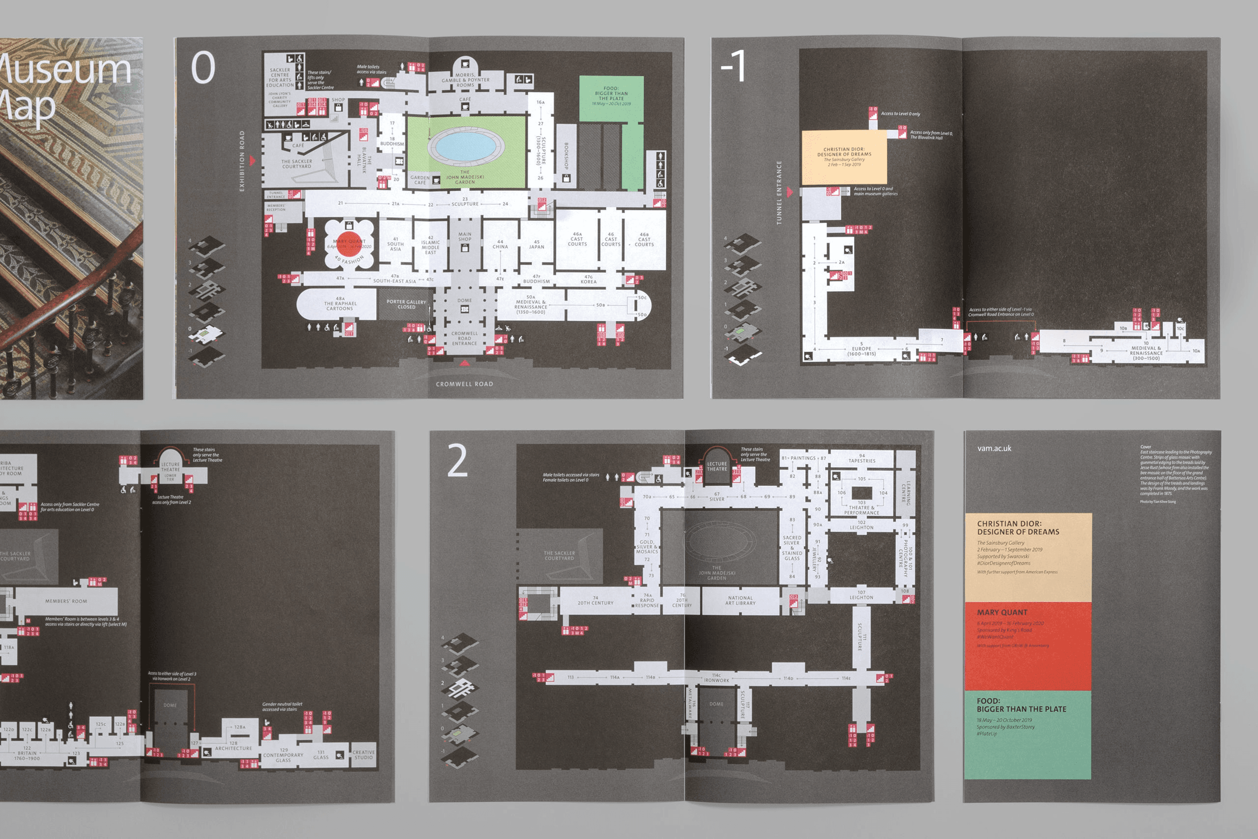
V&A Museum
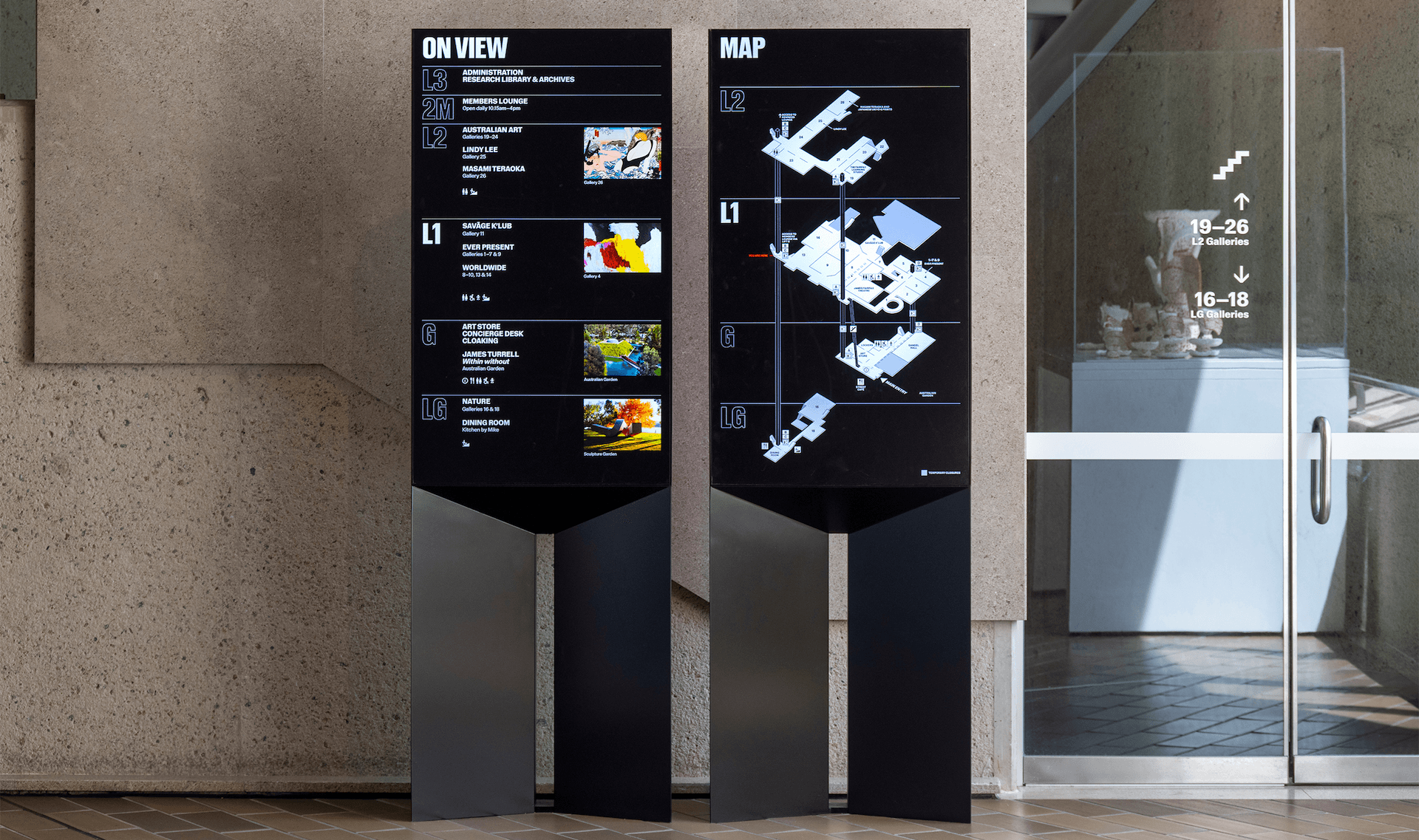
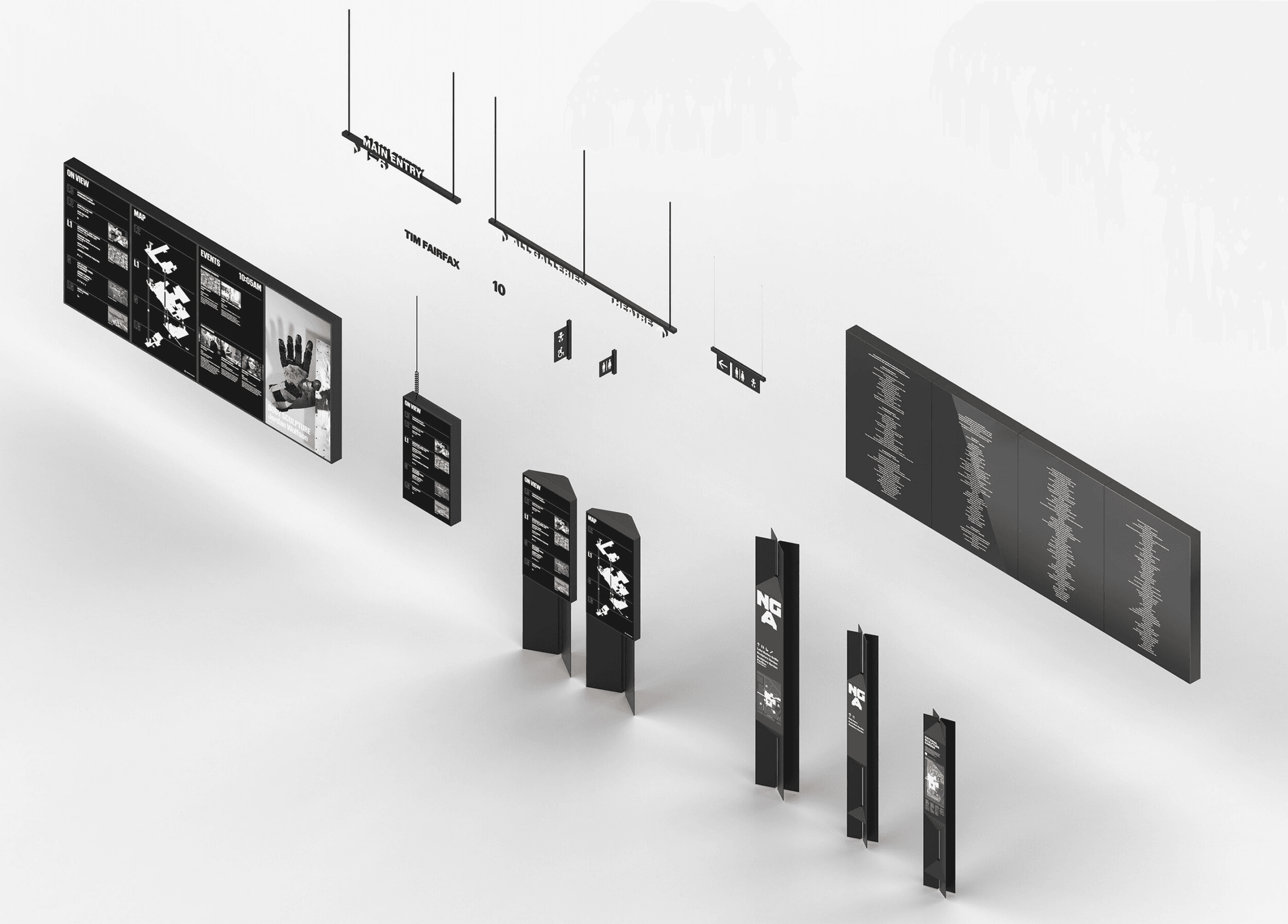
National Gallery of Australia
Minimalist typesetting with limited colours palettes and simple typography gives the complex information room to breathe.
Reimagining the wayfinding system for the State Library Victoria’s complicated layout.
2025 • 2 months
Cartography
Wayfinding
Visual identity
Accessibility & Compliance
Signage
Three-person university project
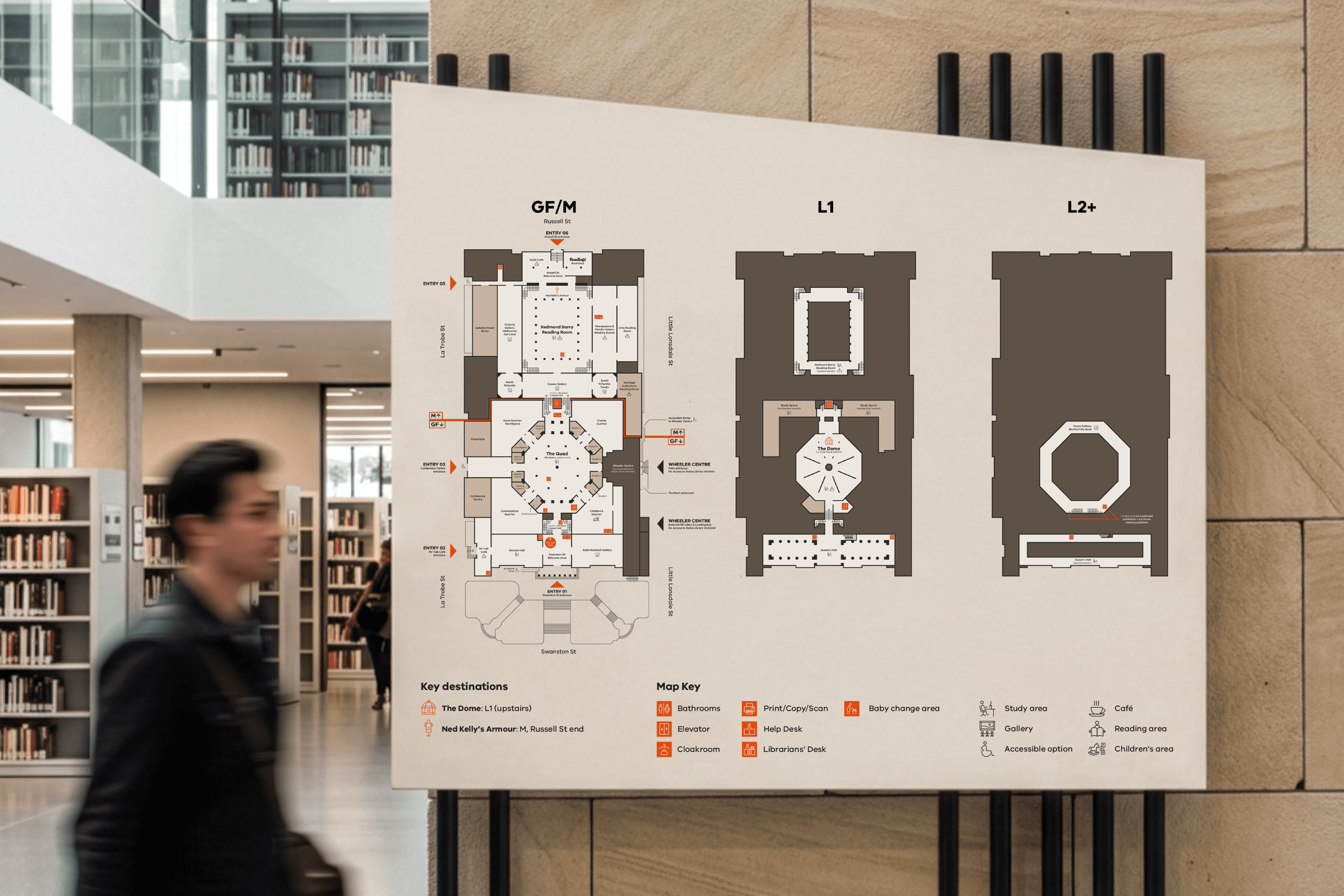
The State Library Victoria (SLV) is a major landmark and cultural centre in Melbourne. Having continually expanded since 1854, the site now comprises 23 distinct interconnected buildings.
Our signage and wayfinding system guides a diverse audience through the complex site. It pays homage to the SLV’s rich history whilst embracing modern, minimalist design.
23 interconnected buildings forming 1 library with 172 years of history.
Although visually appealing, the existing wayfinding system is, in practice, disjointed and hard to navigate.
The SLV’s layout is maze-like, with mezzanine levels, multiple entrances and unintuitive circulation.
An intuitive, elegant wayfinding system would help the SLV’s 2.8 million yearly visitors navigate its complex halls, making their experience more seamless.
Minimalist typesetting with limited colours palettes and simple typography gives the complex information room to breathe.
These identities use one element (colour, dimensionality, etc.) to create a unique identity that works with or directly reflects the building/site.
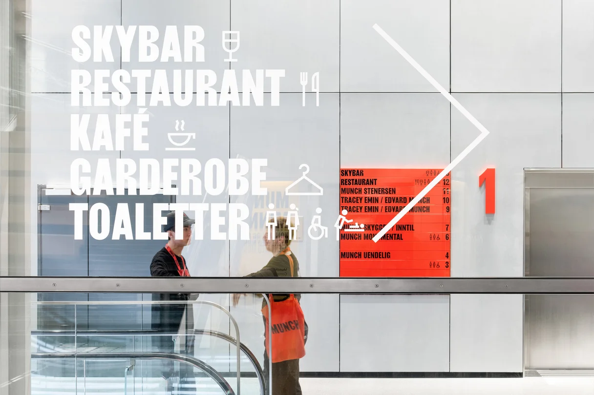
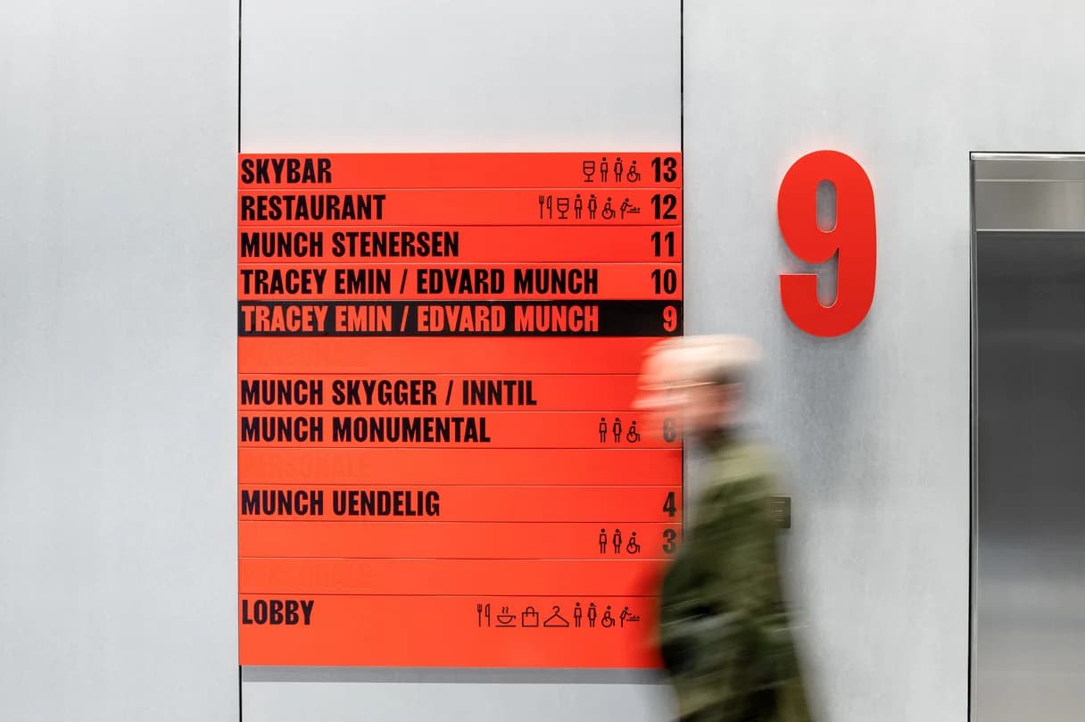
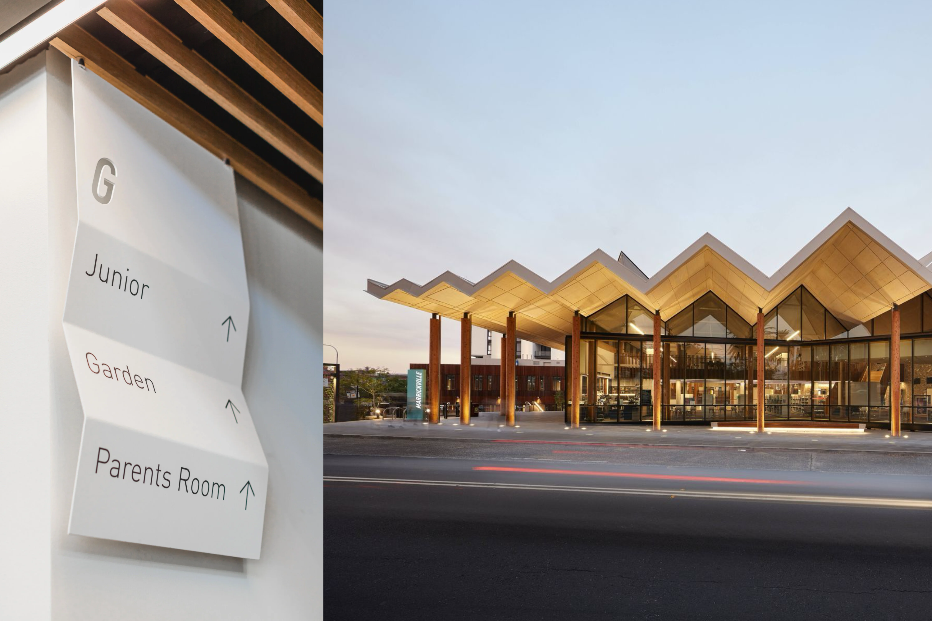
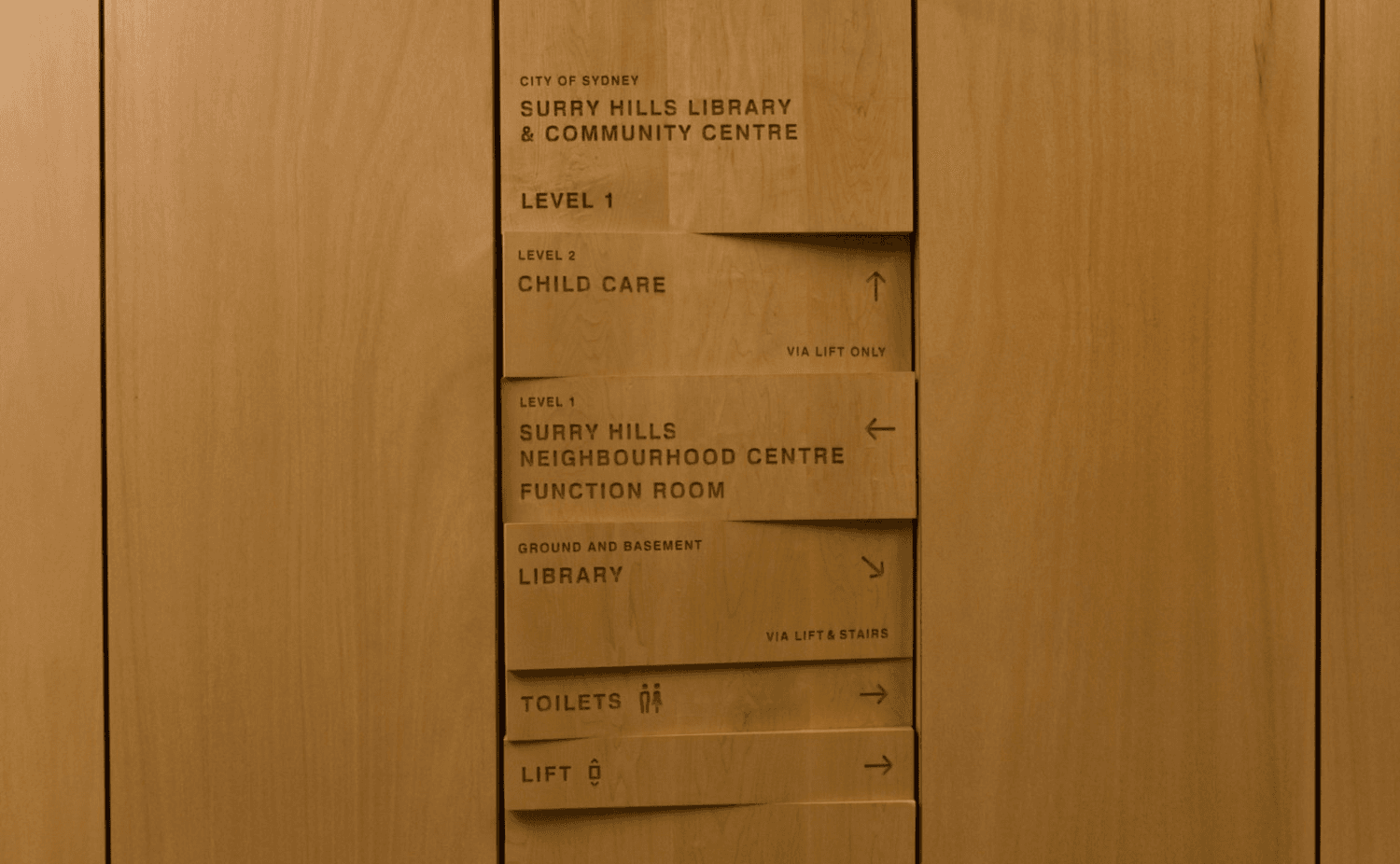
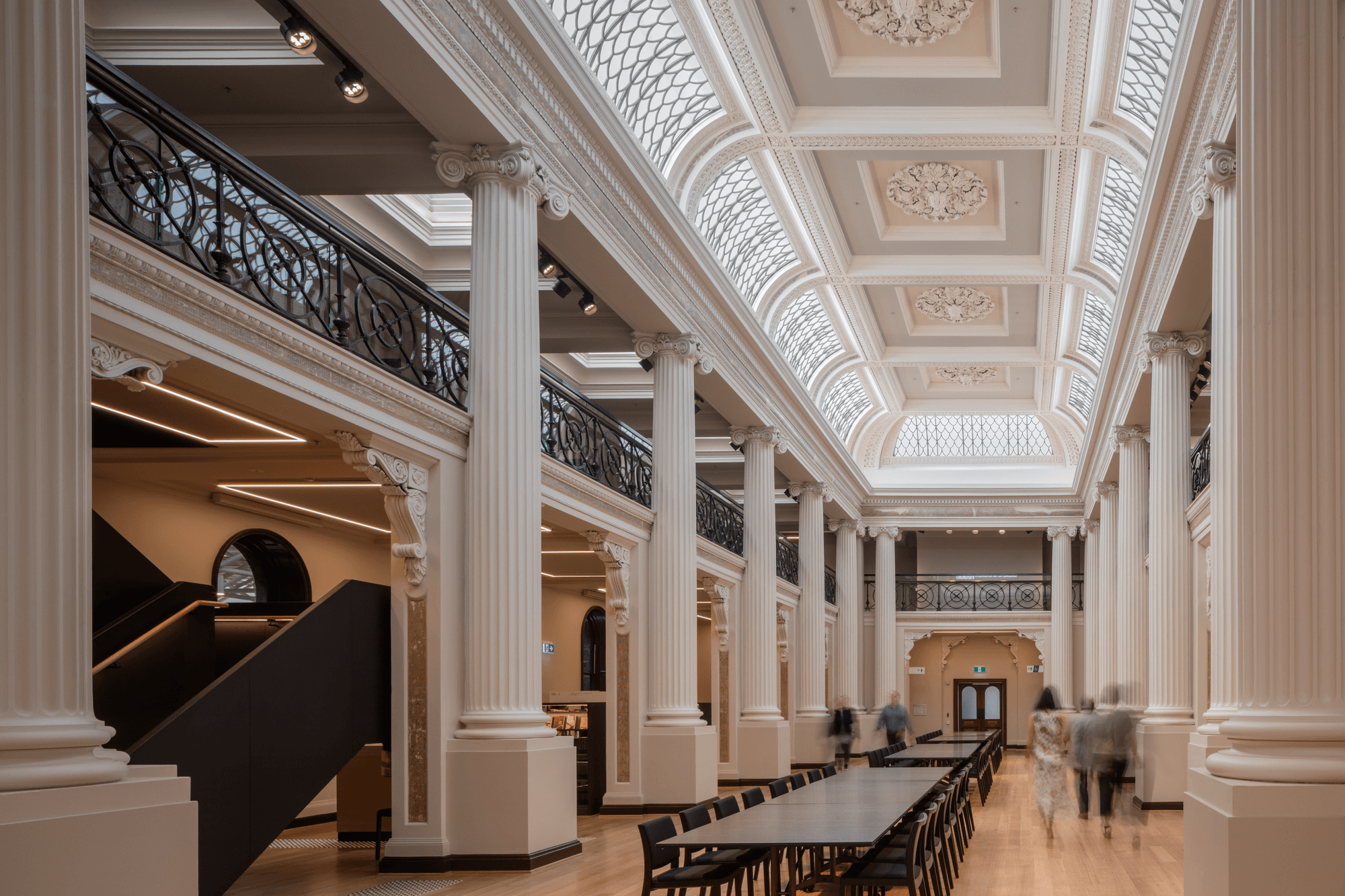
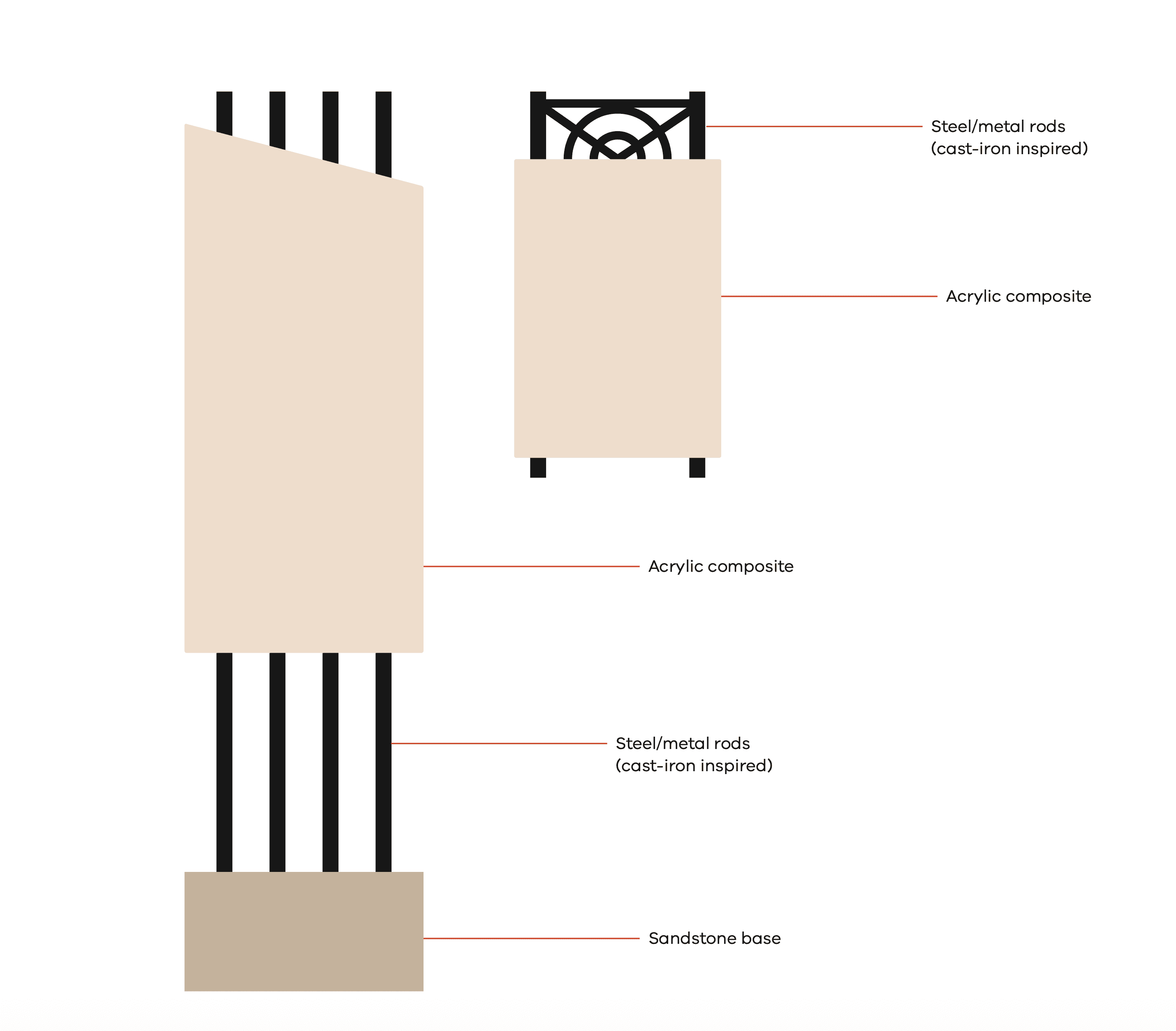
The signage design and materiality borrows from the building’s sandstone construction, grand columns and cast-iron balustrades.
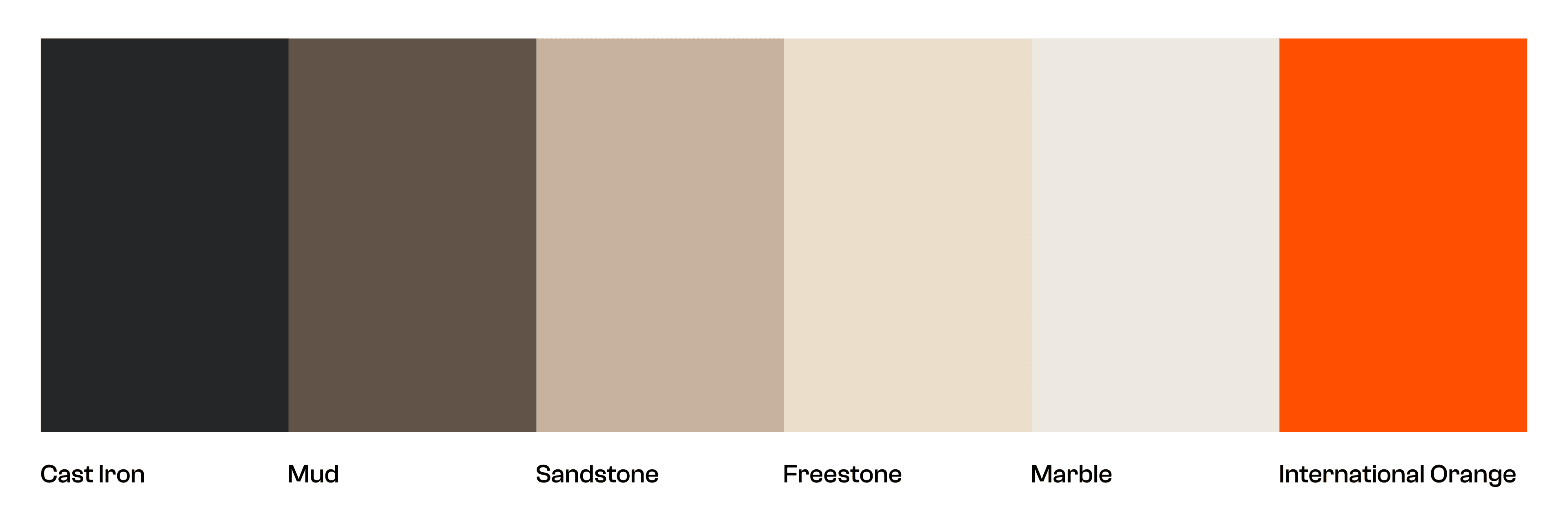
The colour palette is also directly influenced by the building materials.
We used International Orange as an accent as it stands out on the page whilst remaining visually harmonious with the rest of the palette.
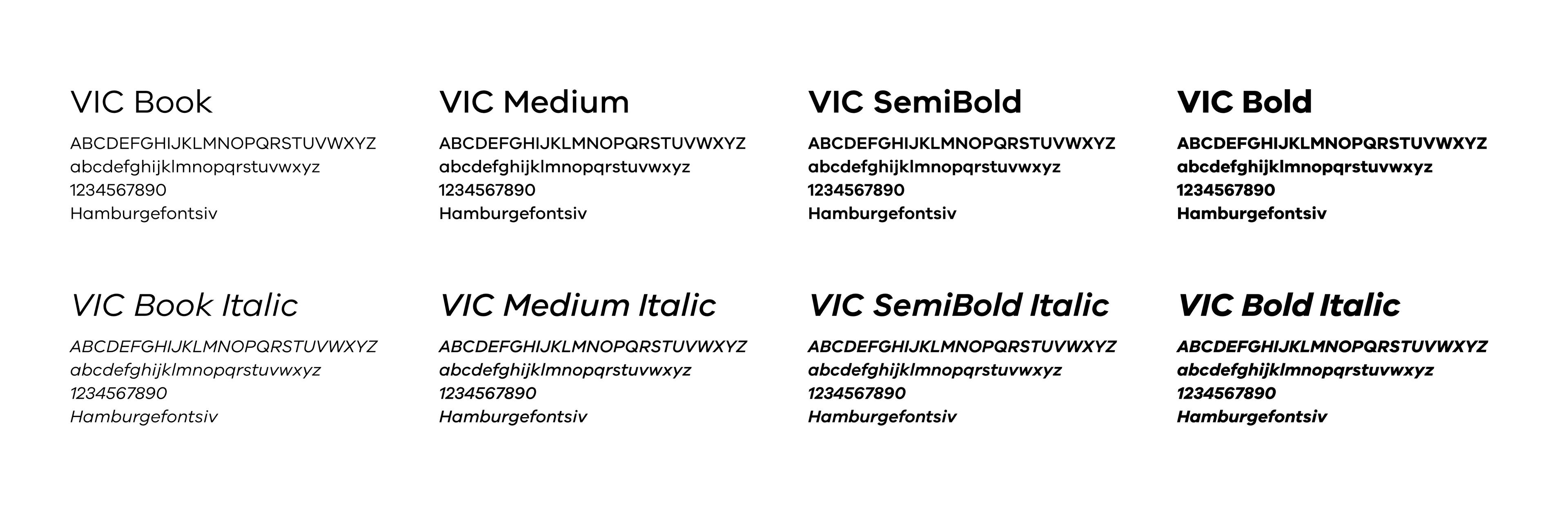
As a state landmark, we decided to use Brand Victoria’s typeface, VIC. This type is highly legible and flexible.
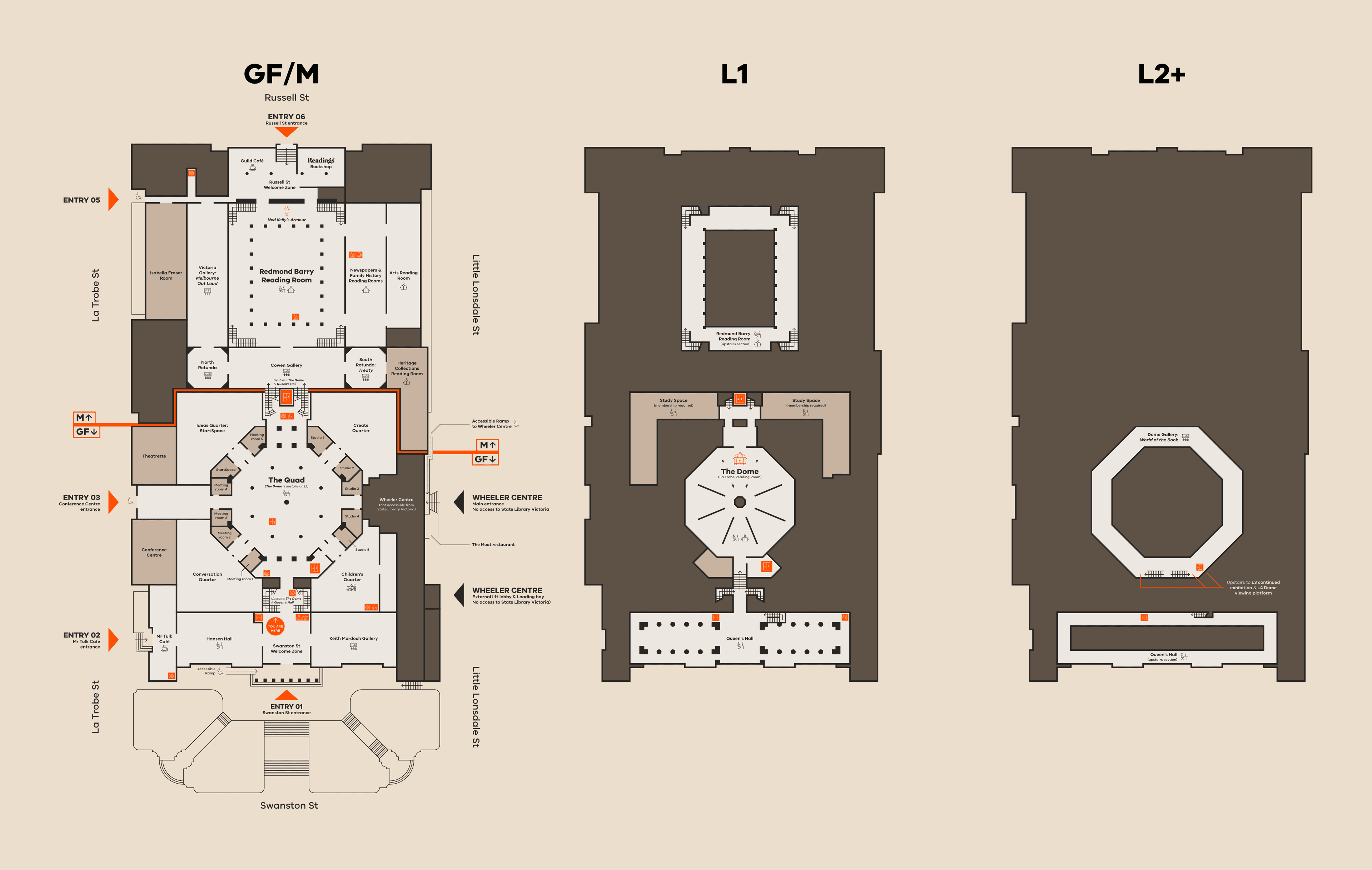
I designed 2 maps for the SLV site:
(1) A detailed map for up-close studying with every publically-accessible location, and
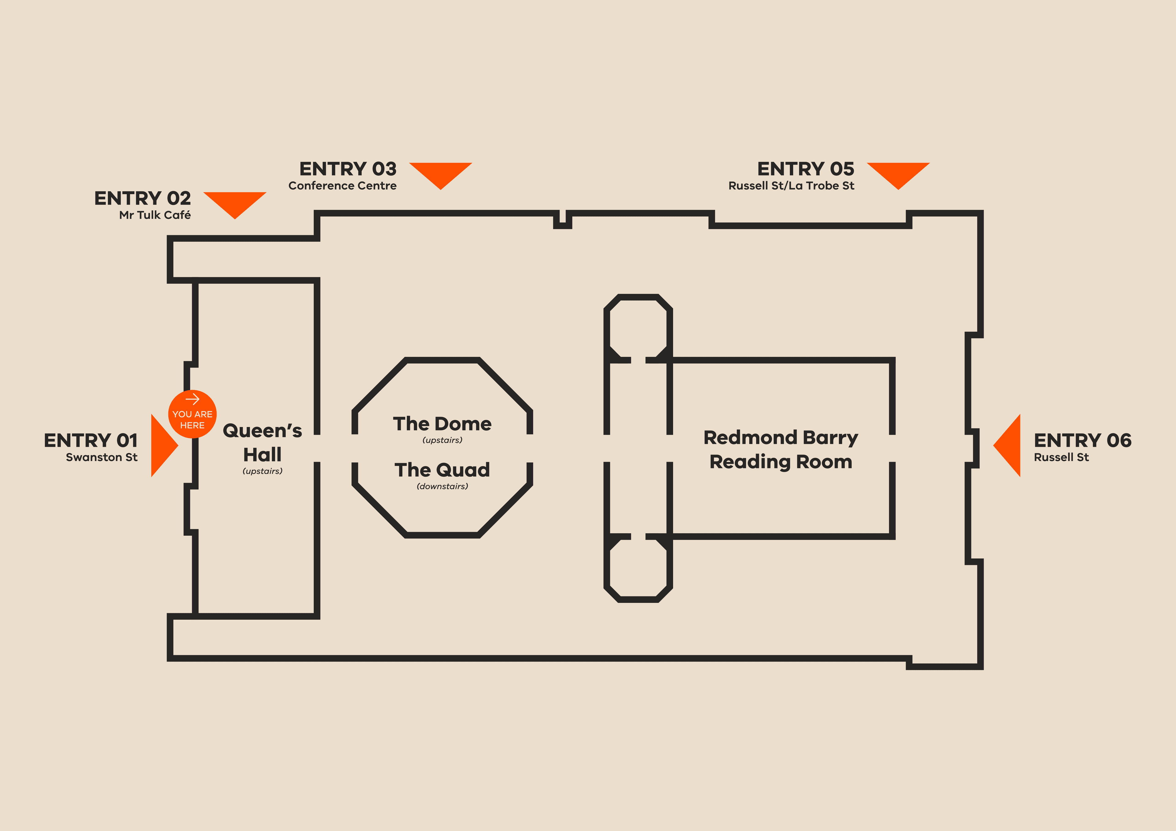
(2) A highly simplified map for quick orientation within the building.
I created the detailed map according to building floorplans, existing maps and imagery. Combining the Ground and Mezzanine levels with a dividing line greatly improved readability and significantly condensed the overall map.
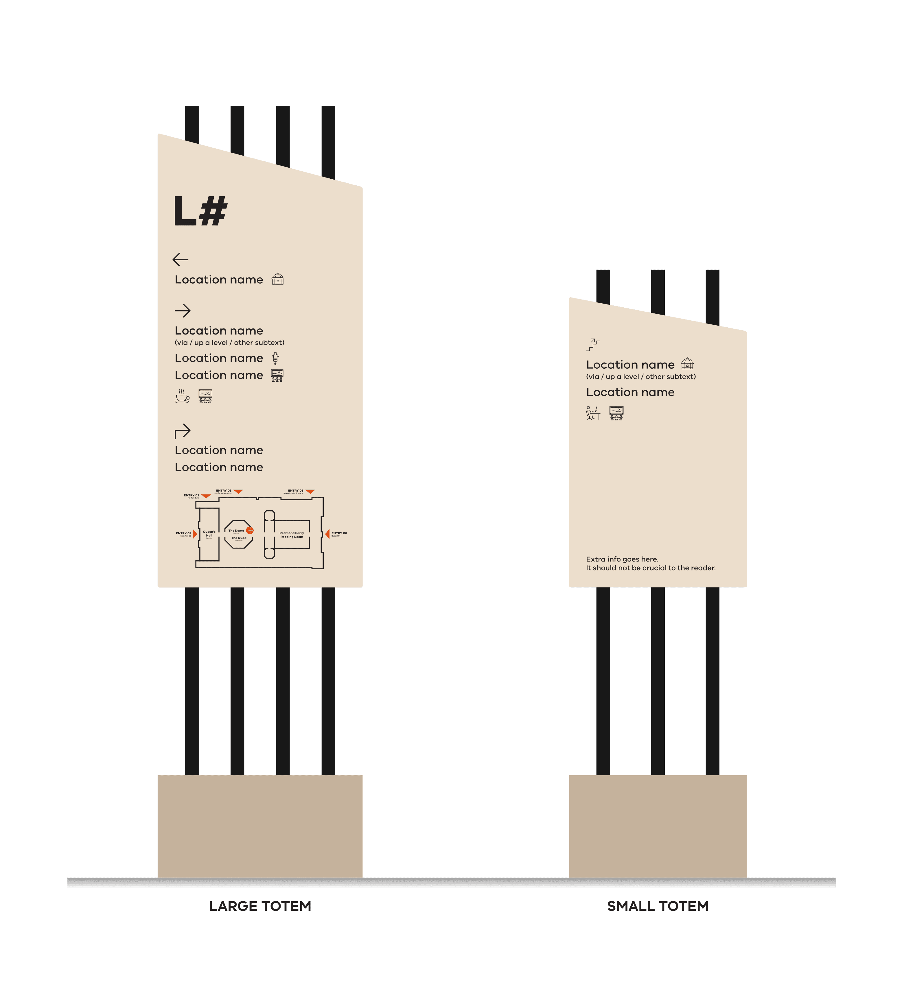
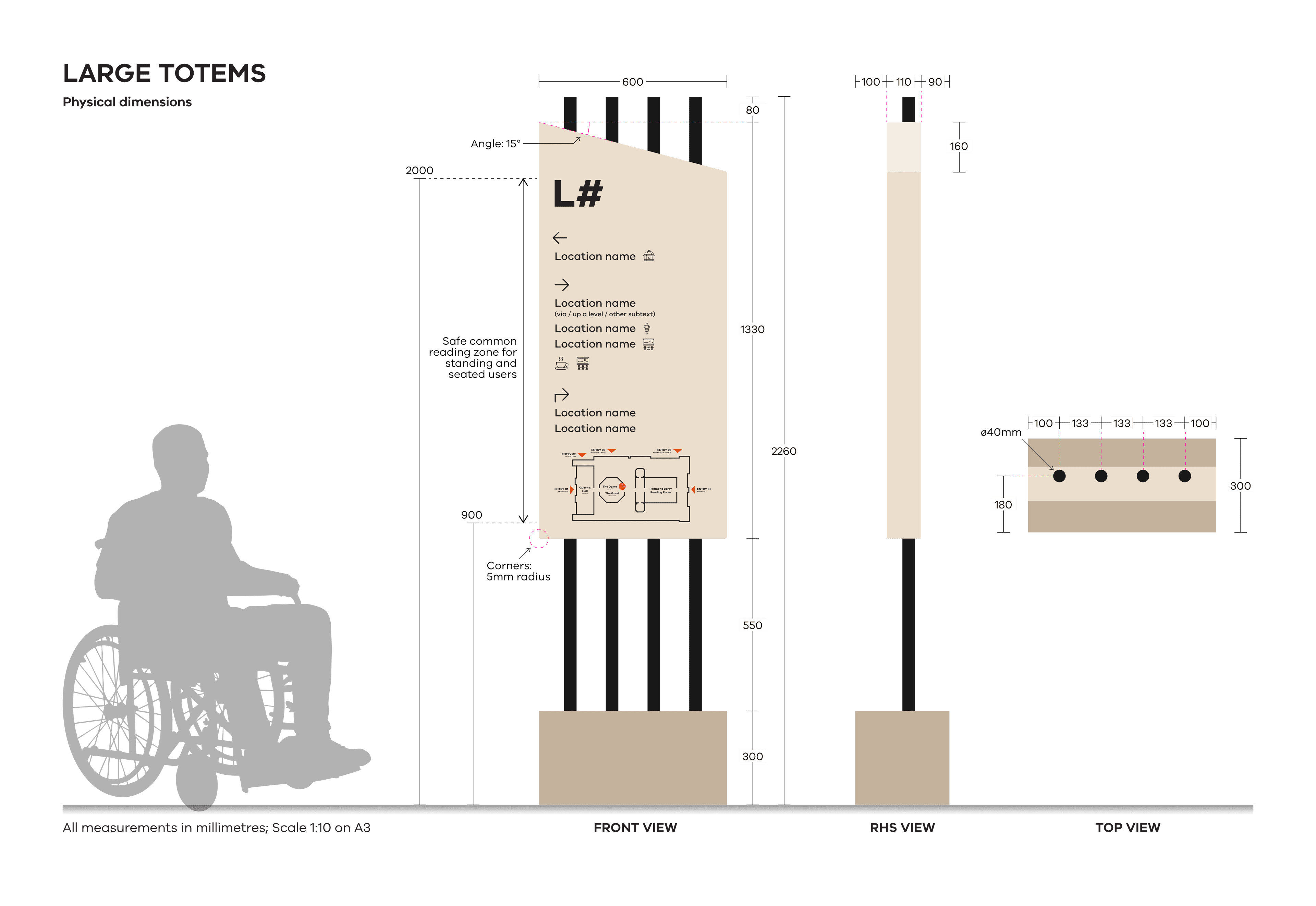
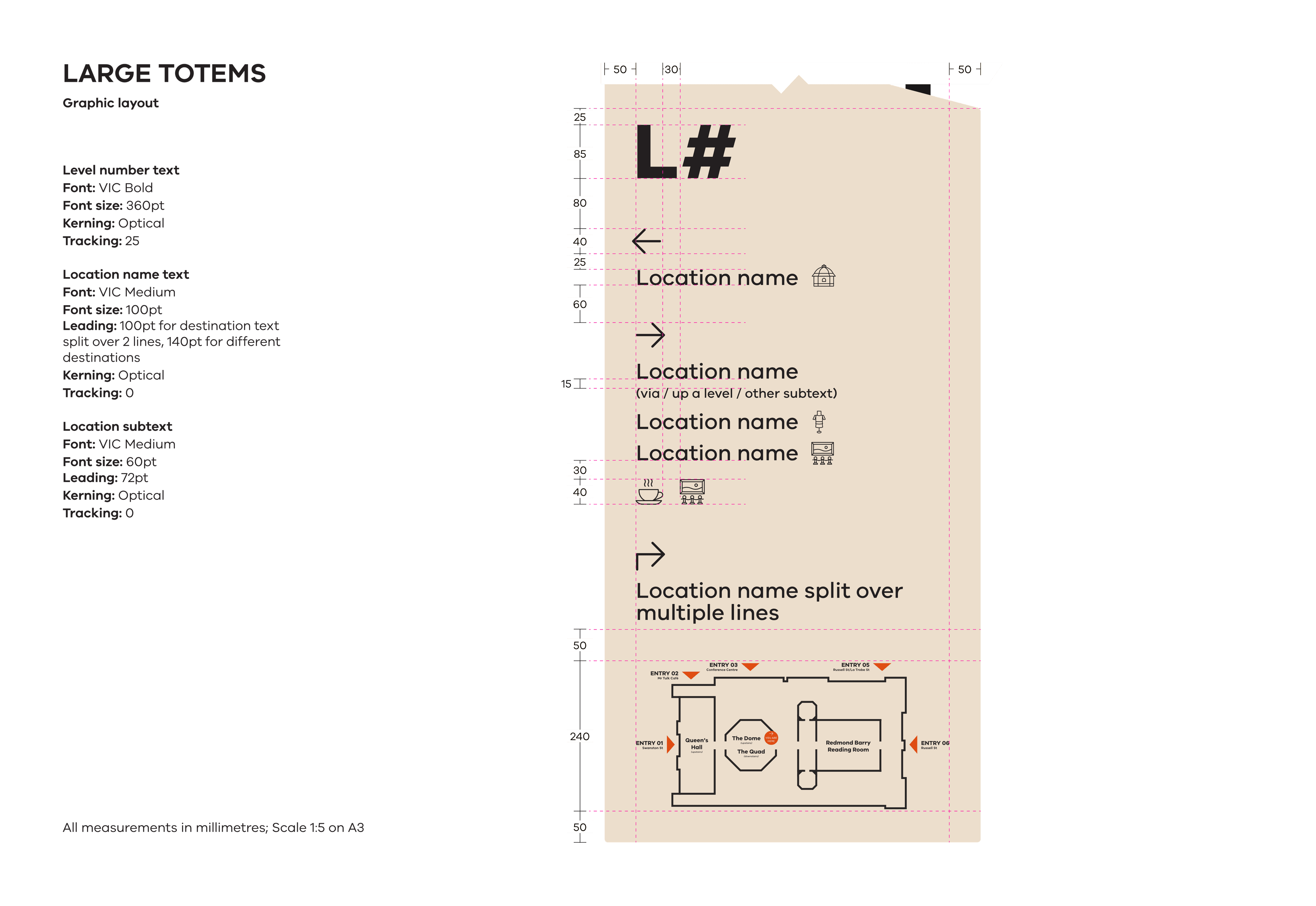
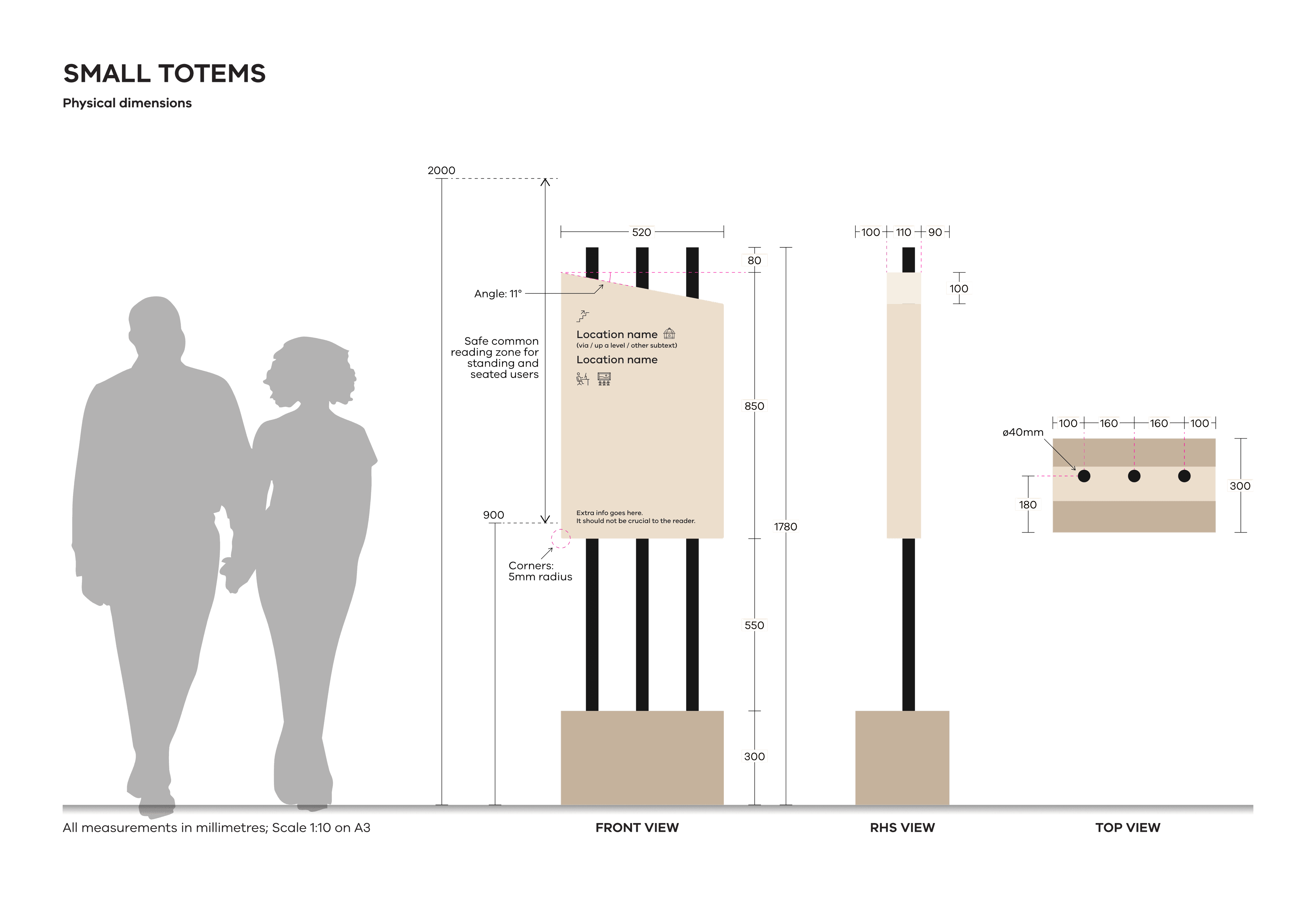
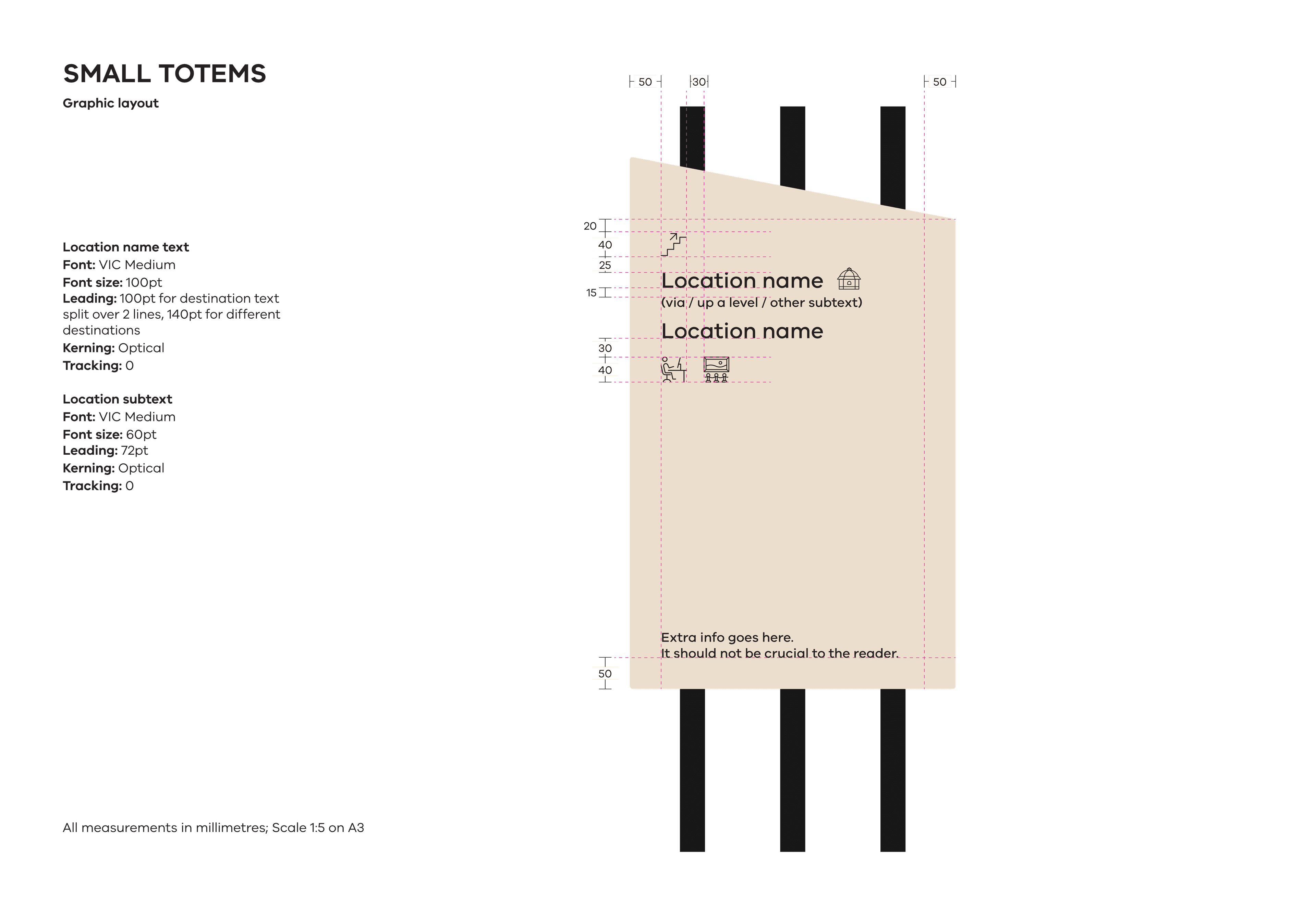
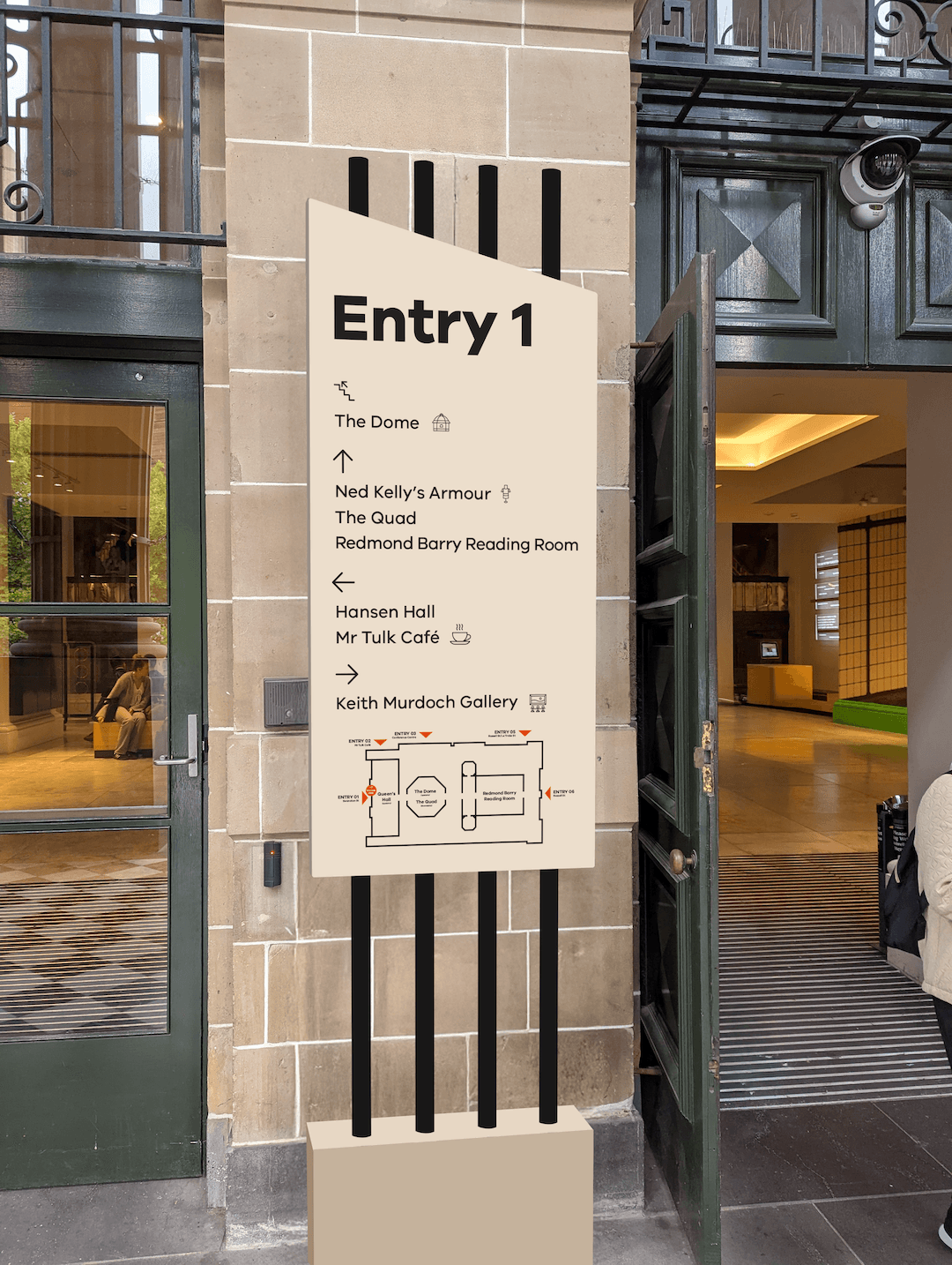
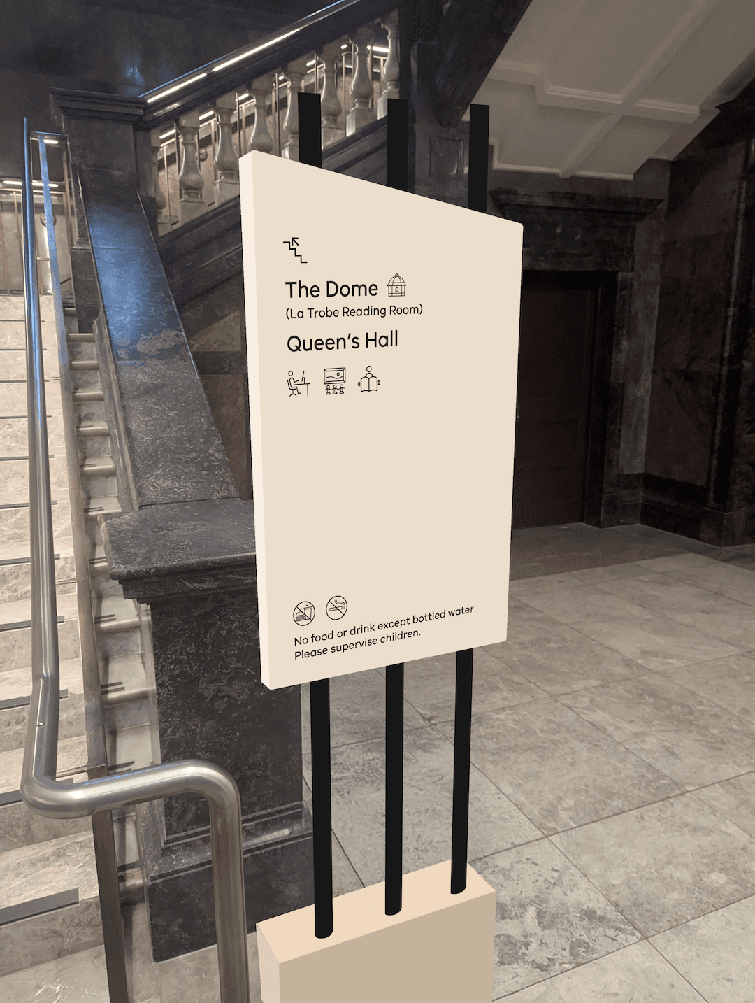
Totems aid users with orientation, journey planning and directions. They attract people from far away.
Totems are prominent, free-standing signs for high-level orientation. They display major landmarks, essential services (via pictograms), and simplified maps rather than granular wayfinding details.
They are reserved for critical locations and broad overviews; minor destinations belong on smaller signs.
Because of their size and the crowds they attract, totems must be highly visible and accessible without obstructing main walkways.
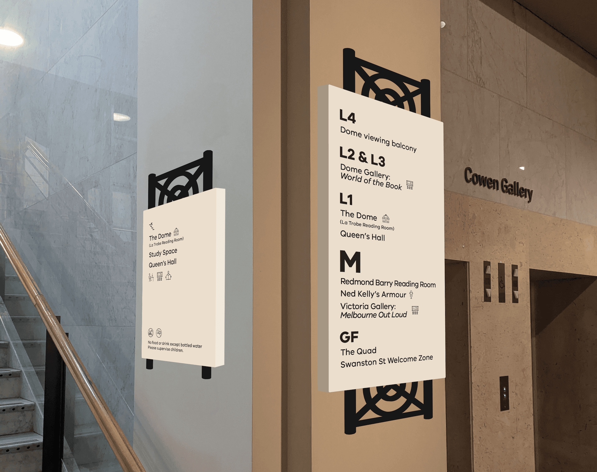
Wall signs provide basic, localised directions to nearby areas or between floors. They are not intended for broader journey planning.
Large wall signs are positioned by lifts to present a floor-to-floor directory.
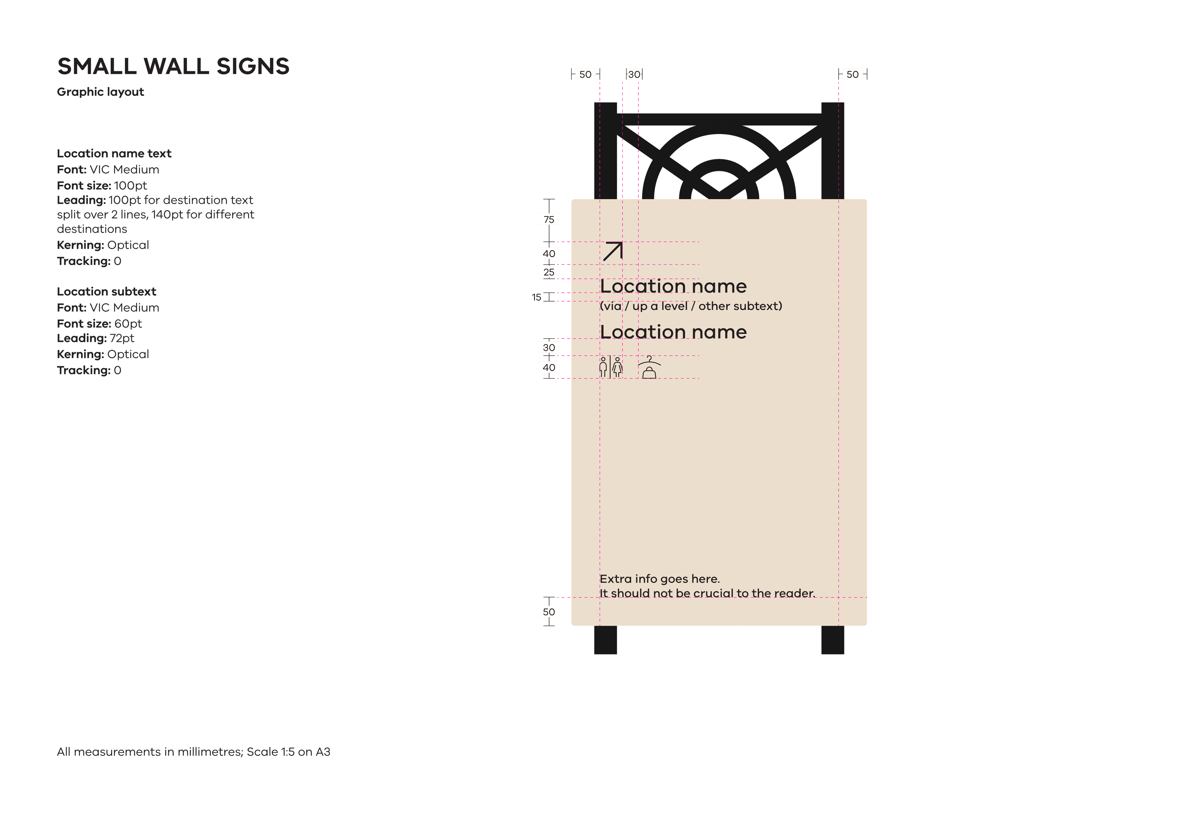
Small wall signs are placed at entrances or along a path. They are meant to be quickly scanned at eye-level, providing a limited number of nearby, possibly lesser-known destinations.
Wall signs are smaller and less imposing than totems. They should not impede upon the continuity of a walkway and should be placed in clear eyesight at entry/exit points.
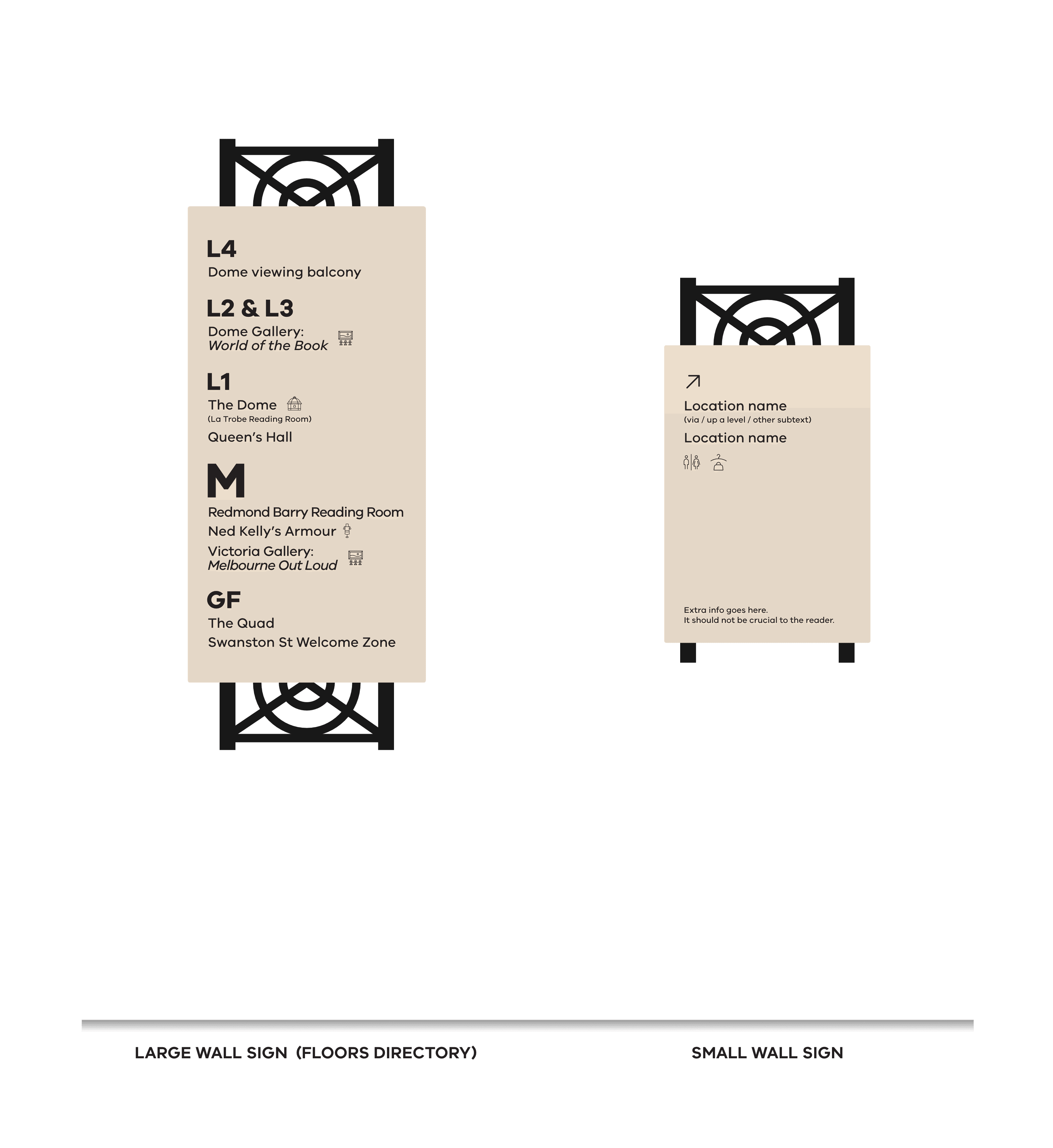
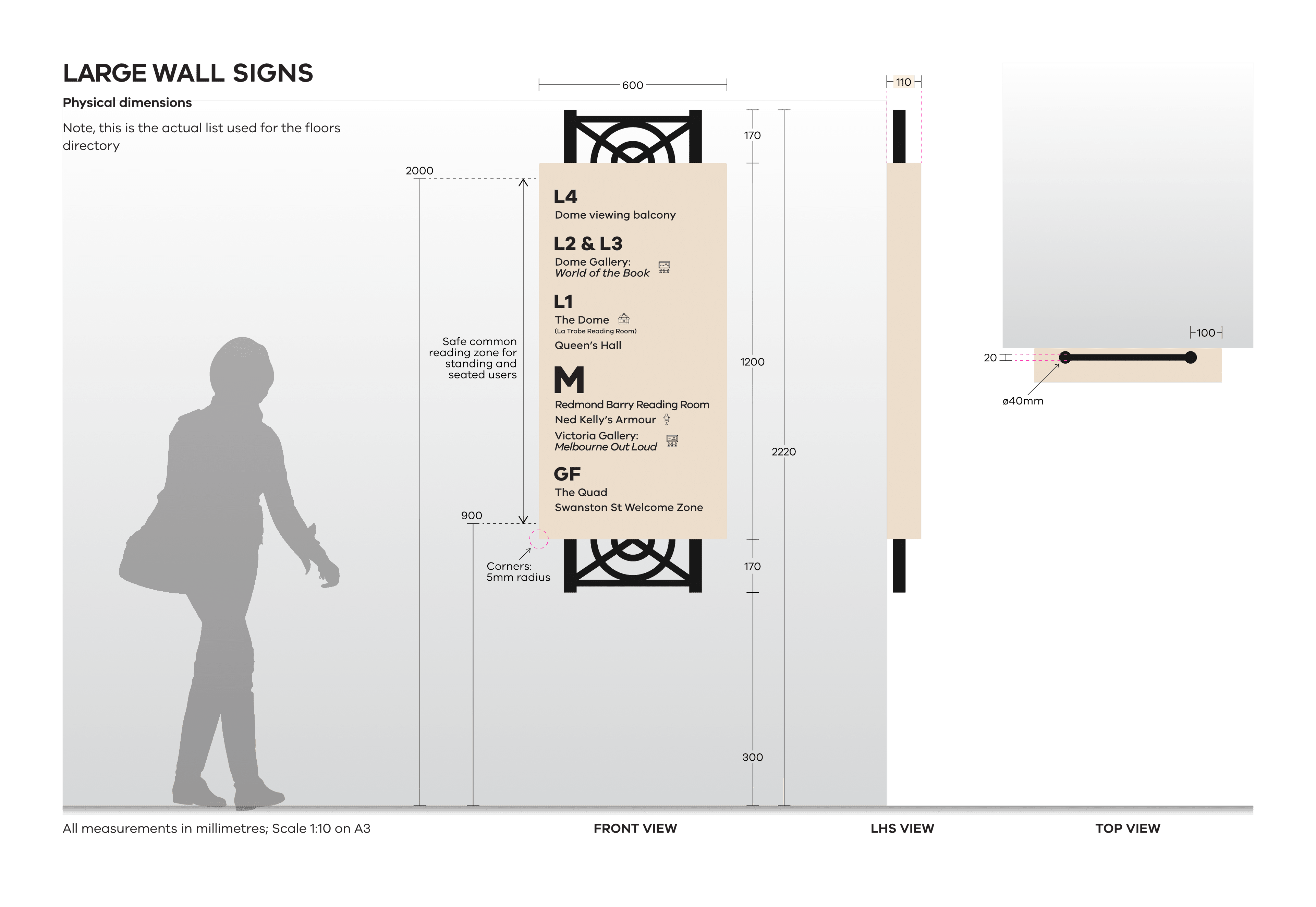
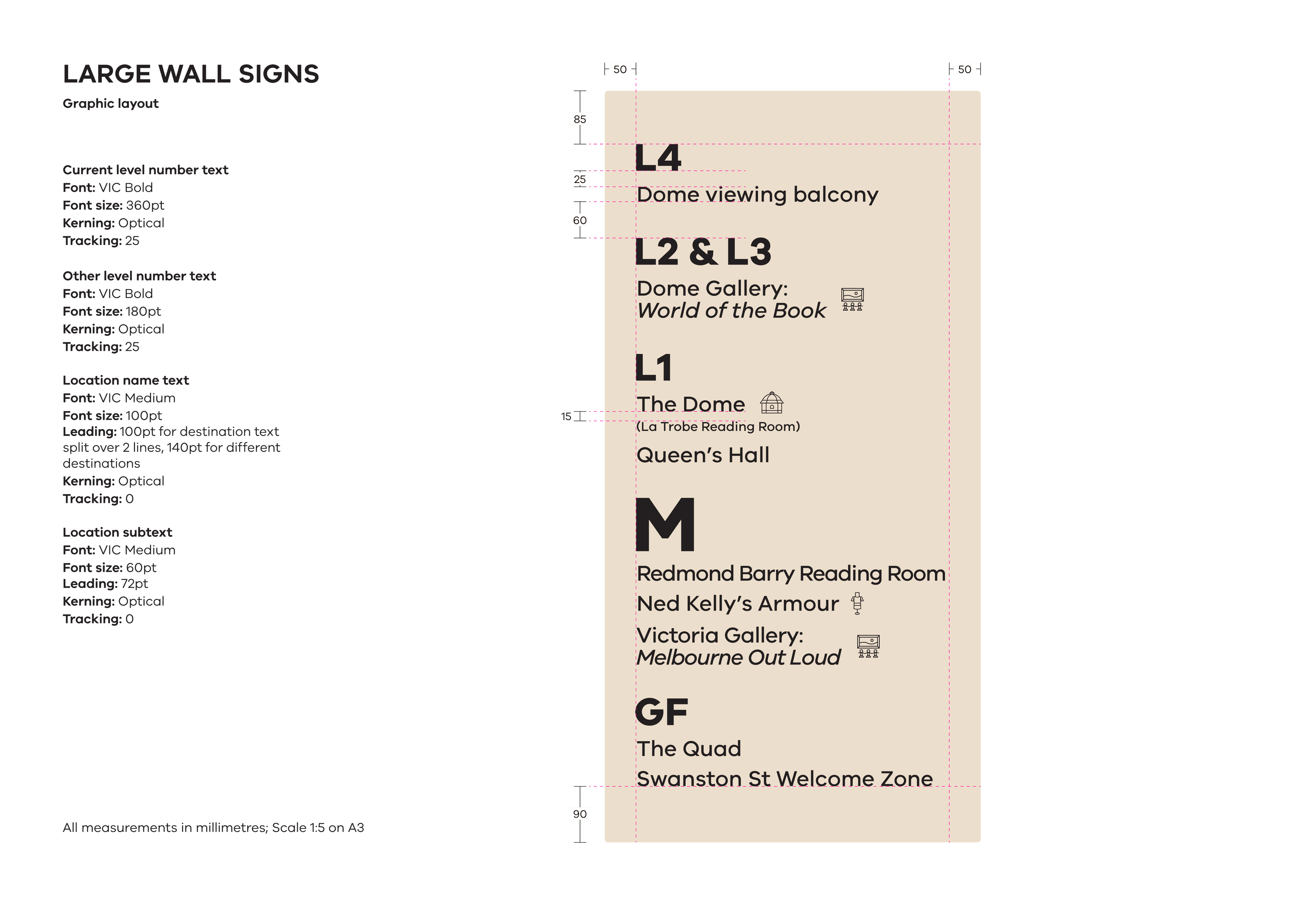
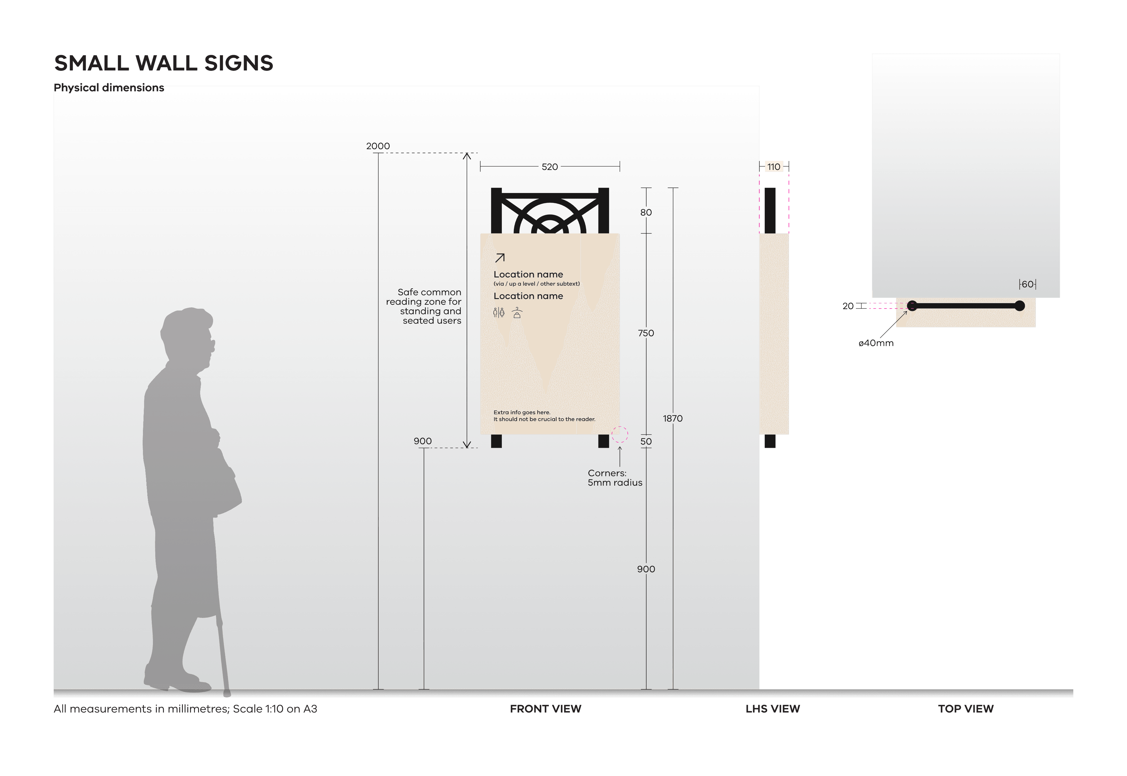
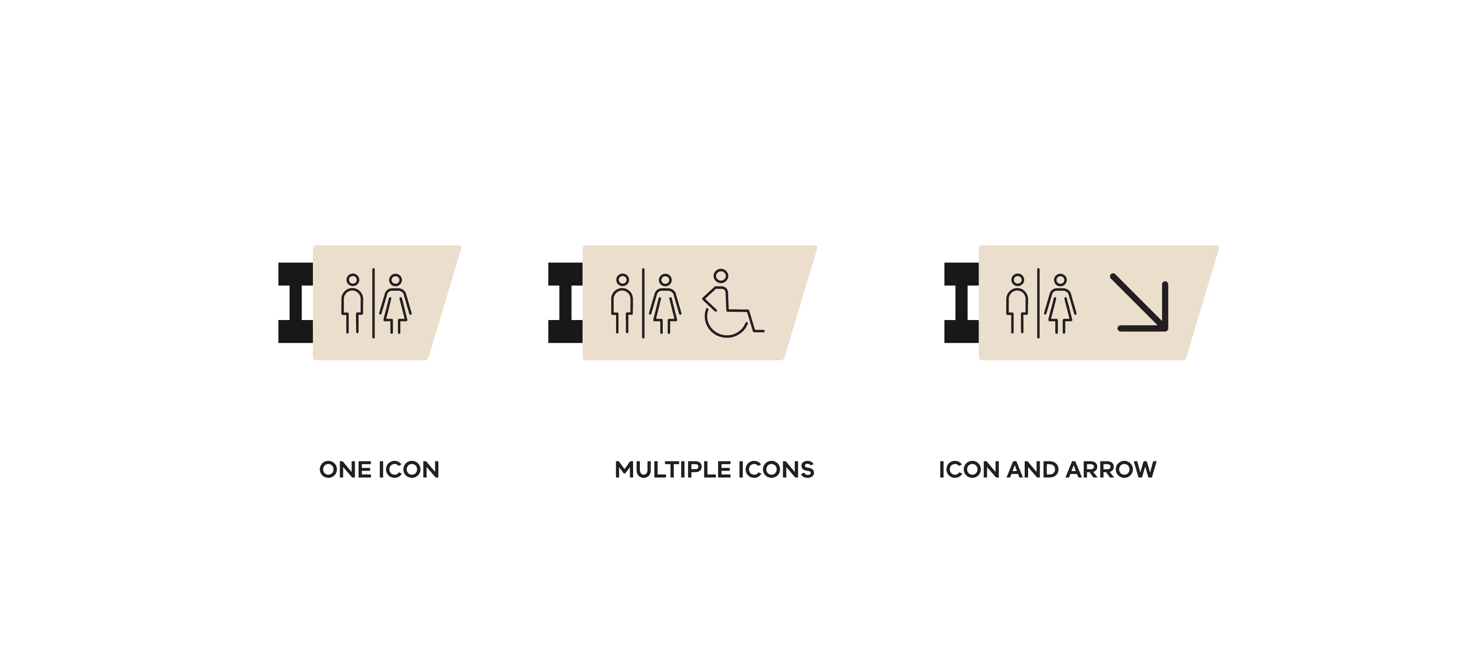
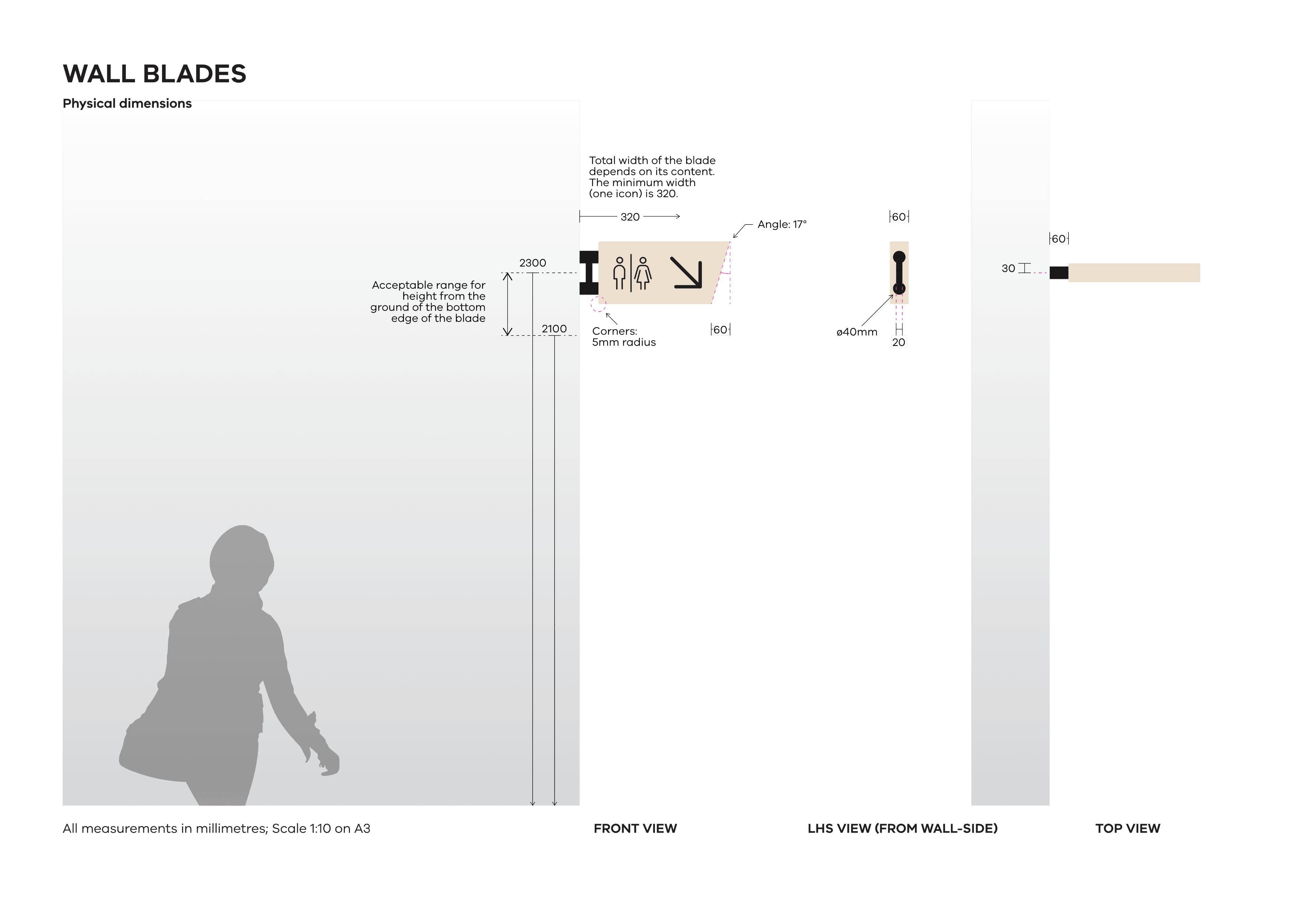
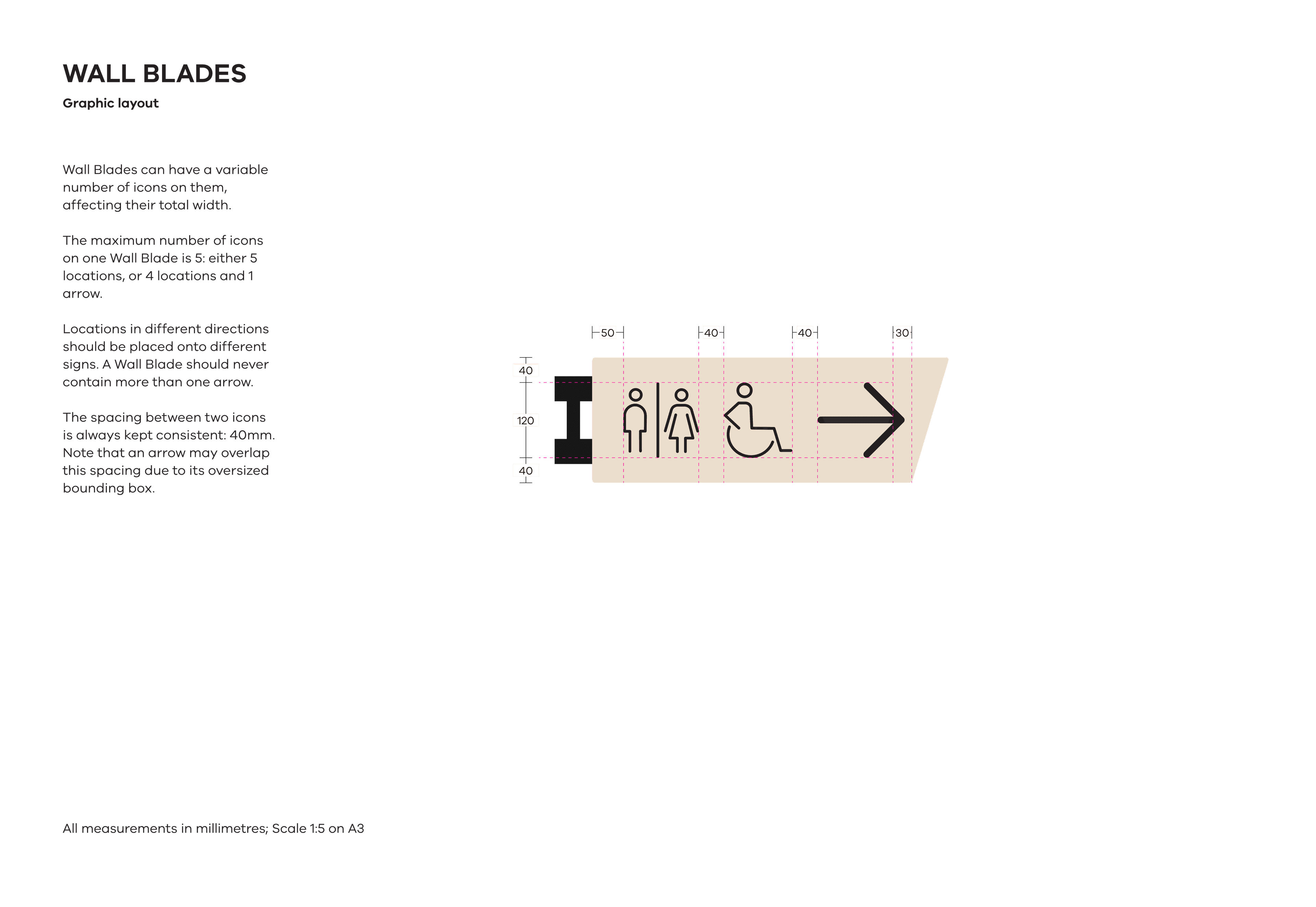
Wall blades are used to signal a specific close-by destination, utility or service. They are placed directly at entrances.
Wall blades stick out from a wall and present glanceable information through pictograms.
Where a wall blade does not have an arrow, it should be placed at the immediate entrance of the specified location. This sign is not meant to invite contemplation.
Wall blades are placed above head height so they are easy to spot and will not impede upon a walkway.
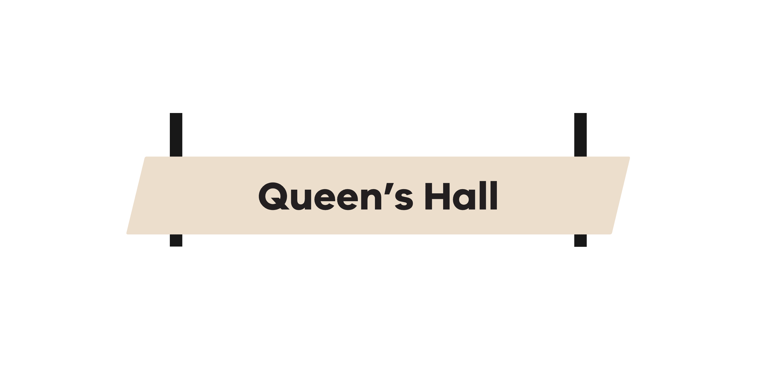
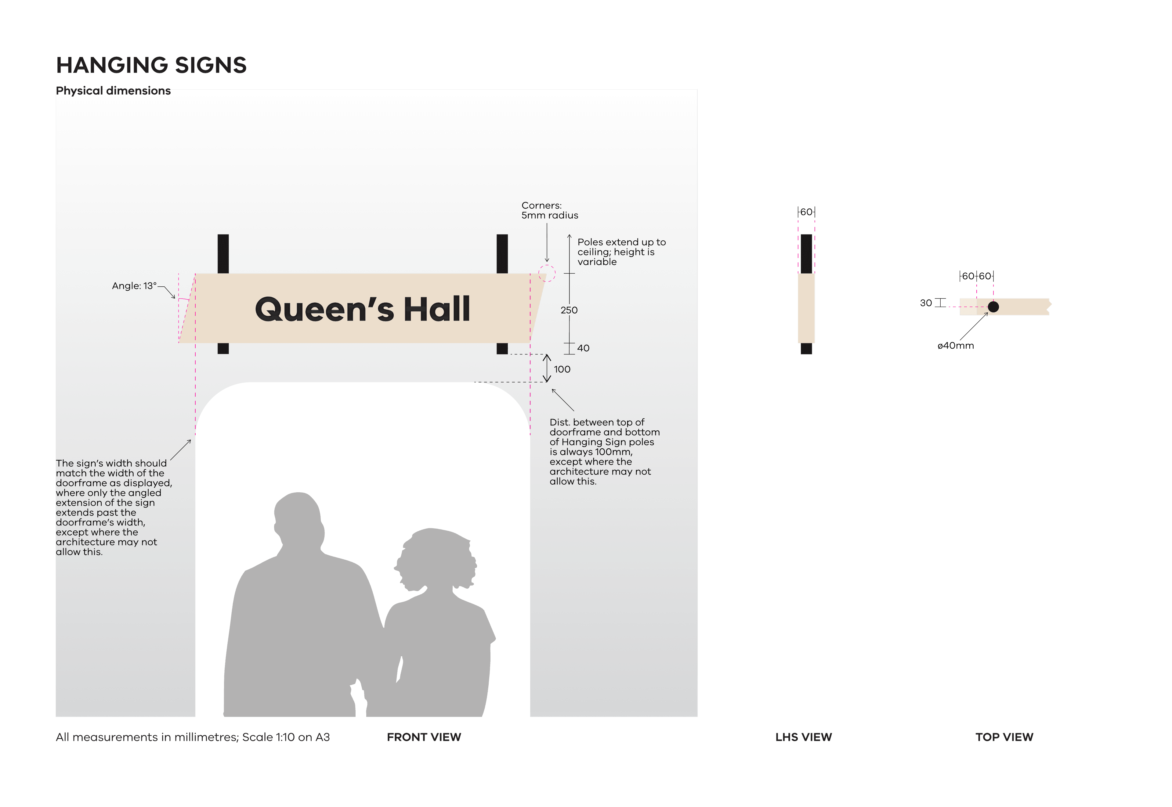
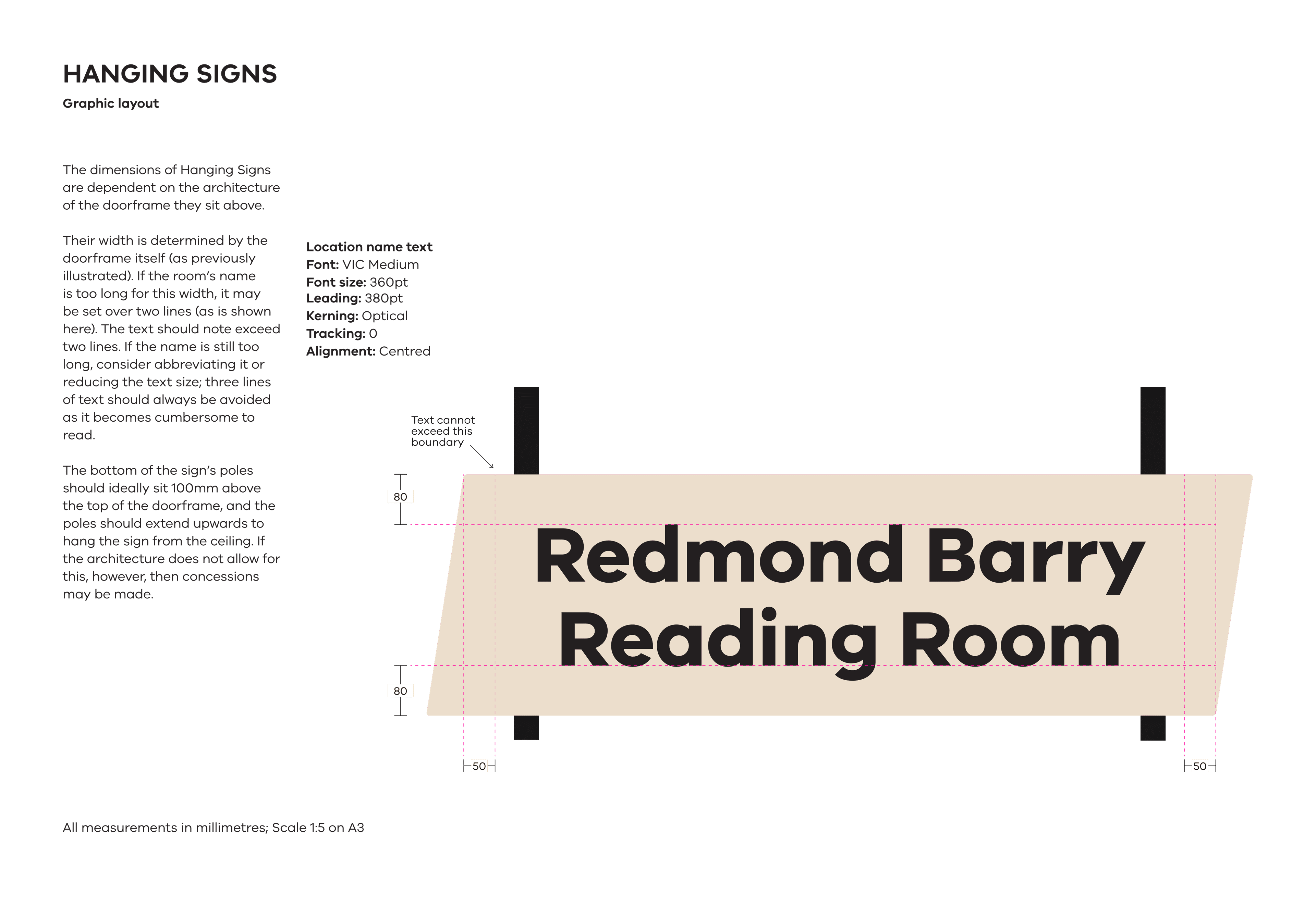
Hanging Signs clarify the room a user is about to walk into.
Hanging signs are primarily for reassurance rather than direction.
These signs only contain the relevant room’s name. This may help people find the room from a distance, especially from within a hall with many adjacent rooms.
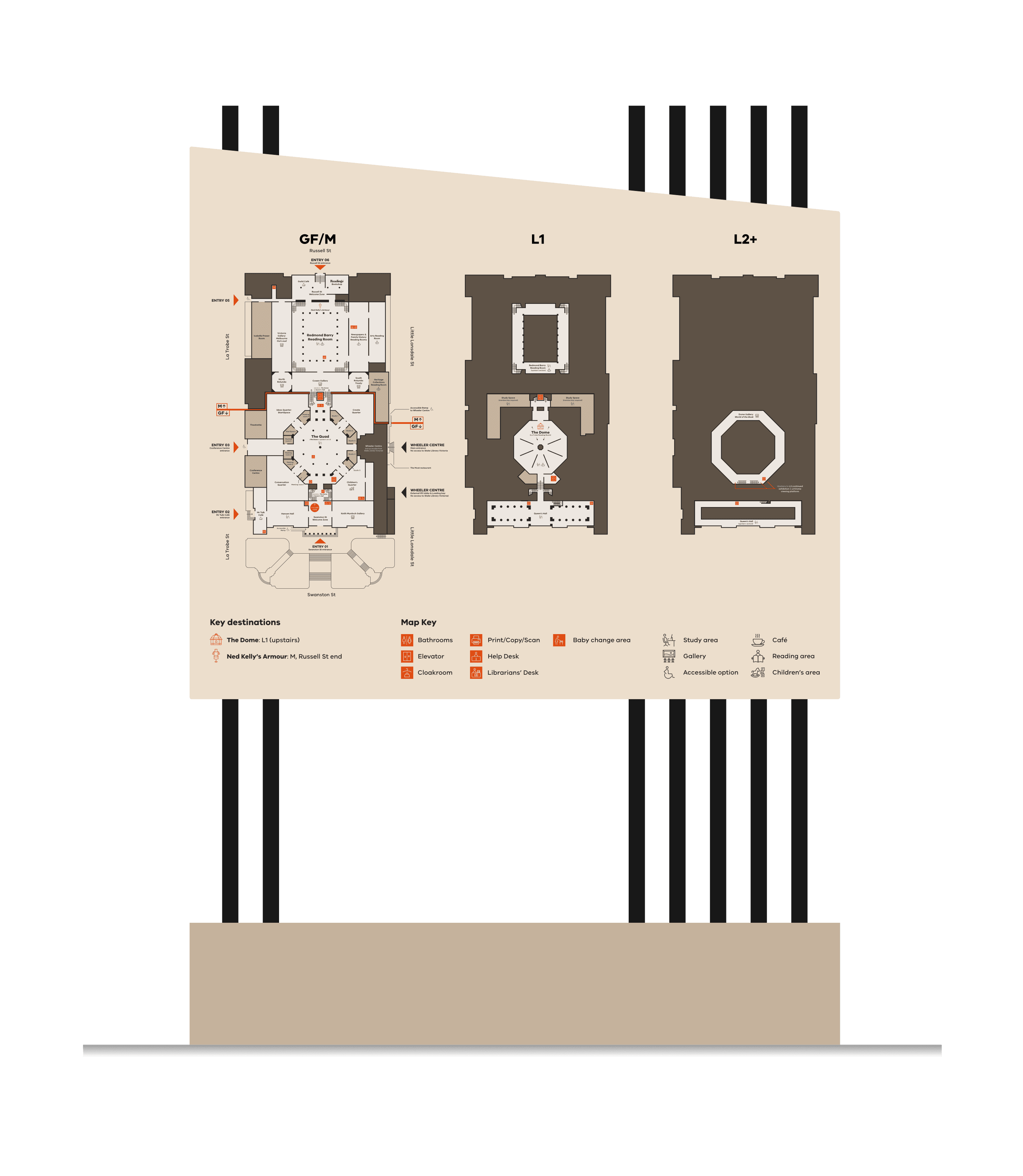
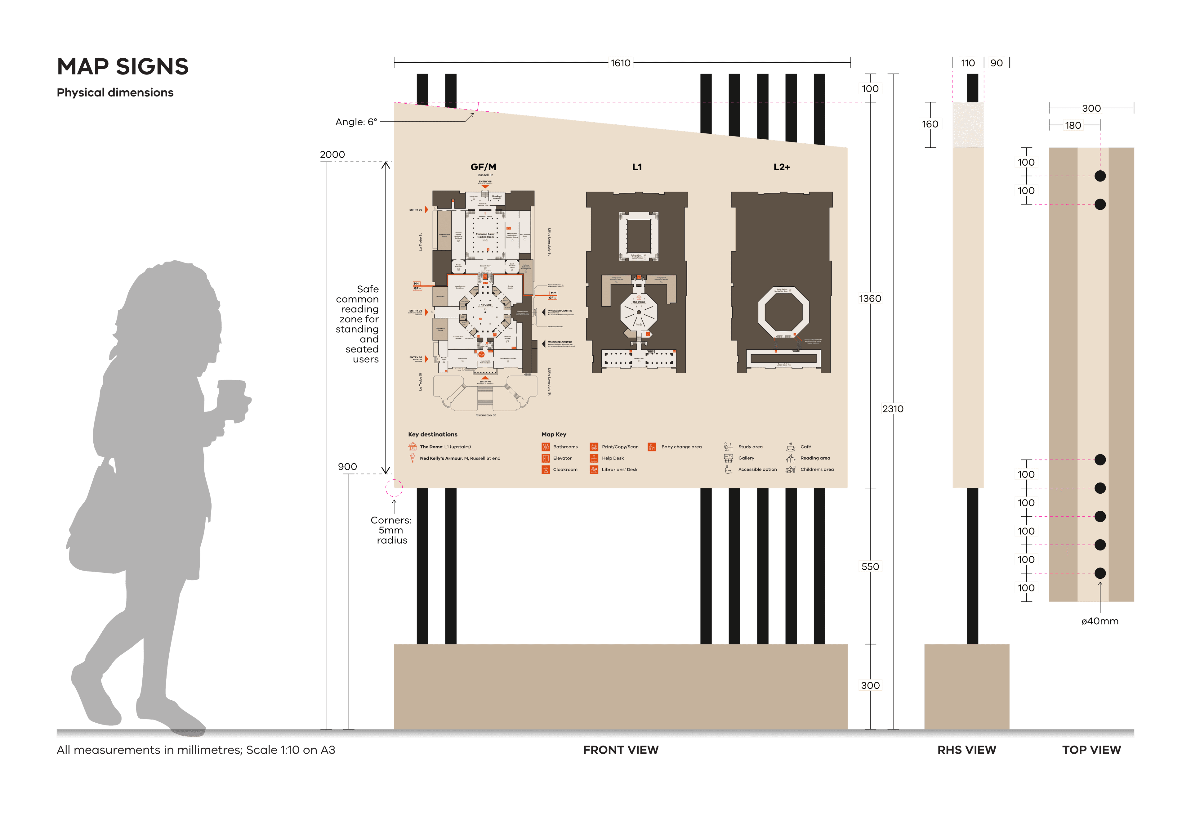
Map Signs are mainly used in entryways/foyers where people need to journey plan. These signs are large and invite people to get up close and study them.
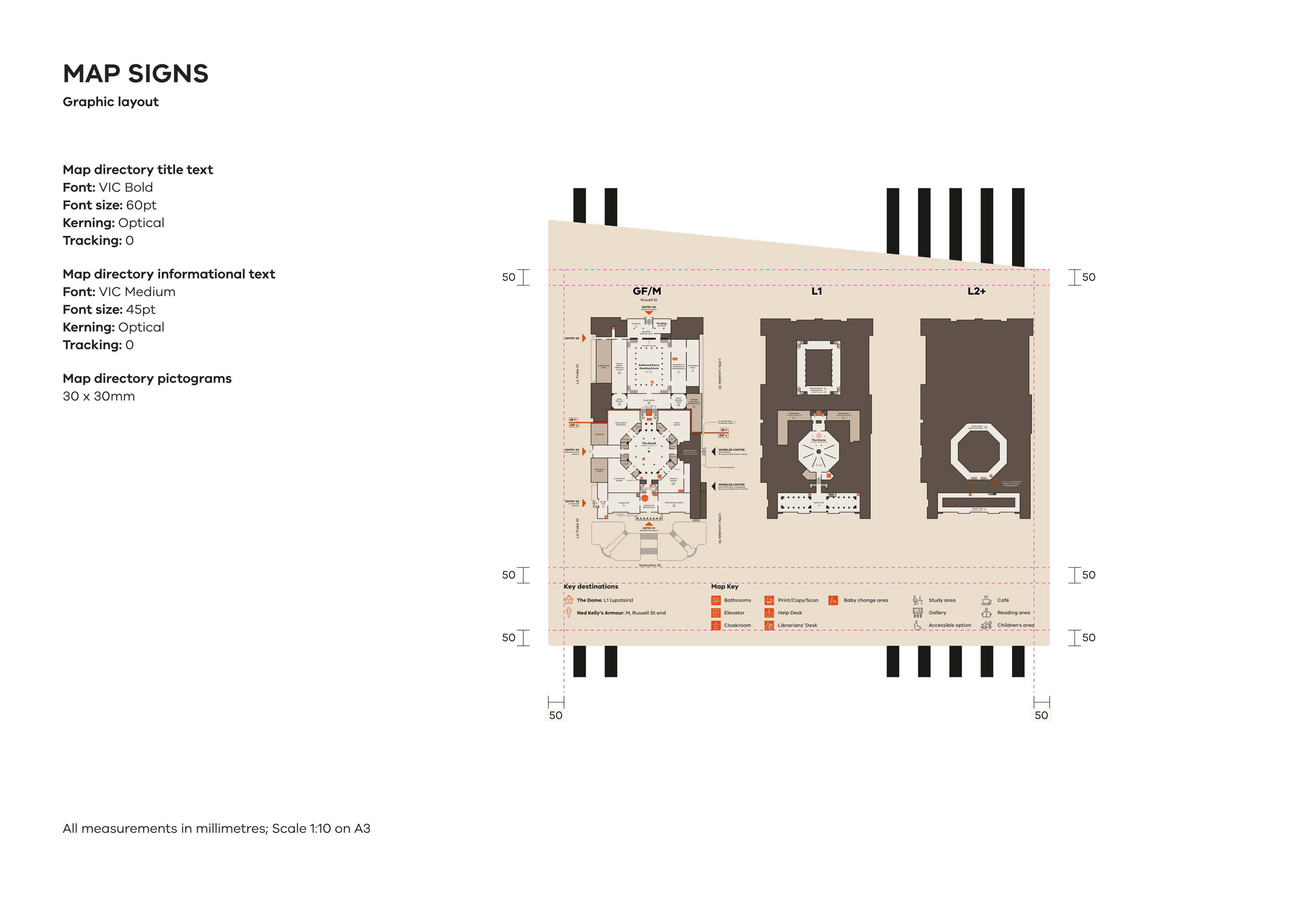
Map signs are large, free-standing signage with incredibly detailed information, presented visually for better orientation. They display every publically accessible room, the site’s layout and key service locations like amenities, printers, etc.
Map signs use comparatively smaller text due to their high information density. It is expected for people to lean in close to the map to chart out a course.
The map itself is oriented in the same direction the user faces; i.e., if the user faces East, the map should display East as up. The map also includes a ‘You are here’ marker to help users orient themselves.
Due to their size, Map Signs must be placed well away from busy walkways. These signs are in and of themselves destinations people will seek out.
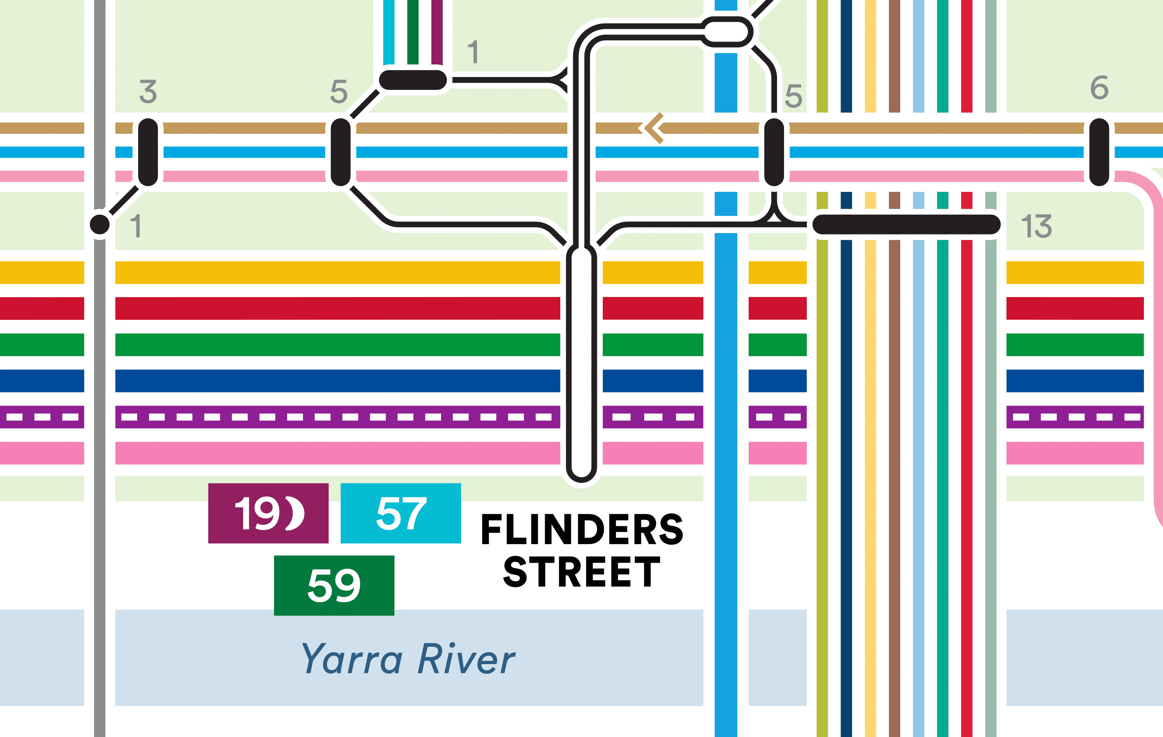
Combining 54 complex tram and train lines into an intuitive network map.
Wayfinding
Information design
Visual systems
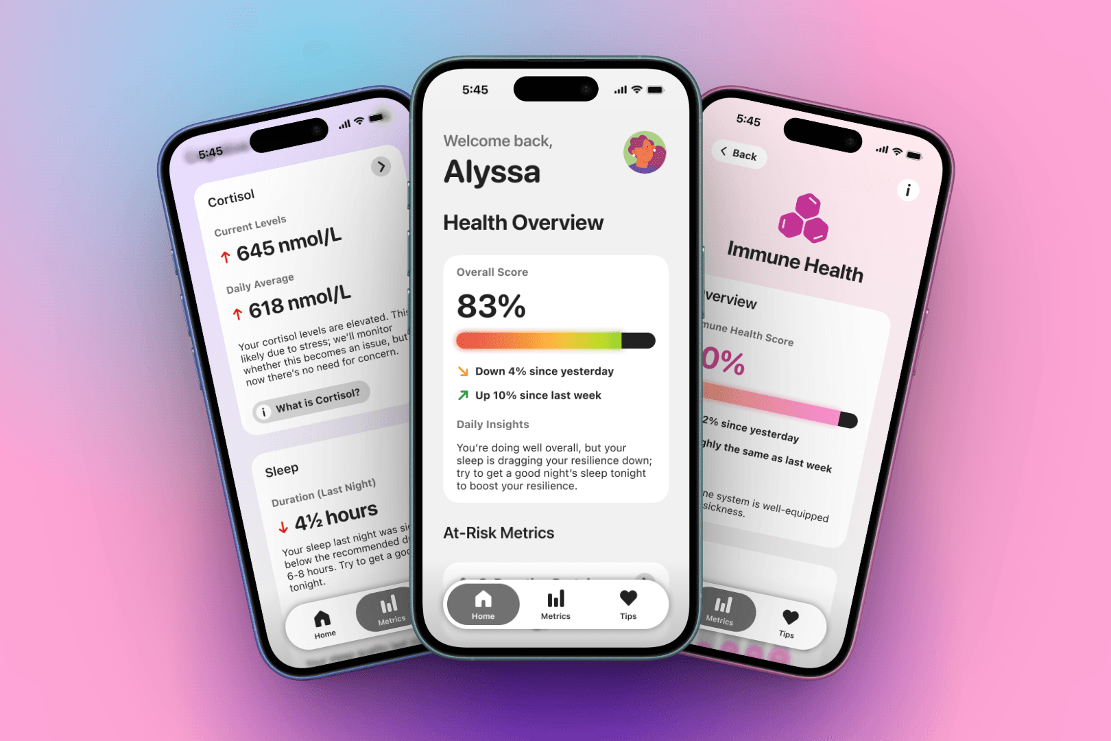
Making holistic health data simple and easy using speculative immune tracking technologies.
UX/UI
App design
Usability testing