Flexible Colours and Gradients
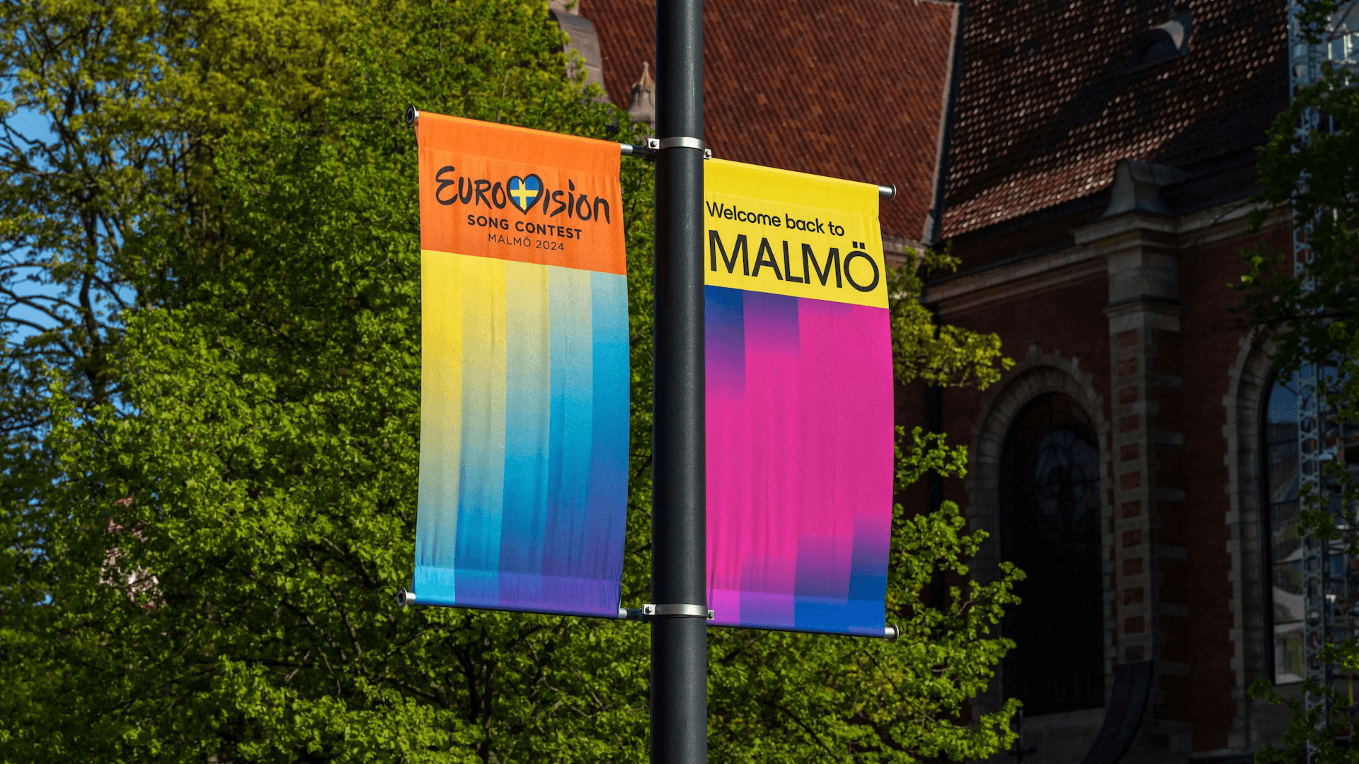
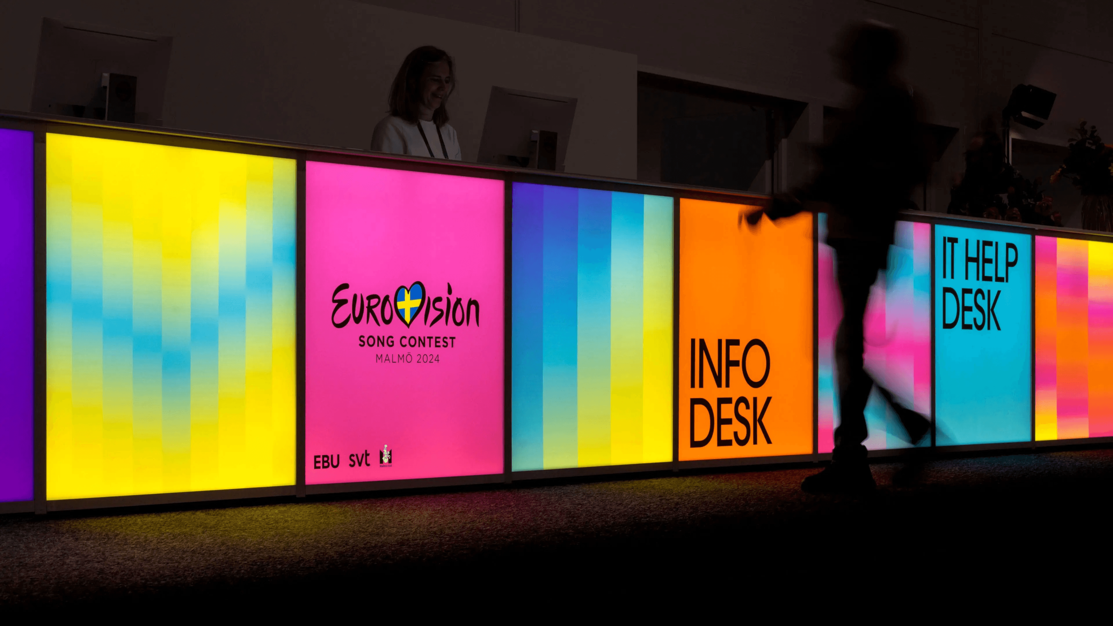
Eurovision 2024
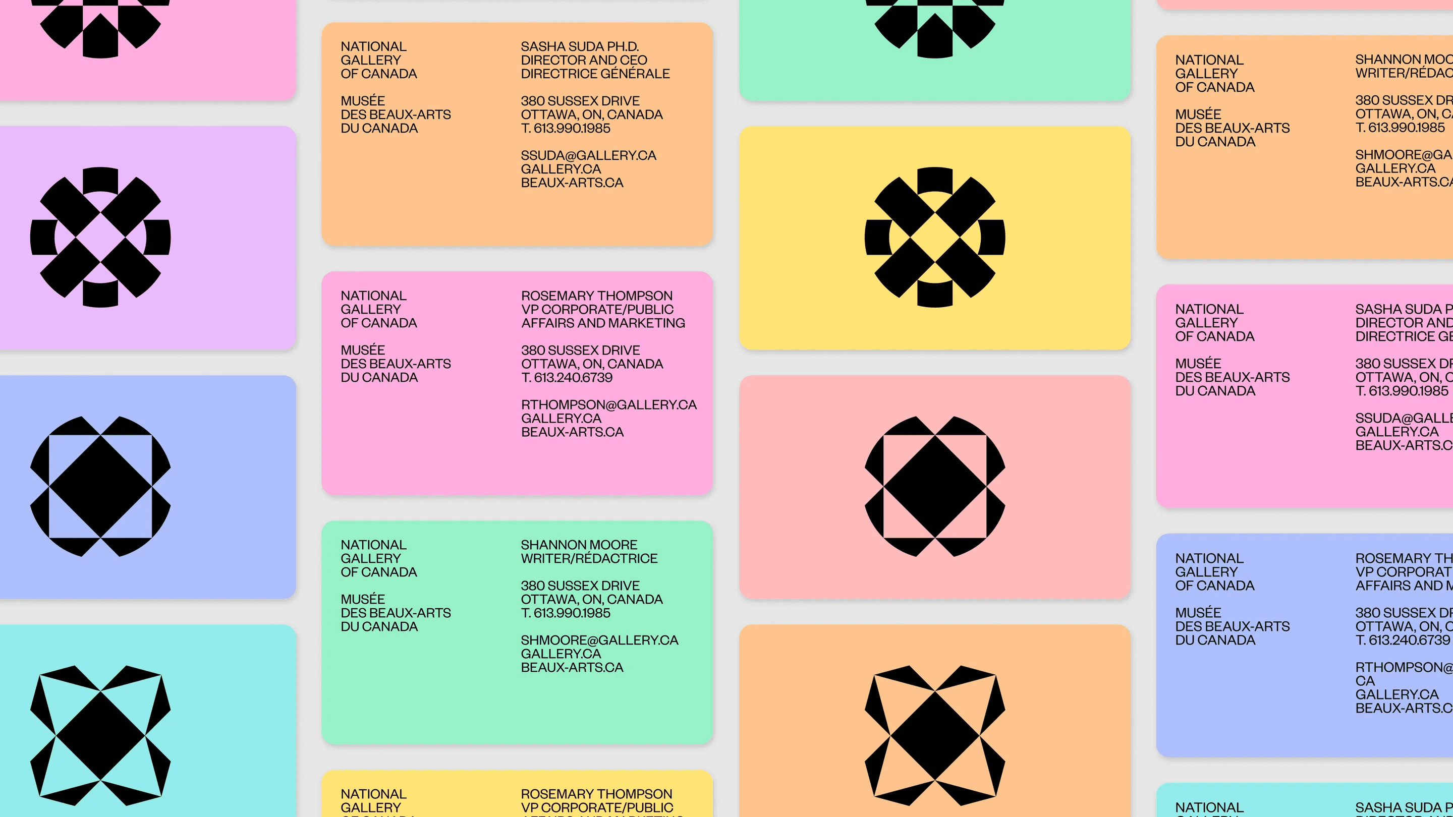
National Gallery of Canada
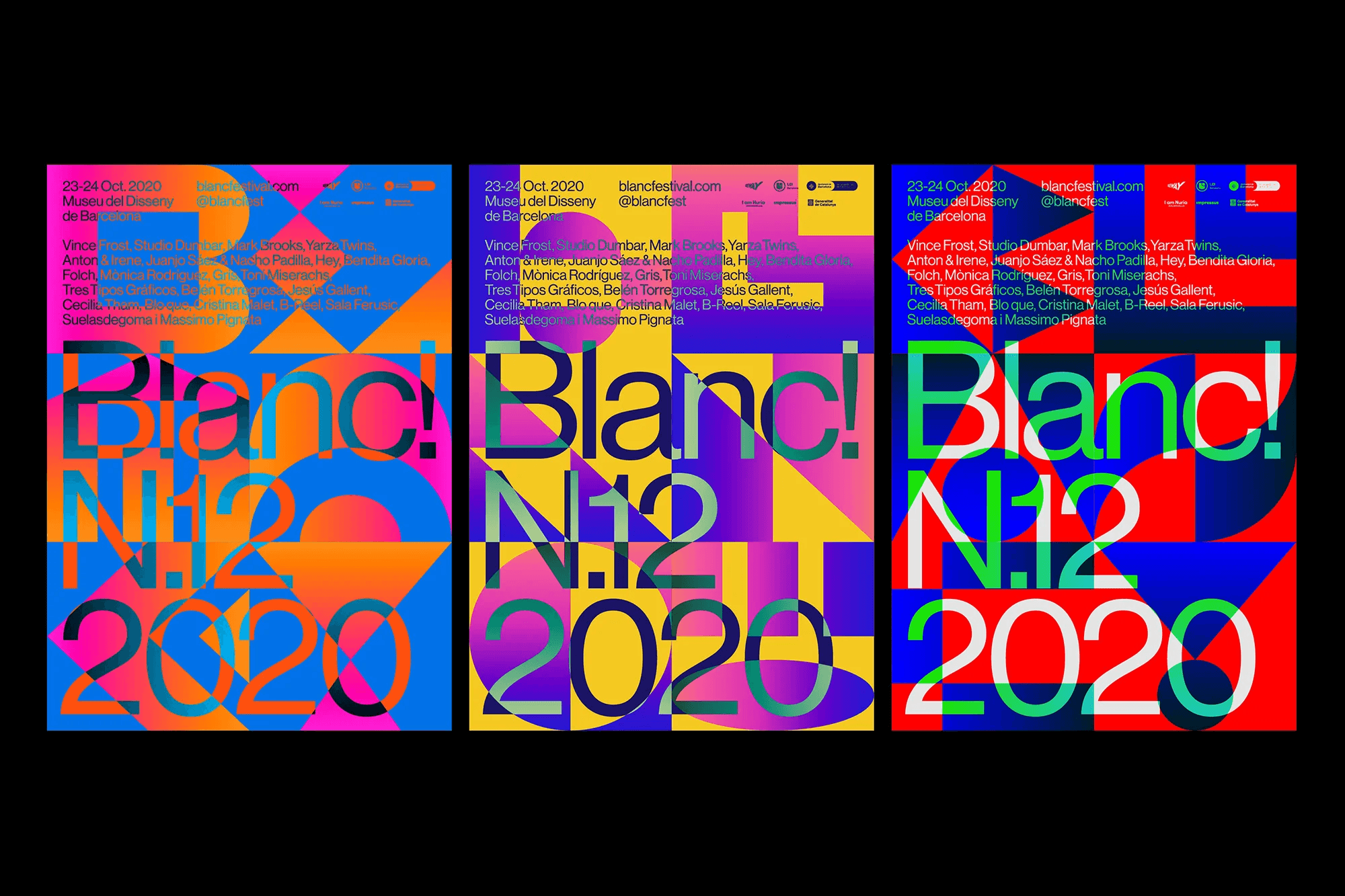
Blanc! 2020
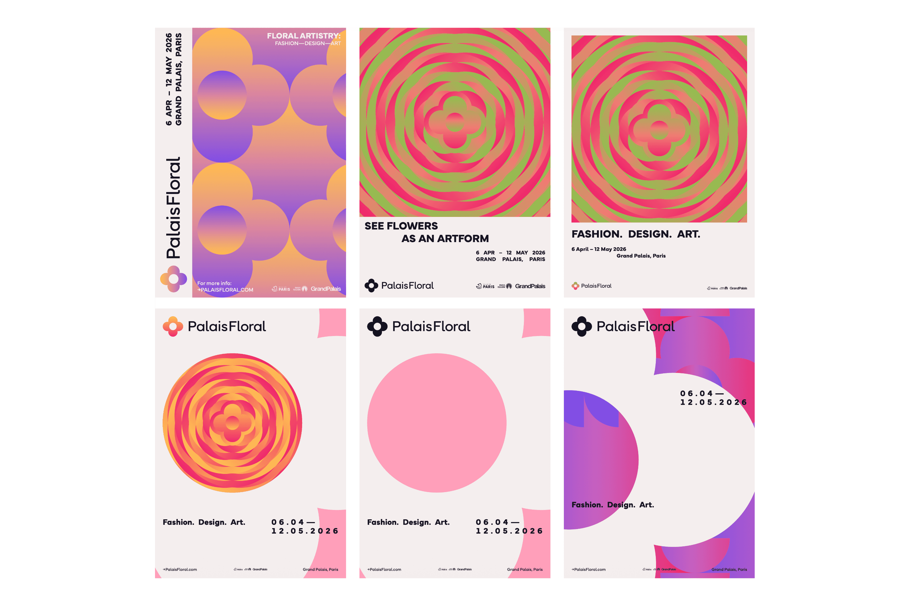
Modular grids, repeated graphic elements and adaptable layouts create flexible identities that scale across print, digital and environmental applications.
Branding, marketing and environmental peripherals for a Parisian artistic flower show.
2025 • 3 months
Brand strategy
Visual identity
Art direction
Graphic system
Campaign & collateral design
University project
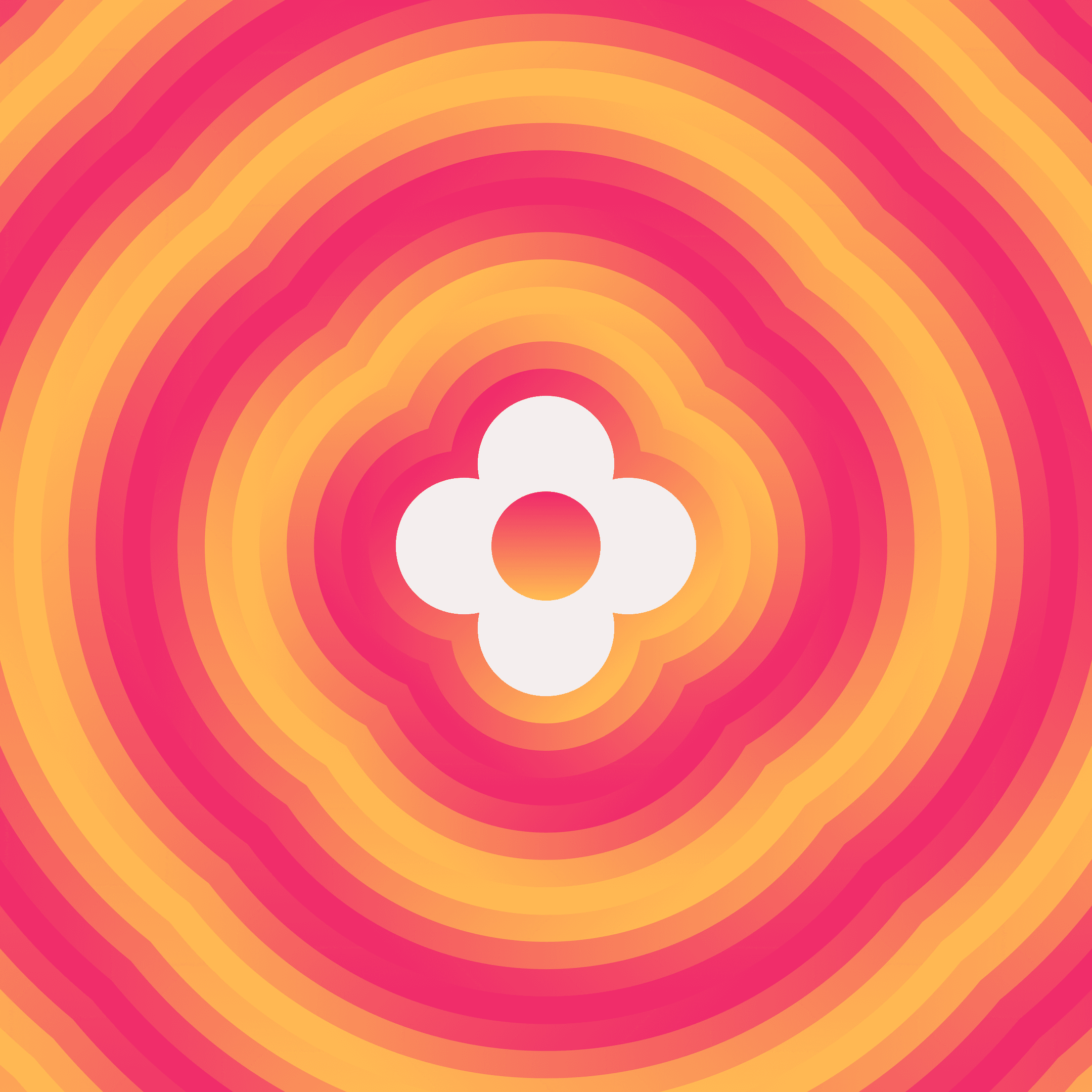
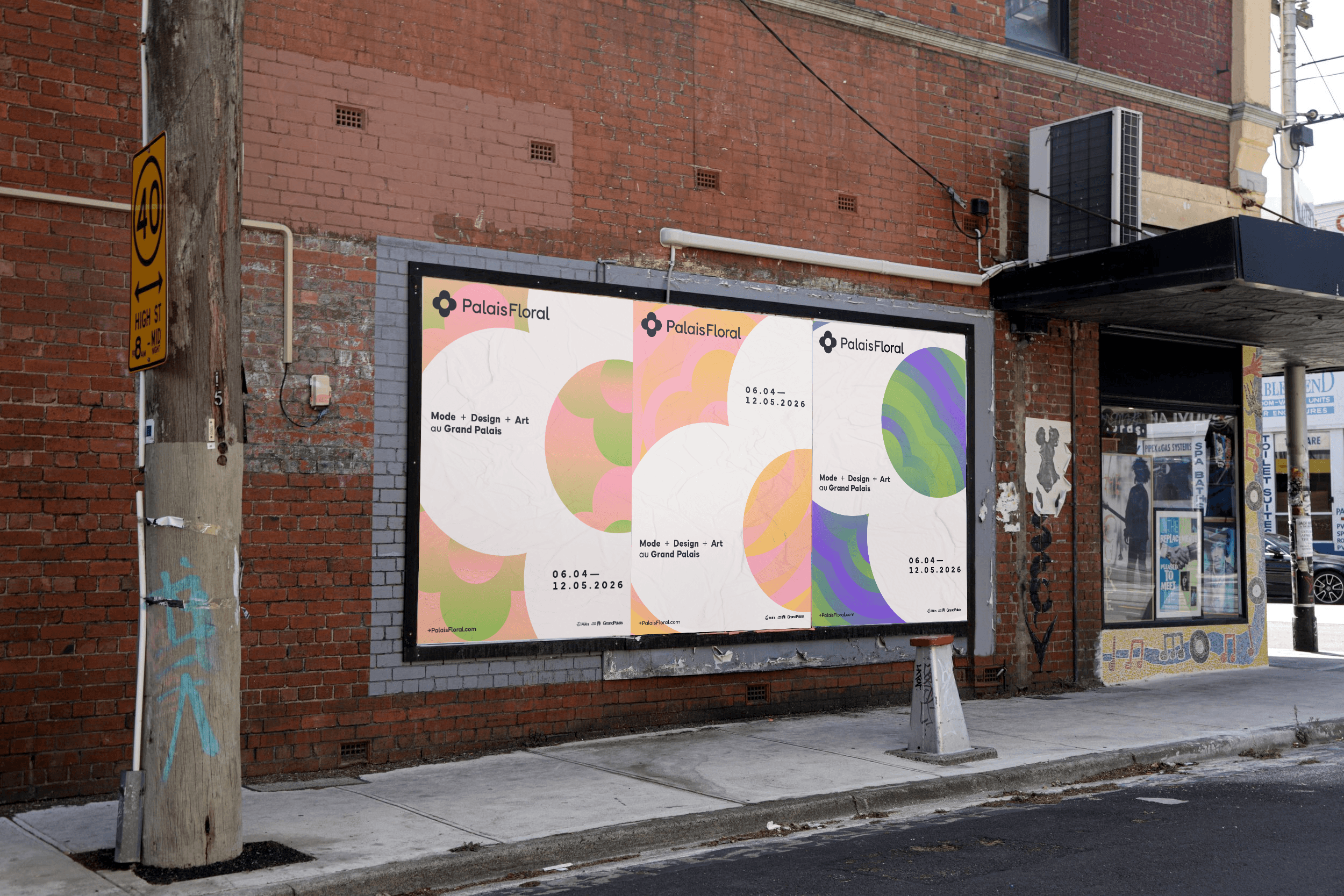
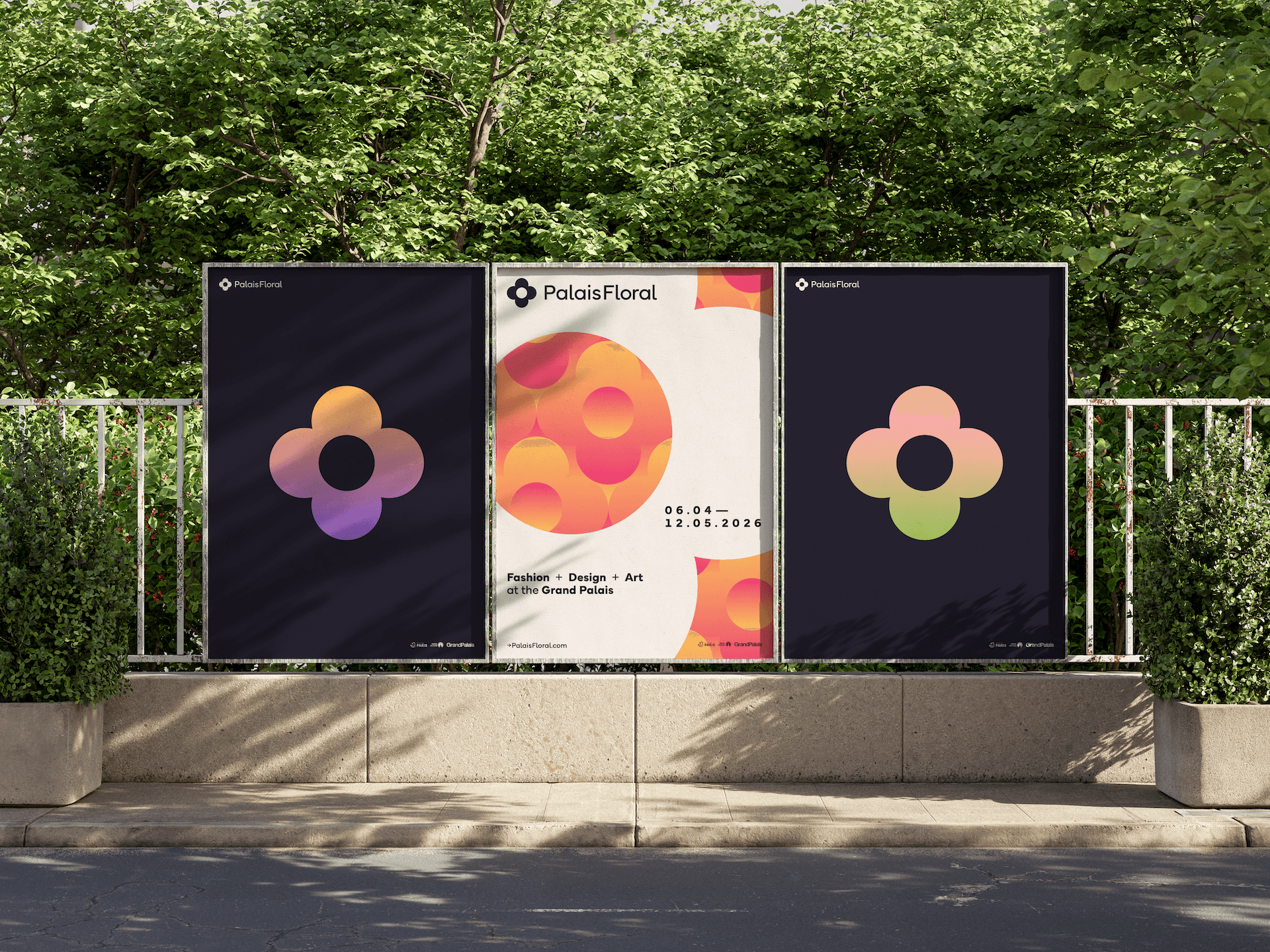
PalaisFloral is a speculative floral artistry festival bringing together art, fashion and design at Paris’s Grand Palais.
The identity balances the culture and prestige of its setting with the energy and experimentation of a contemporary festival.
A curated festival devoted to showcasing local Parisian and international floral artistry, design and fashion.
Existing similar events promote themselves as traditional horticultural shows, broader art festivals or somewhere in-between.
PalaisFloral caters to a diverse audience of creative professionals, art connoisseurs and a cultured public
PalaisFloral is highly experimental and somewhat niche, but strictly non-exclusive or -pretentious.
Innovation, Sophistication & Beauty, Uniqueness and Creativity
By focusing on the intersection of nature and creativity, PalaisFloral differentiates itself and creates a novel, unconventional experience.
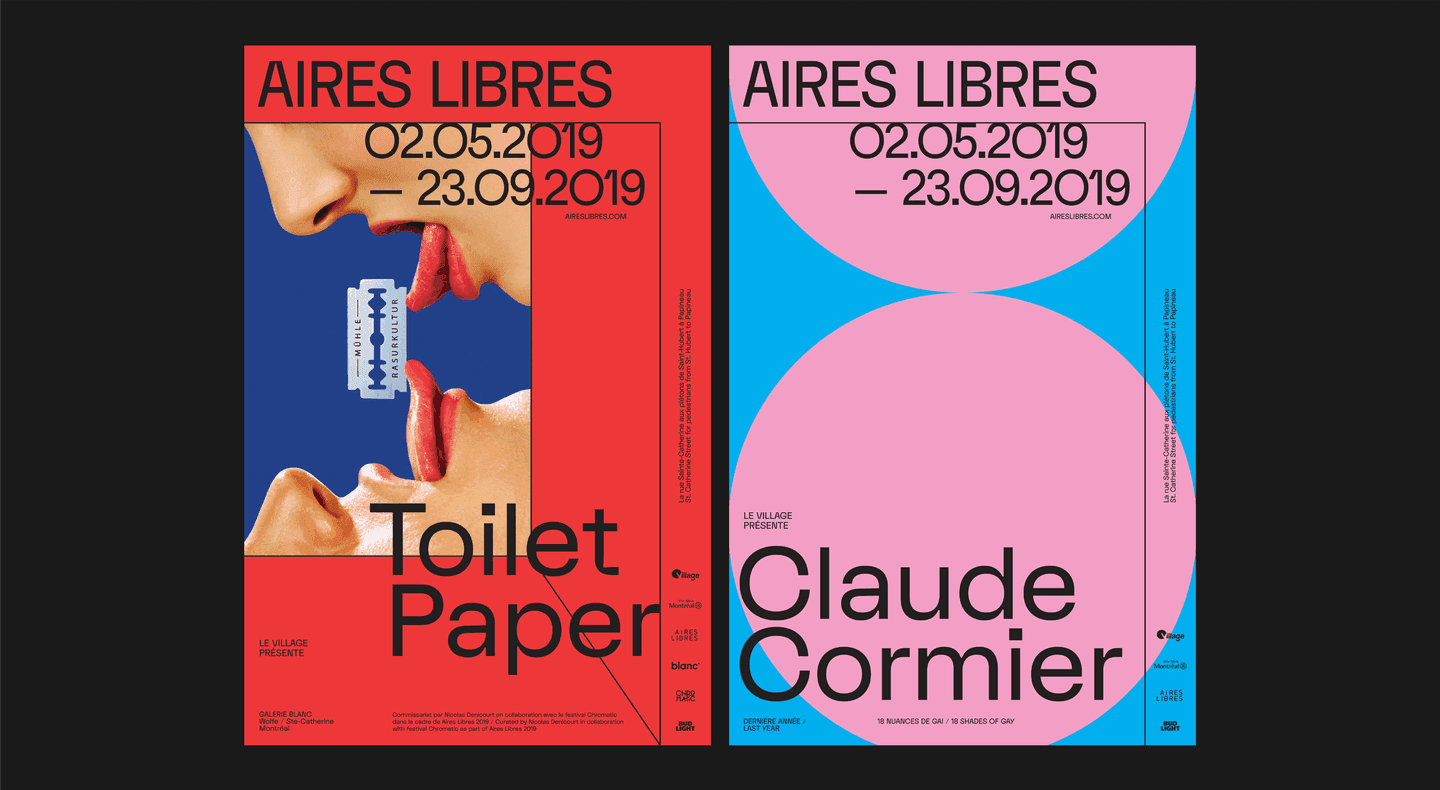
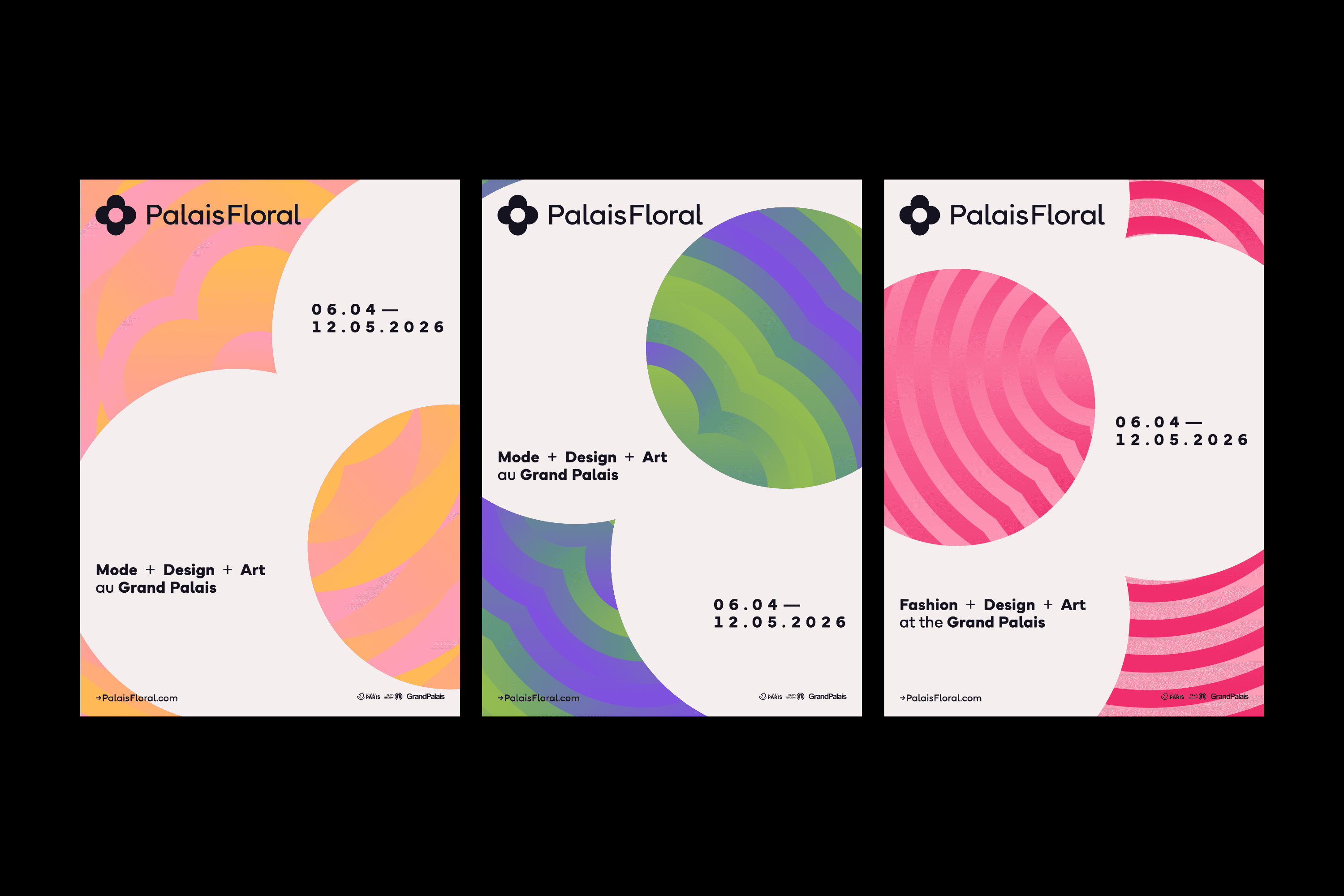
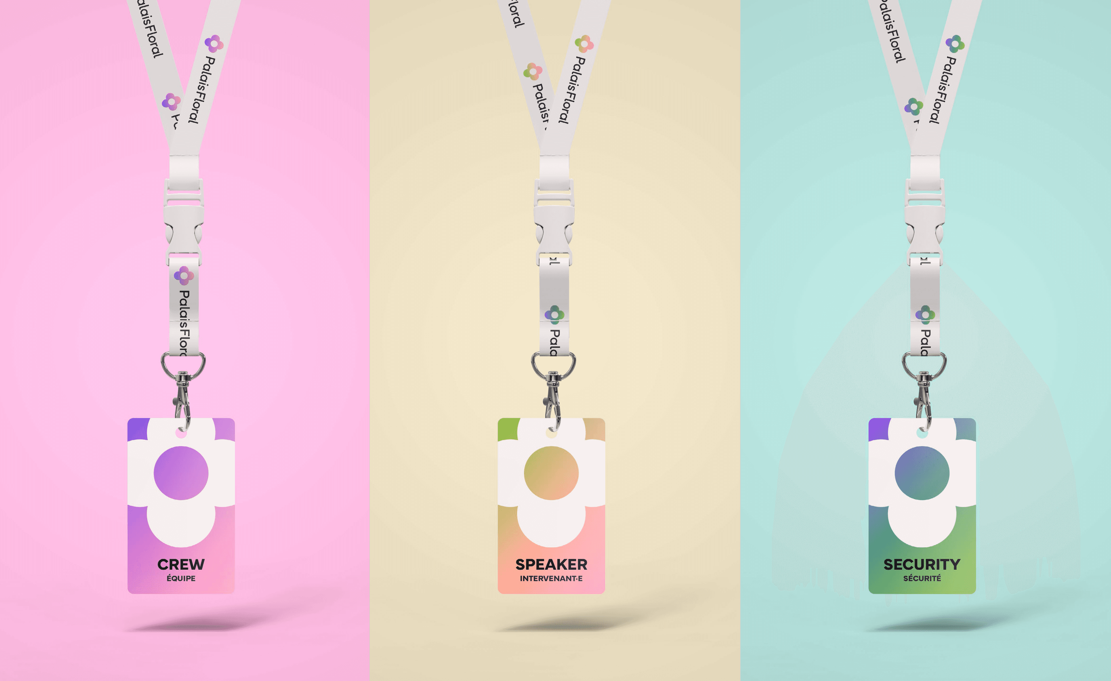
Modular grids, repeated graphic elements and adaptable layouts create flexible identities that scale across print, digital and environmental applications.
Simple geometries form the bases of these identities, ensuring brand recognition is strong across all media.
It also ensures the branding is able to take a backseat to any content introduced.
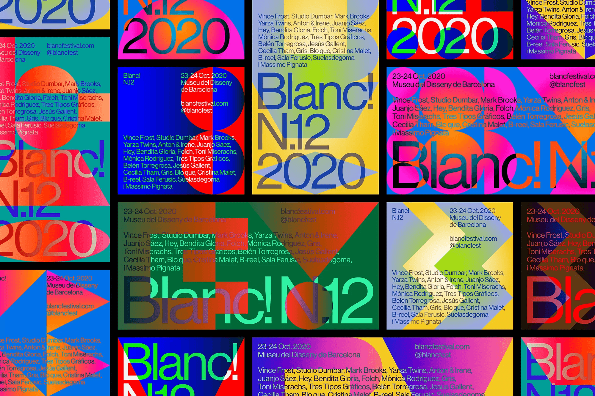
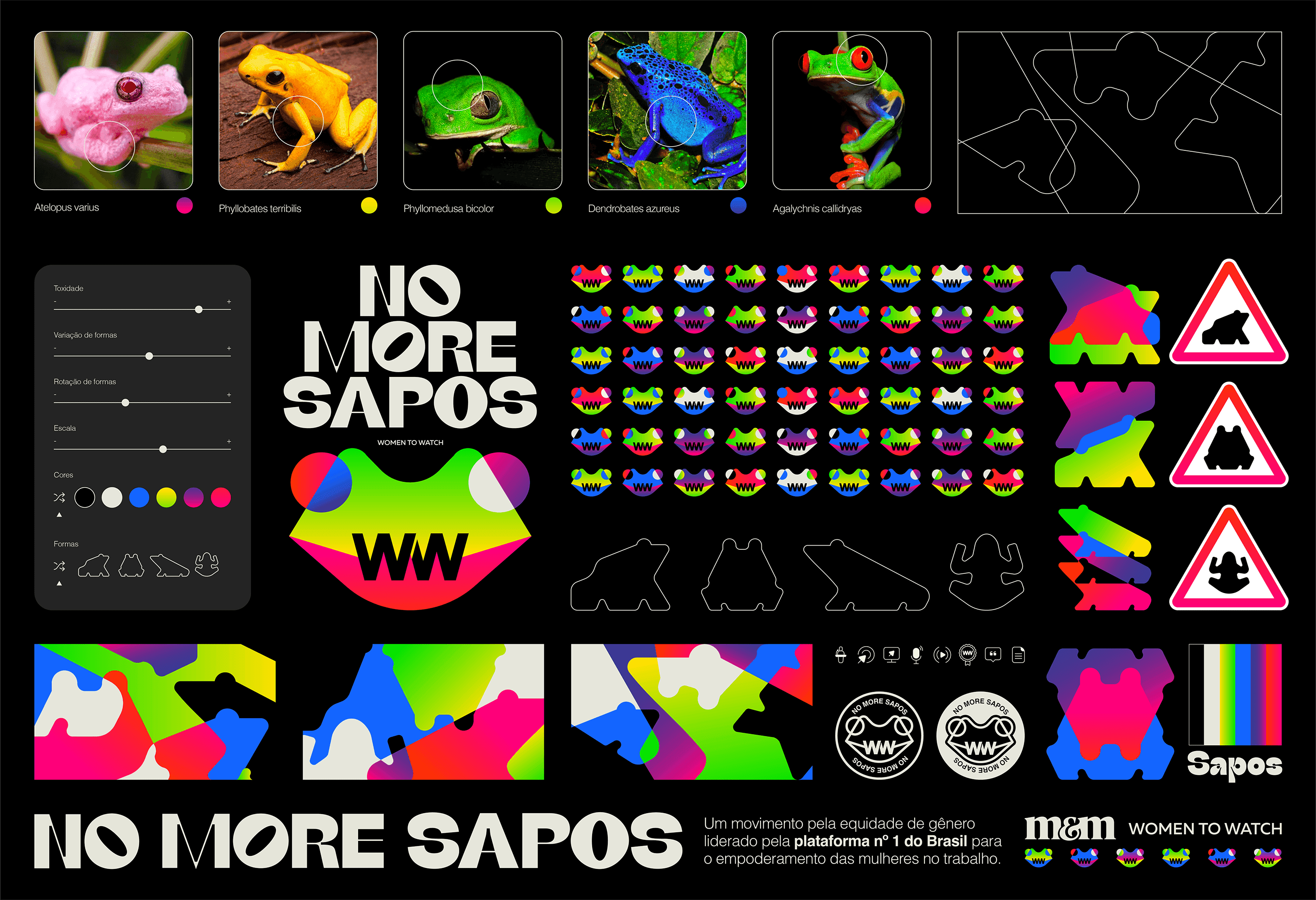
Unconventional applications of typography because graphic elements in and of themselves, allowing more expressive identities without adding more elemements.
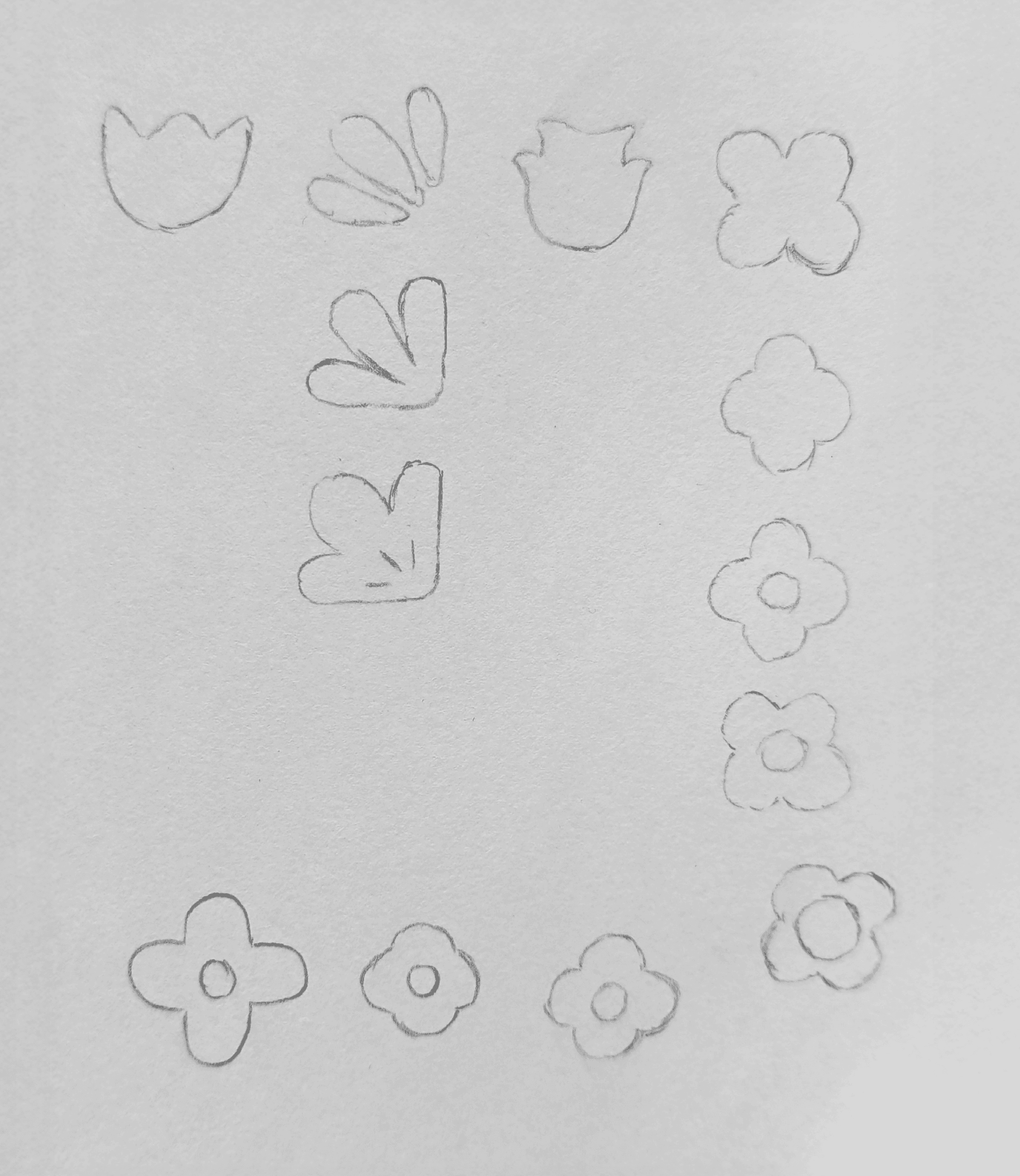
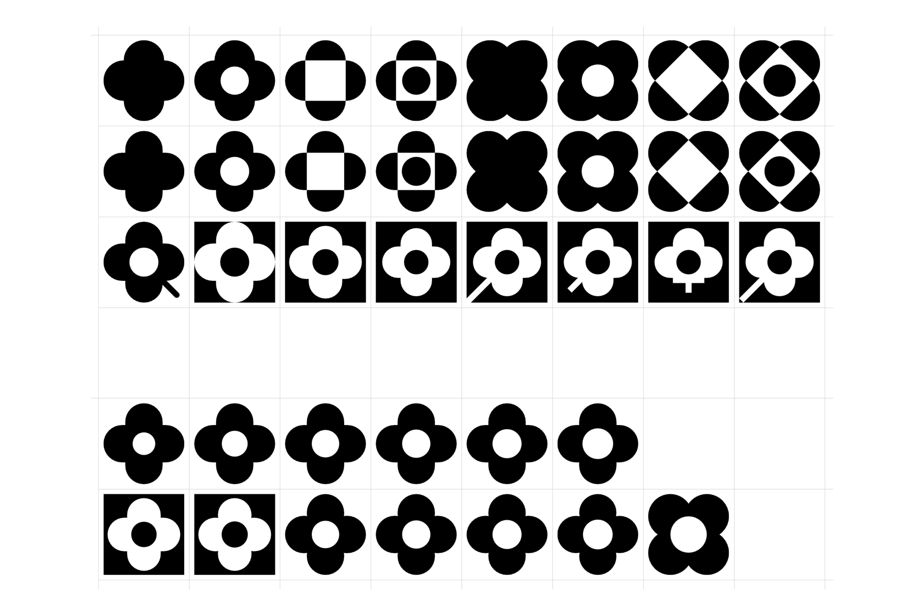
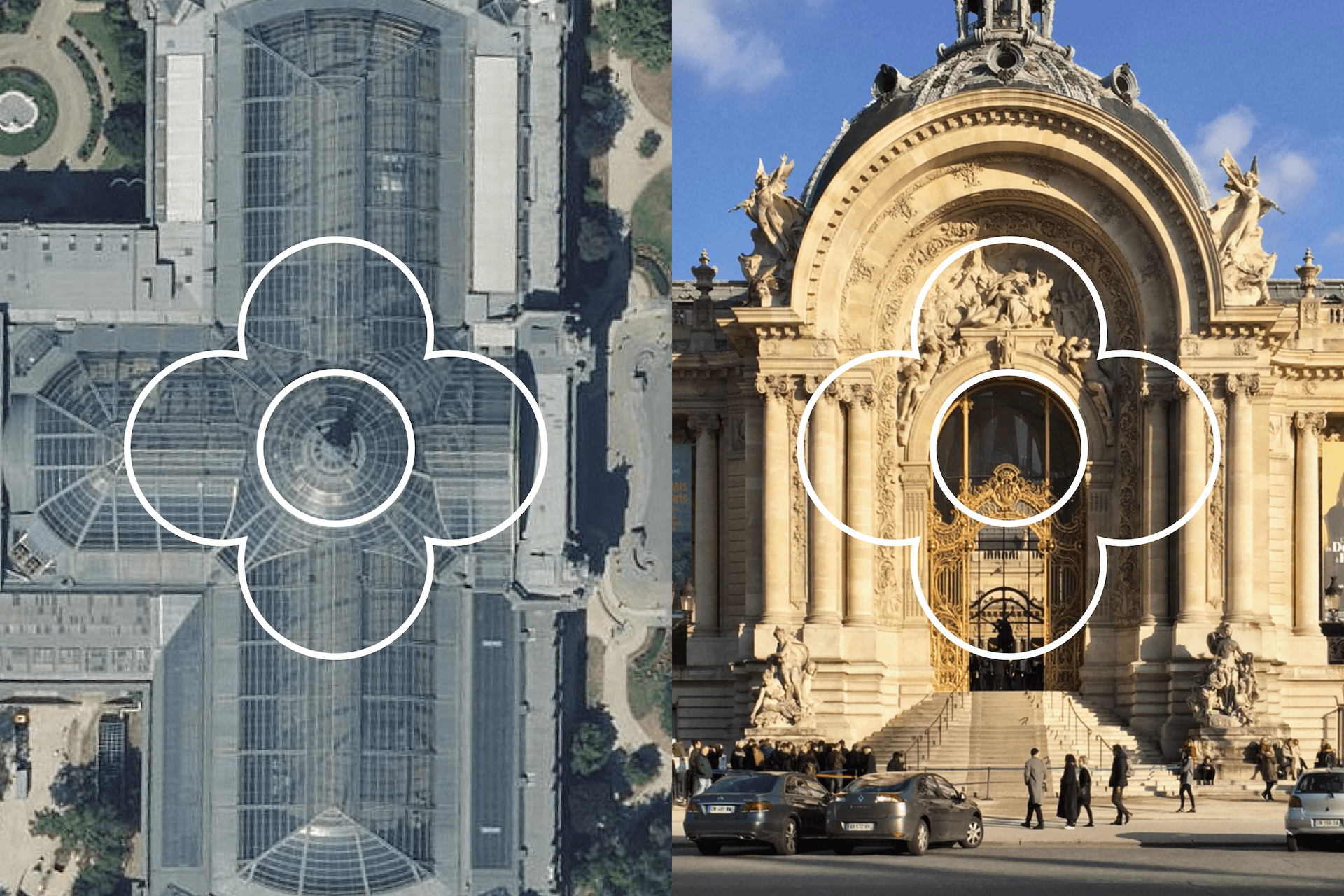
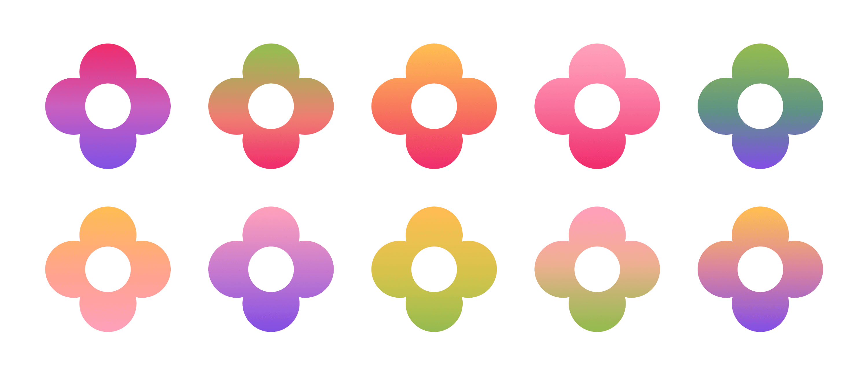
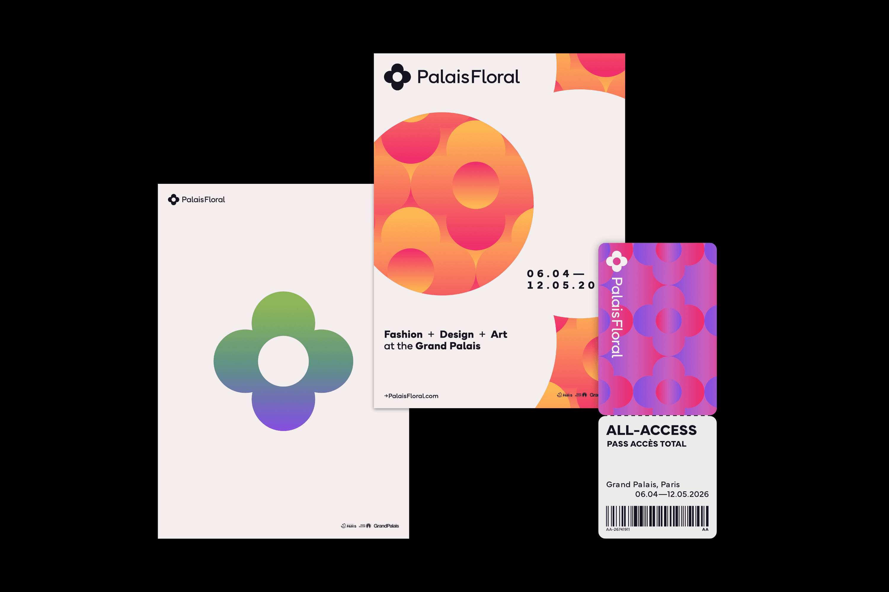
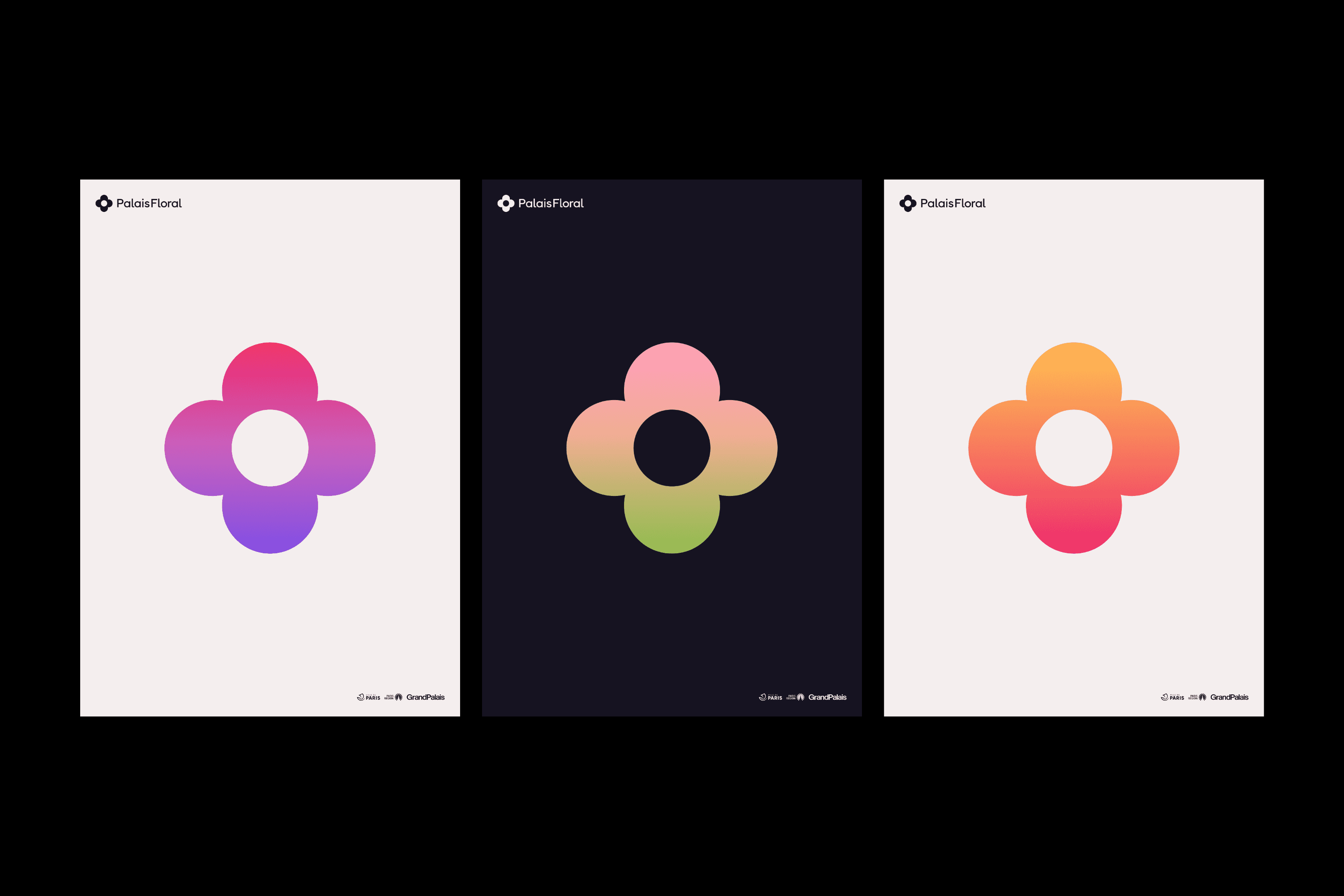
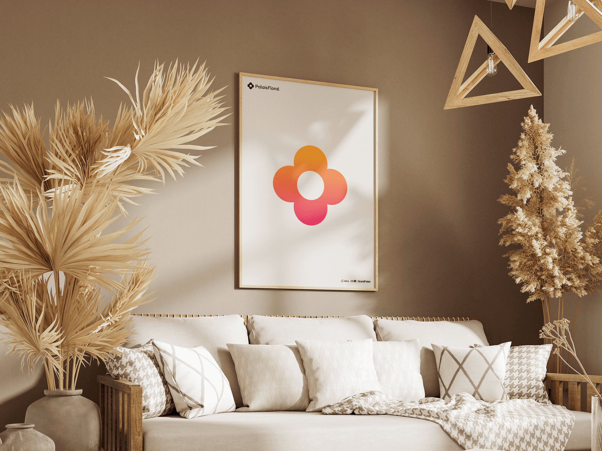
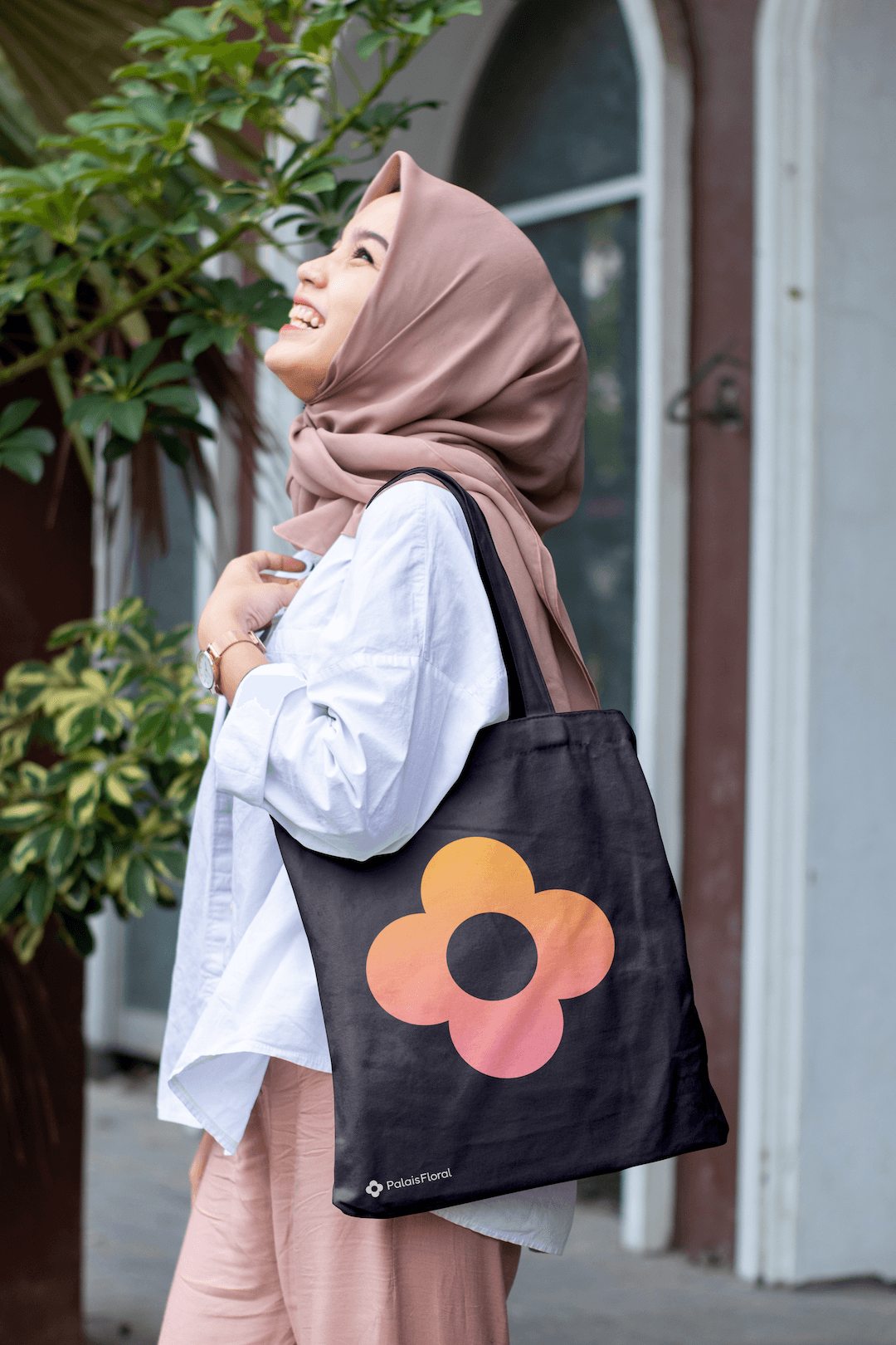
Although I explored several design directions, I landed on the vertical 4-petal flower as it proved to be distinct, elegant, geometric and context-appropriate.
The flower design is inspired by the architecture of the Grand Palais and Petit Palais.
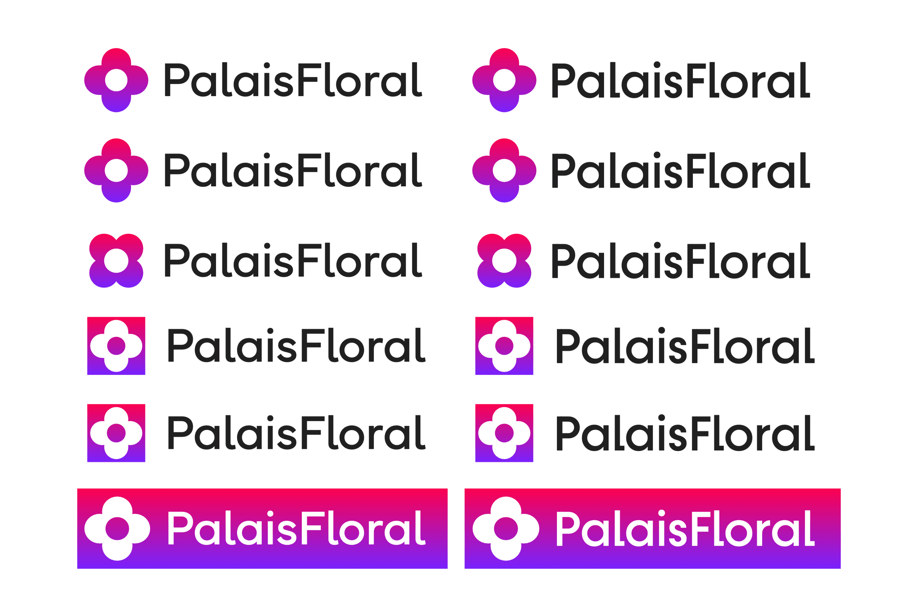
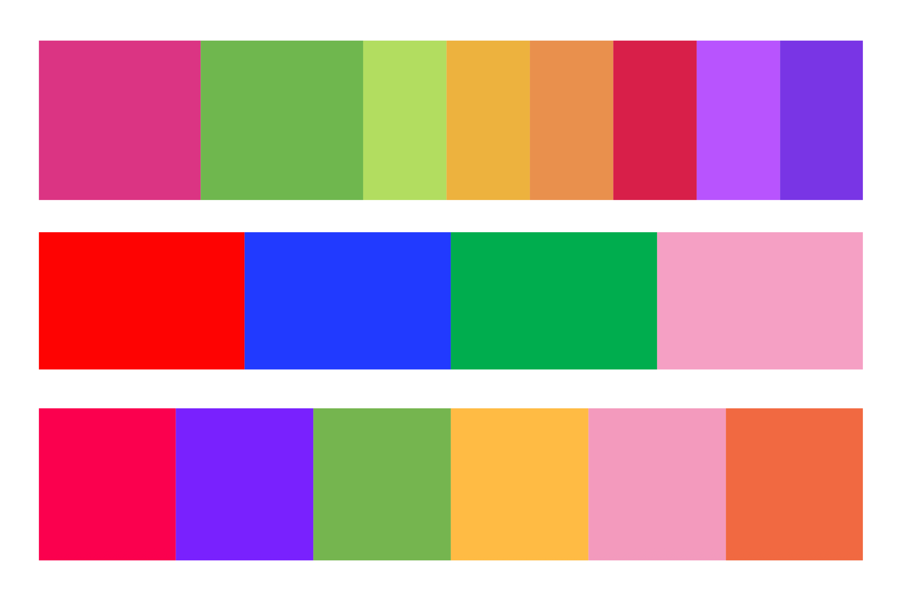
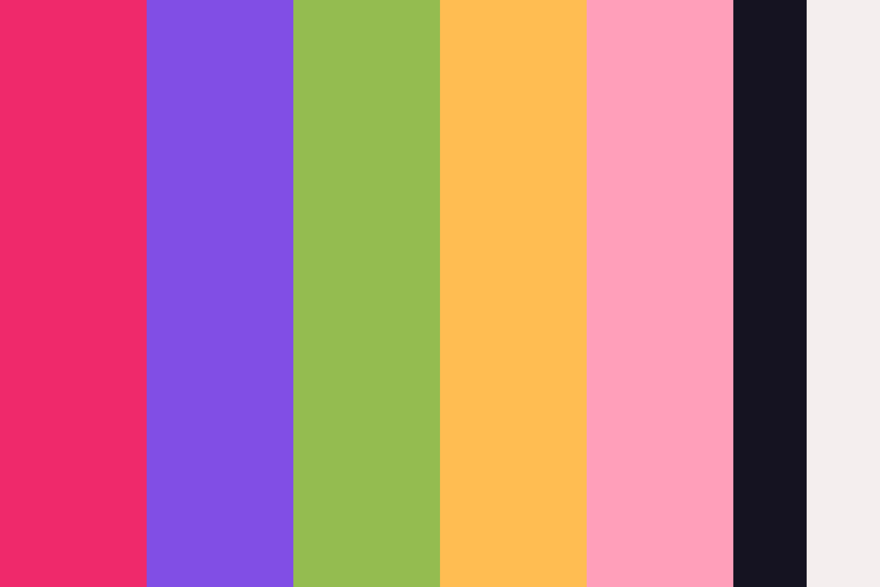
I explored different colour directions. The first direction was vibrant, the second more restrained. I settled on a third that balanced dominance with elegance.
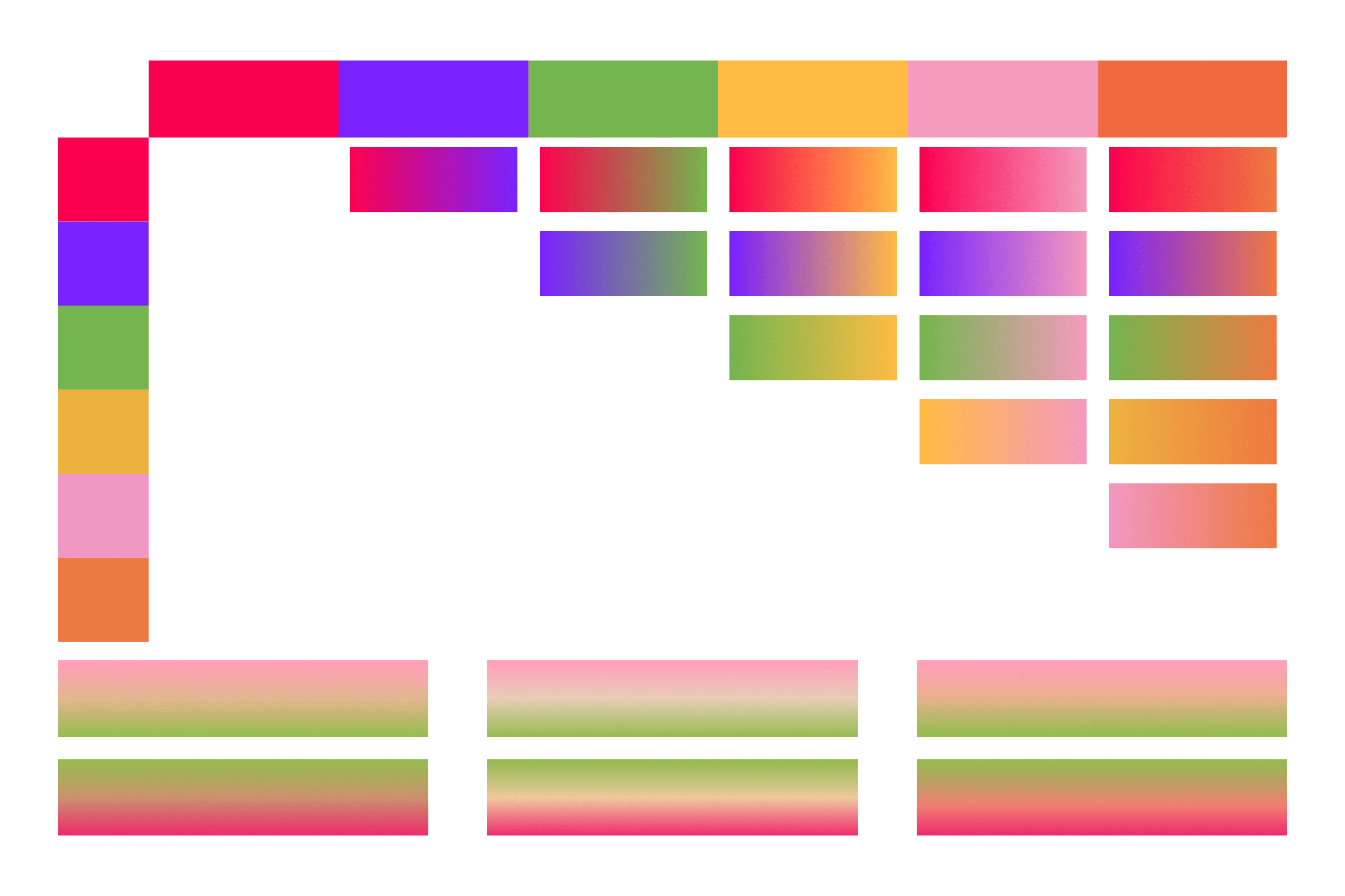
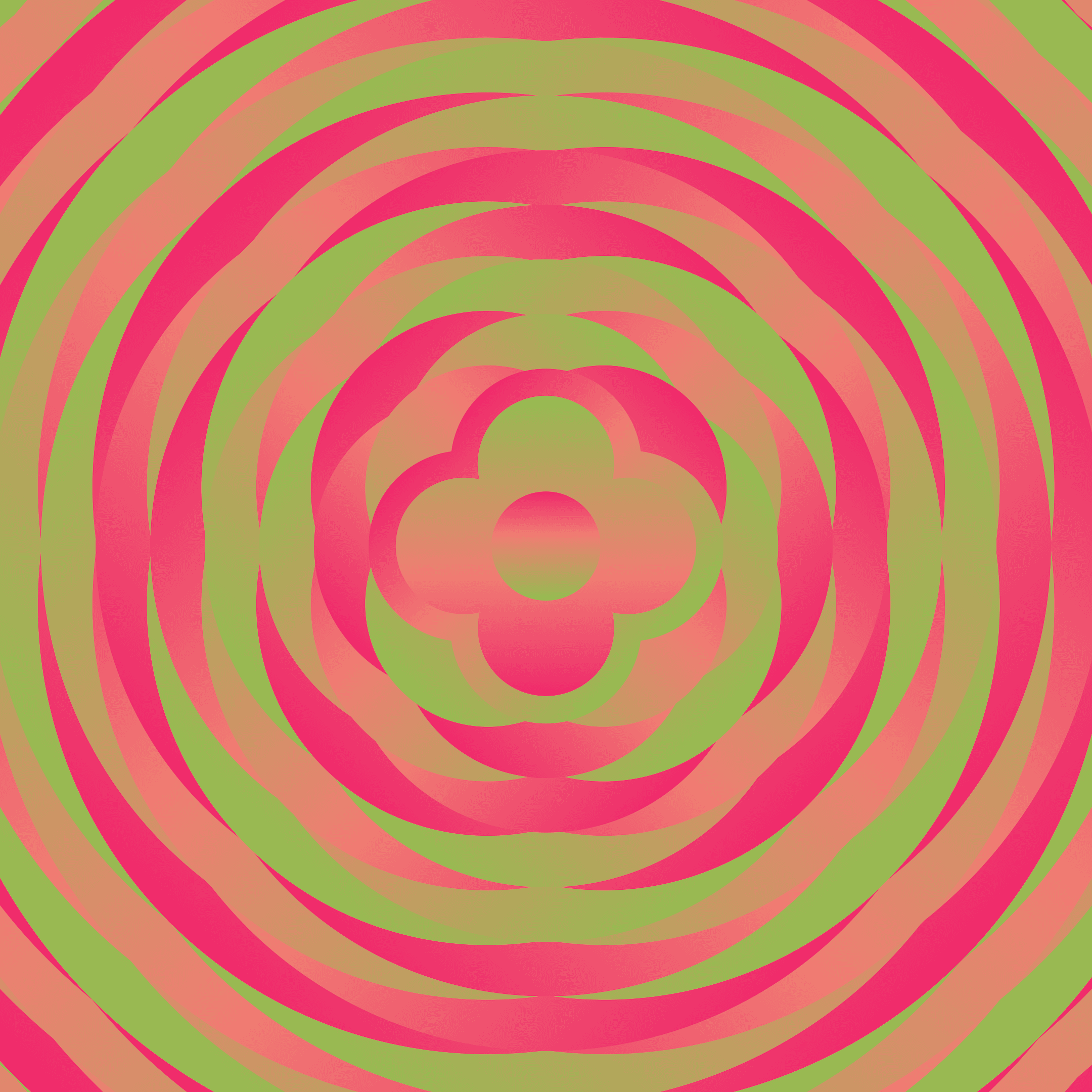
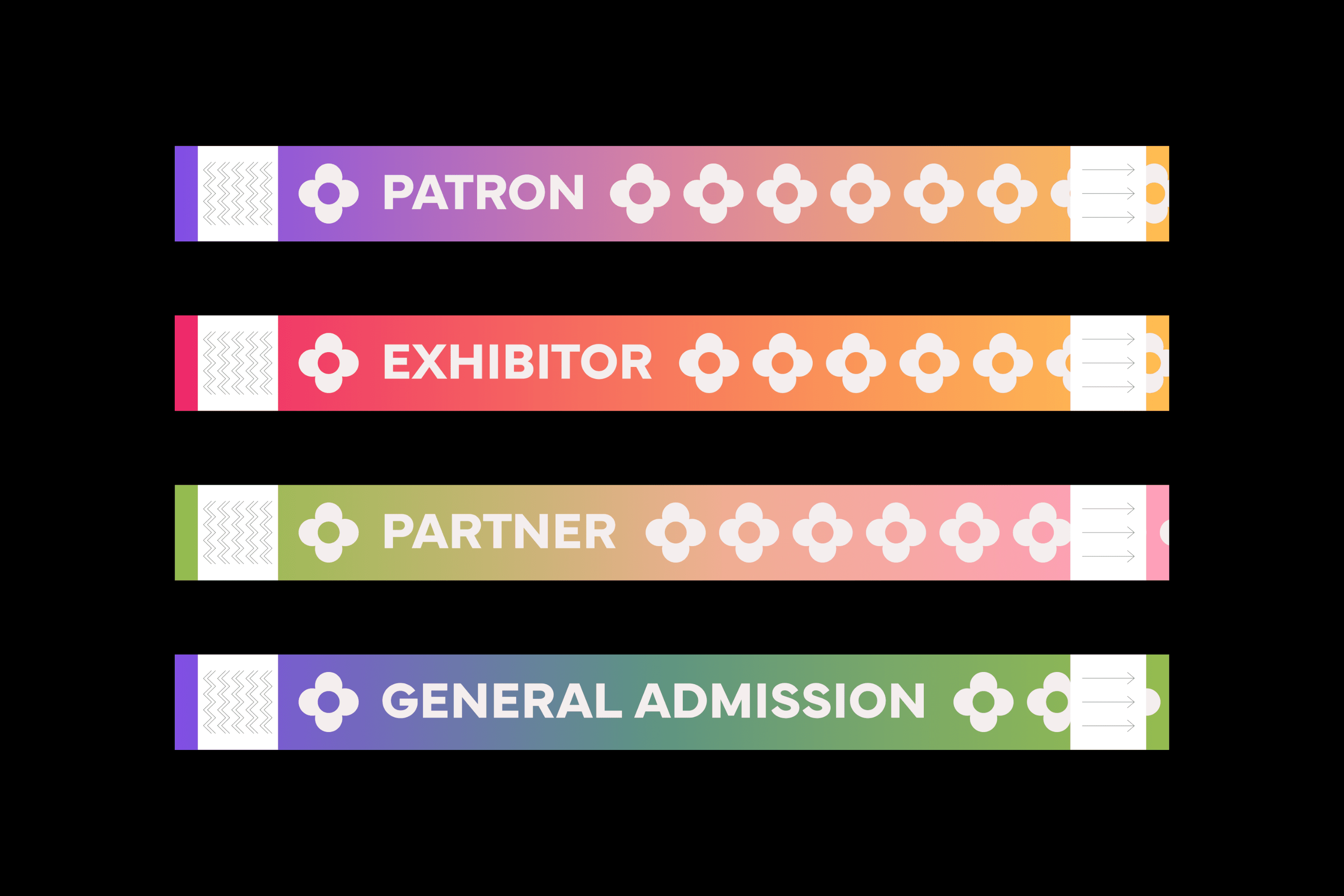
The gradients are direct combinations of the palette’s colours. Some gradients required tuning to remove muddy transition colours.
I removed orange from the final palette as it unnecessarily overcomplicated the system.
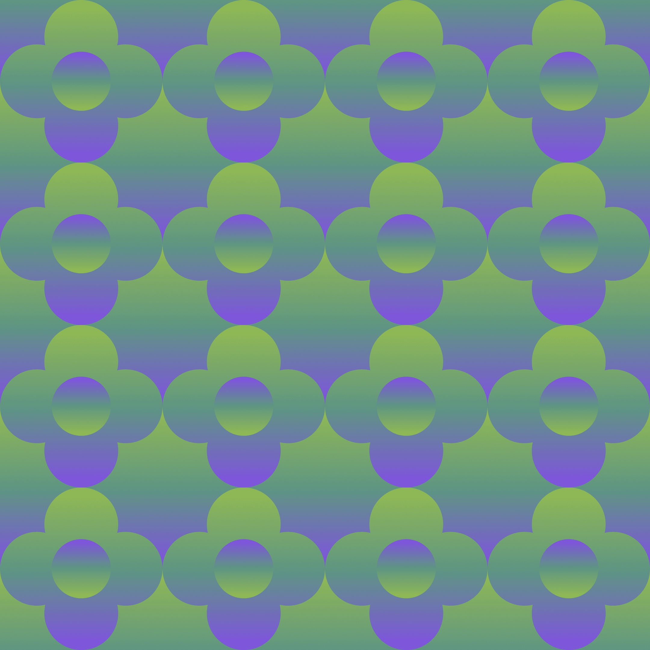
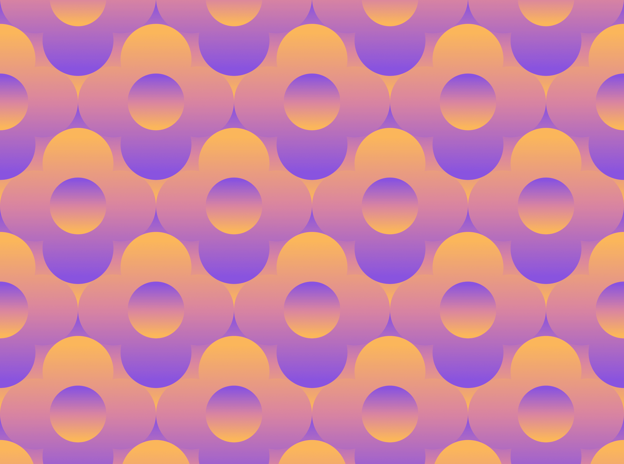
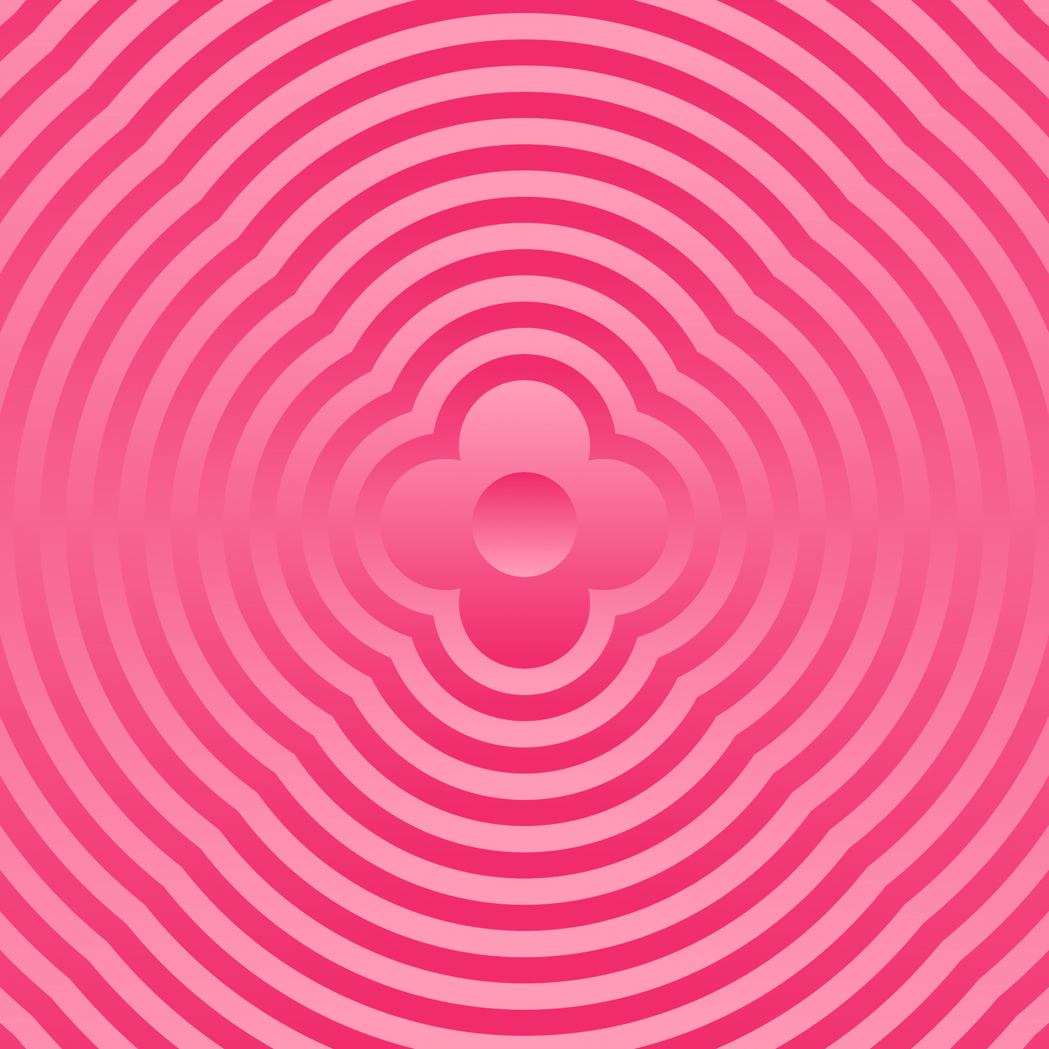
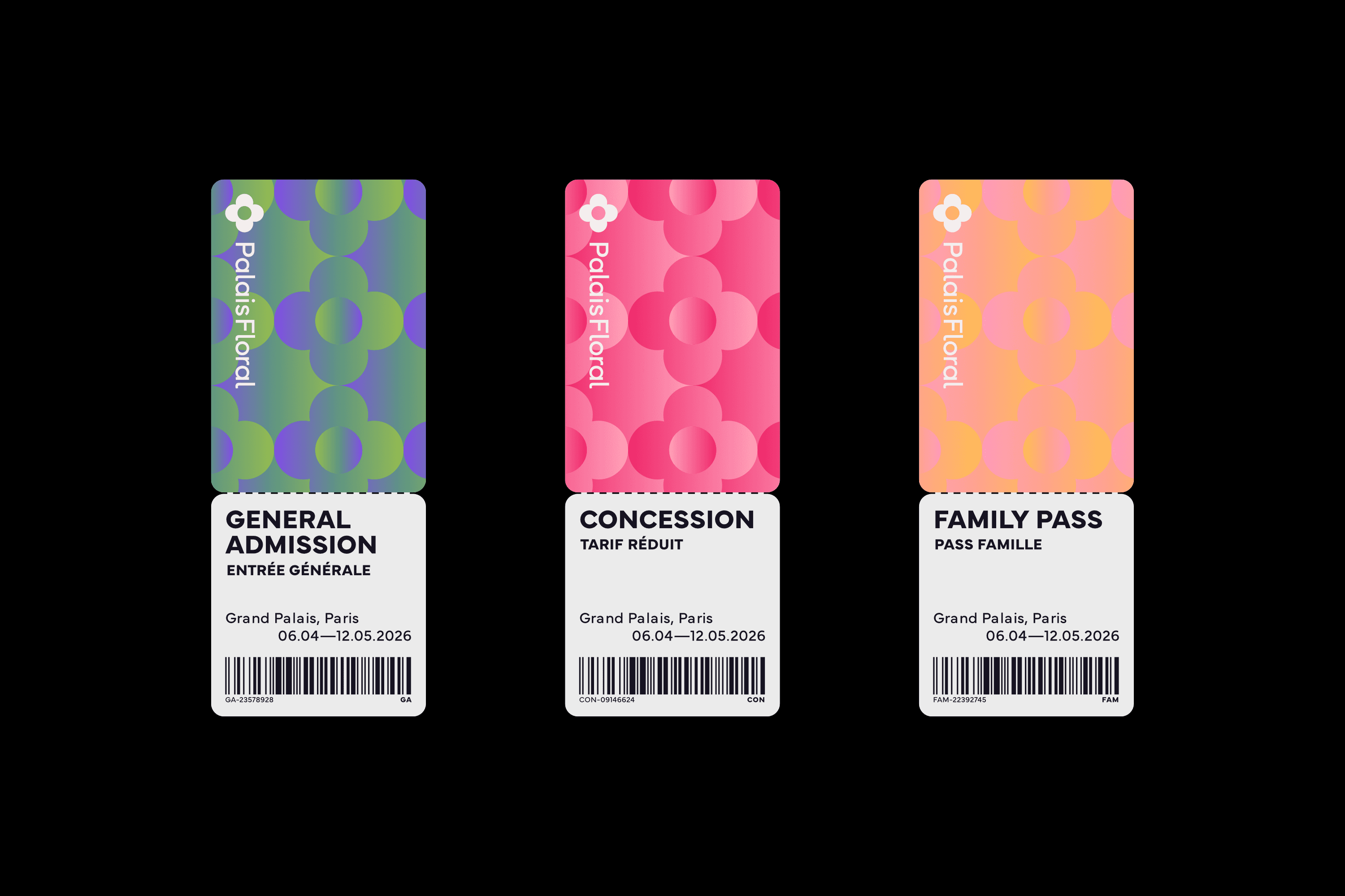
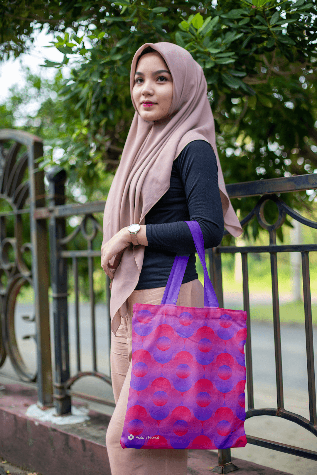
I directly used the mark to create brand assets like background patterns and as a compositional device in and of itself.





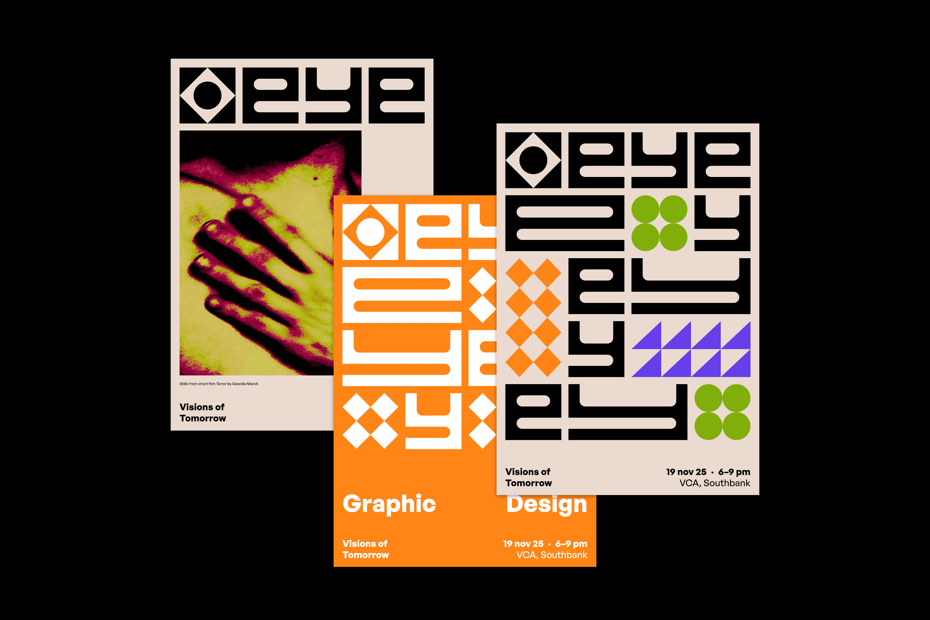
A student exhibition’s branding identity to celebrate creativity, diversity and potential.
Visual identity
Branding
Environmental design
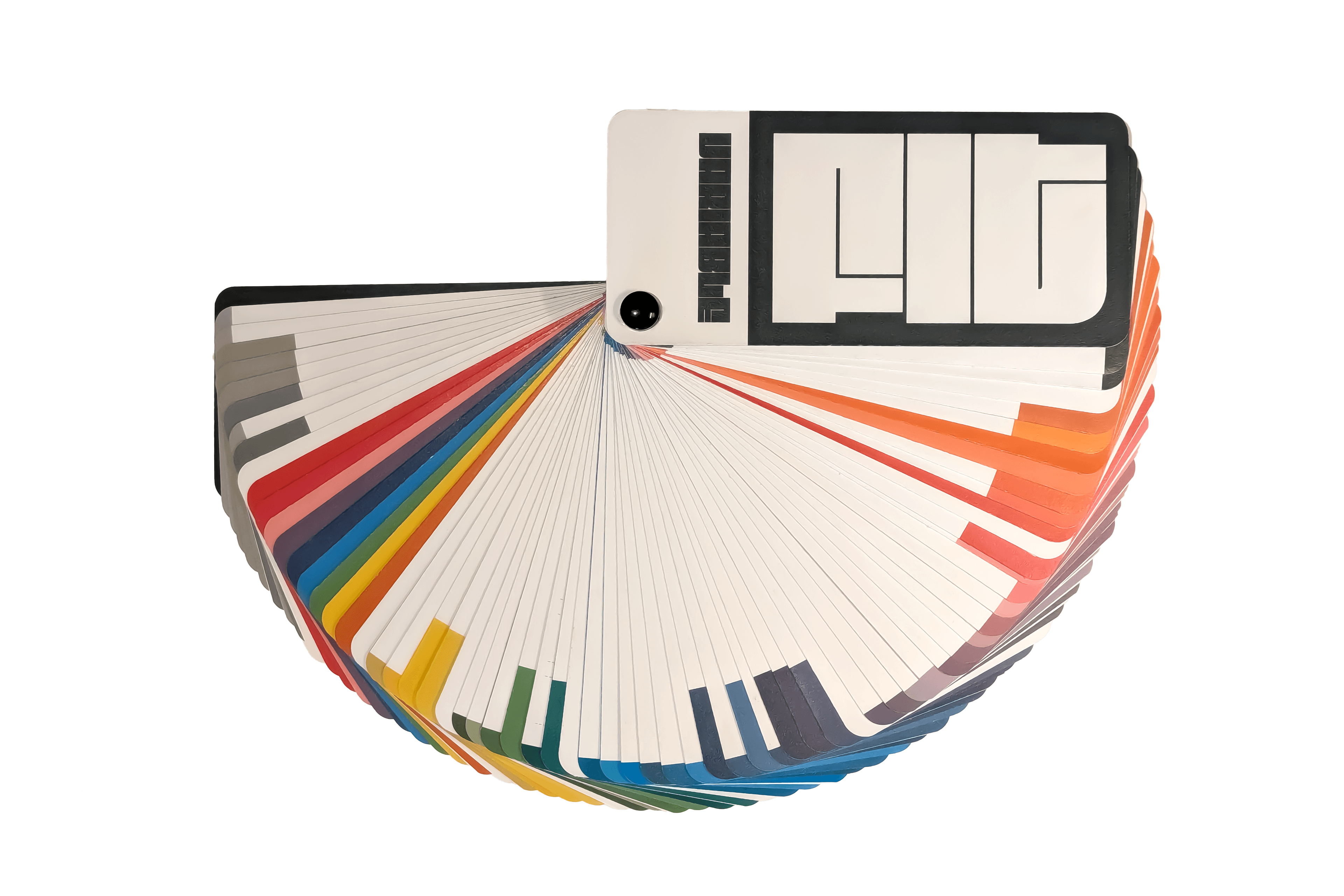
An experimental colour swatch form factor to showcase an experimental typeface.
Experimental typography
Typesetting
Product design