Gallery Identities
ACMI
National Gallery of Canada
Decebren 2023
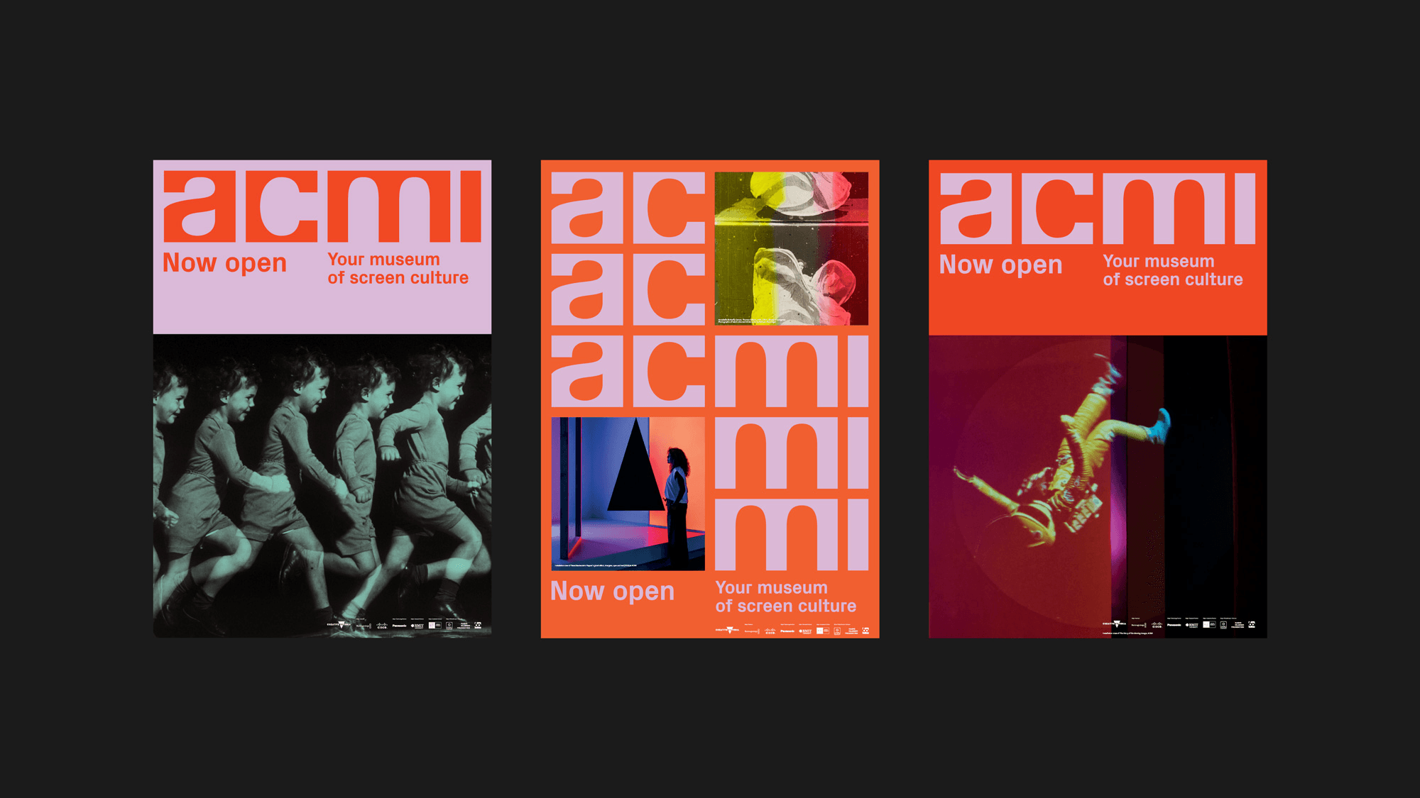
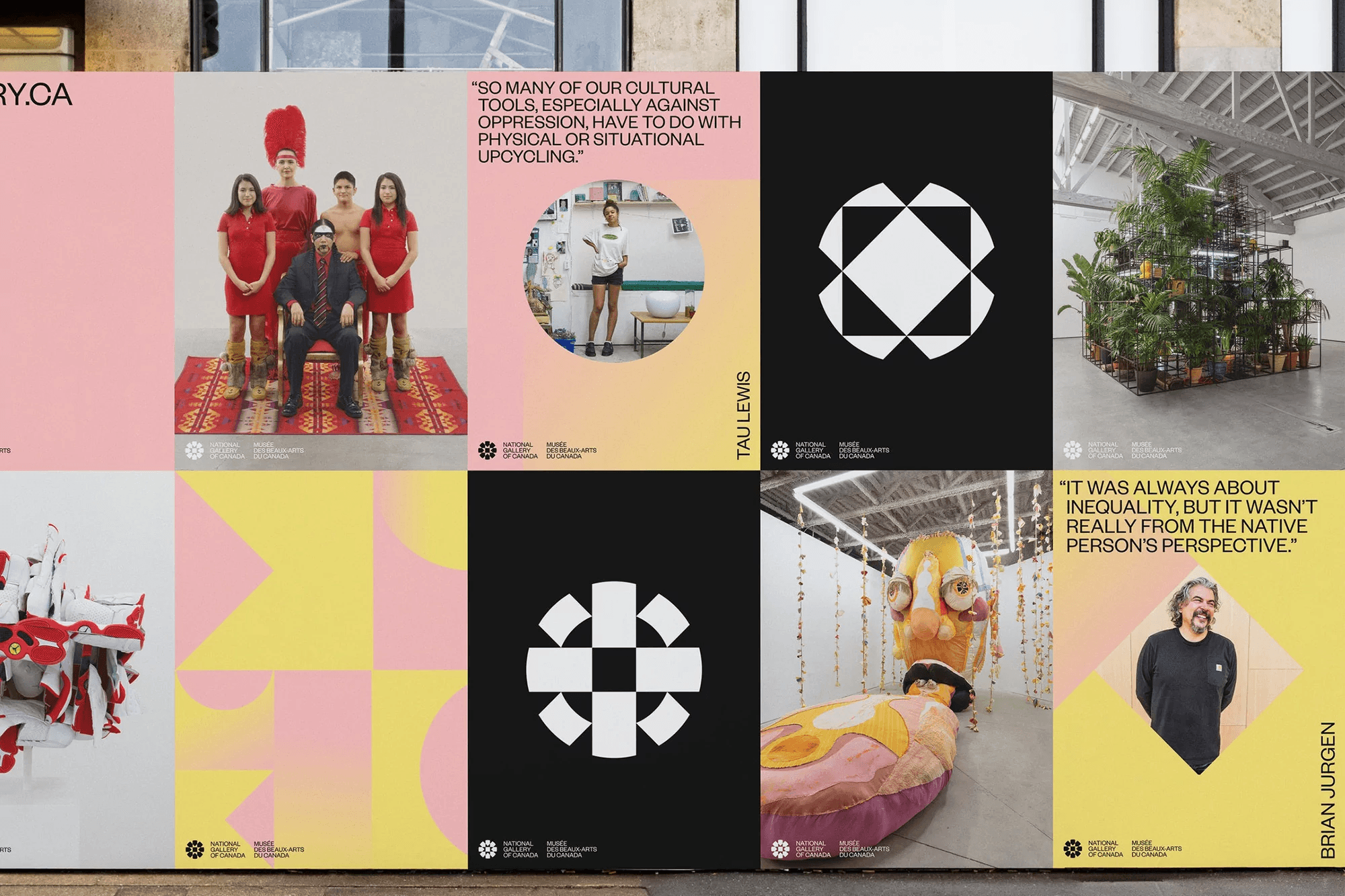
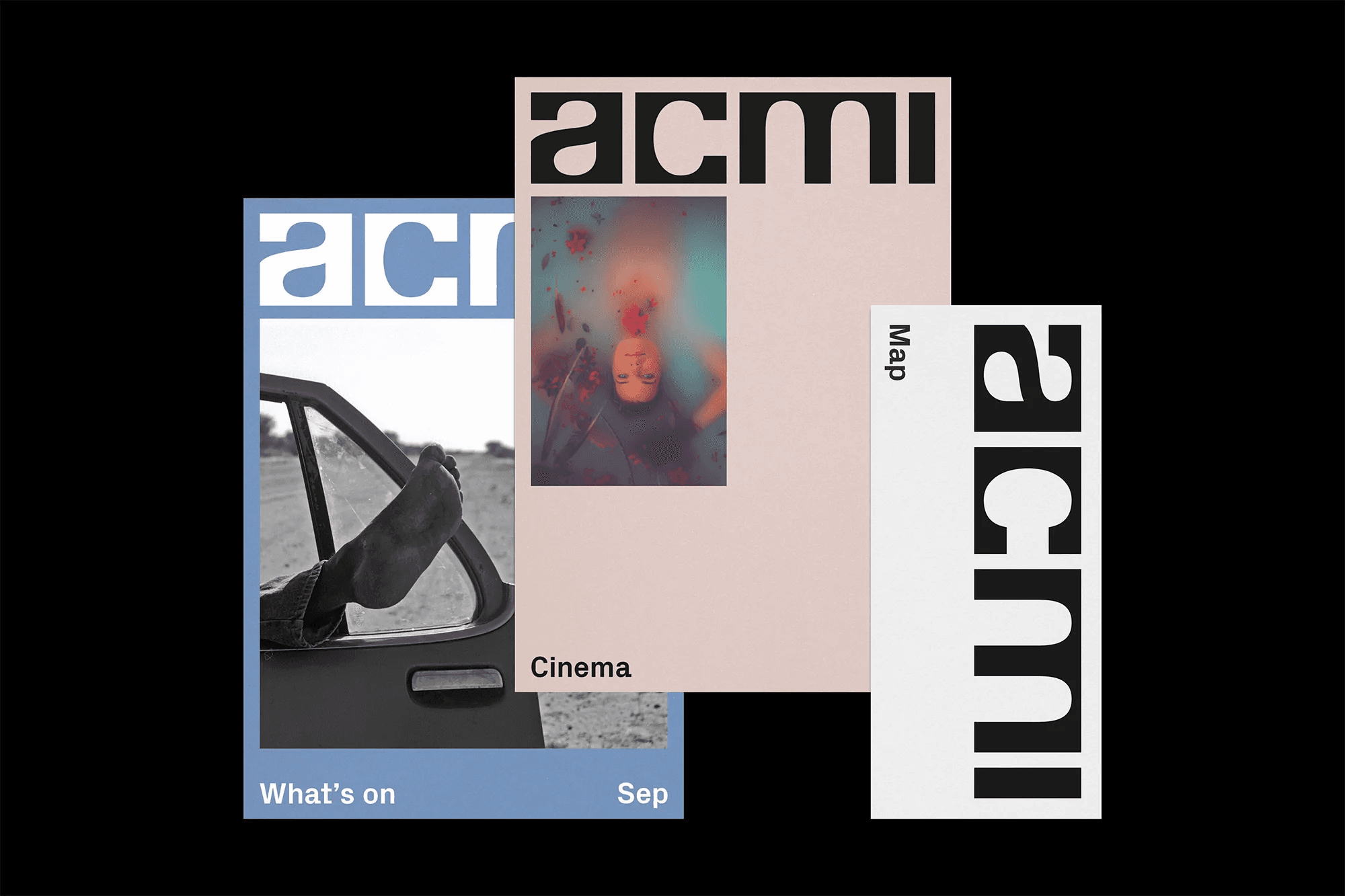
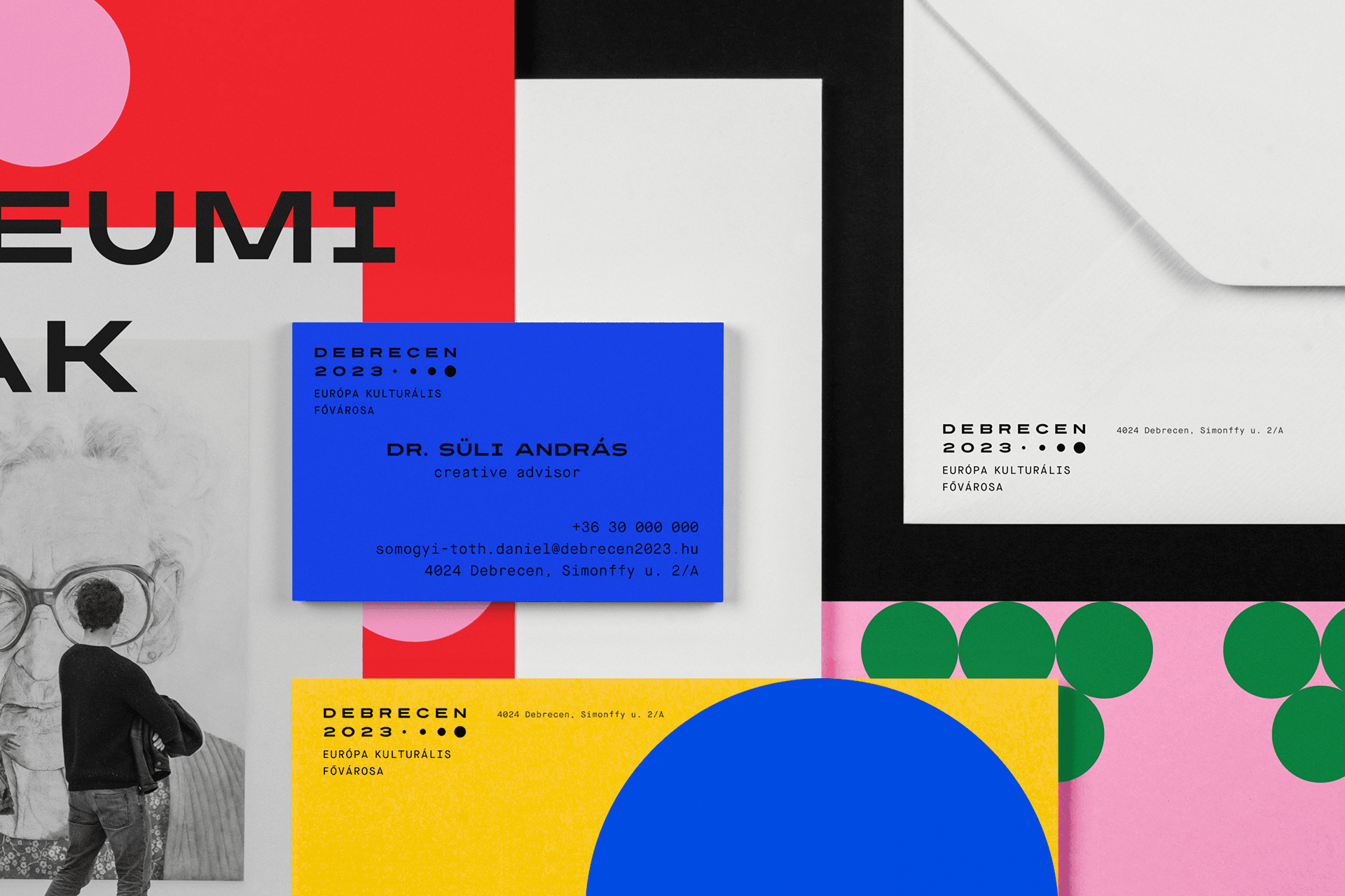
Contemporary gallery identities revealed how professionalism and vibrancy can simultaneously emerge through strong systems rather than decorative graphics.
A student exhibition’s branding identity to celebrate creativity, diversity and potential.
2025 • 2 months
Visual identity
Branding
Exhibition graphics
Environmental design
Typographic design
Two-person university project
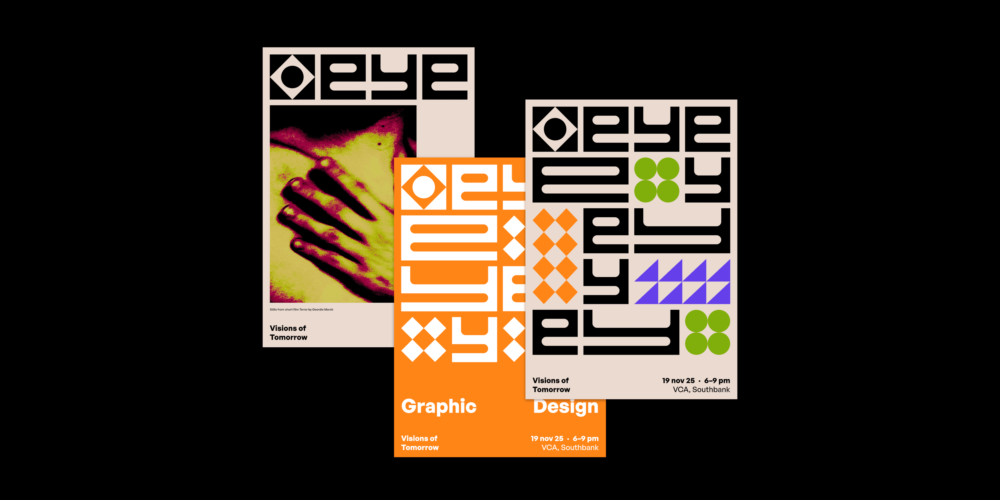
The VCA’s End of Year Exhibition (EYE) celebrates the work of final-year students across 3 disciplines: Graphic Design, Performance Design and Costume Design.
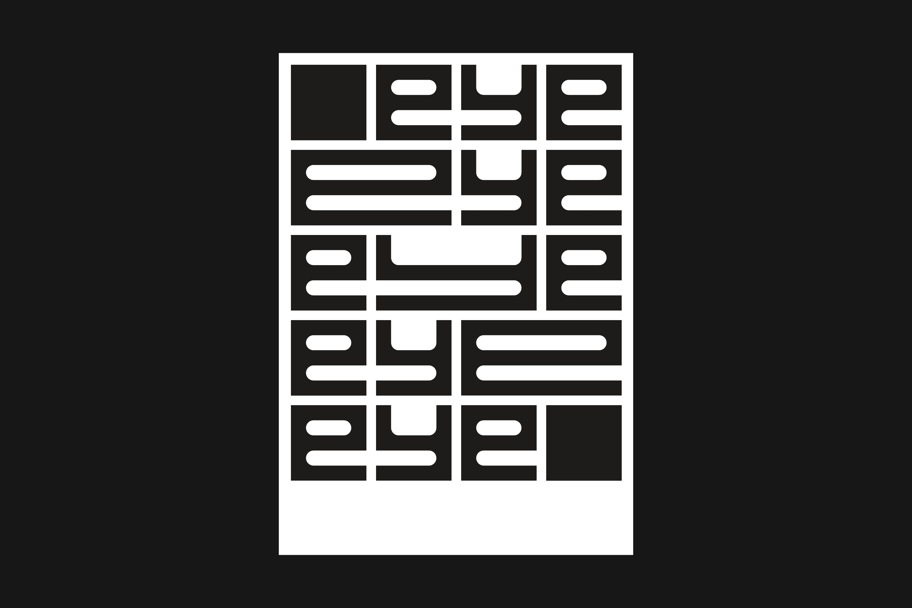
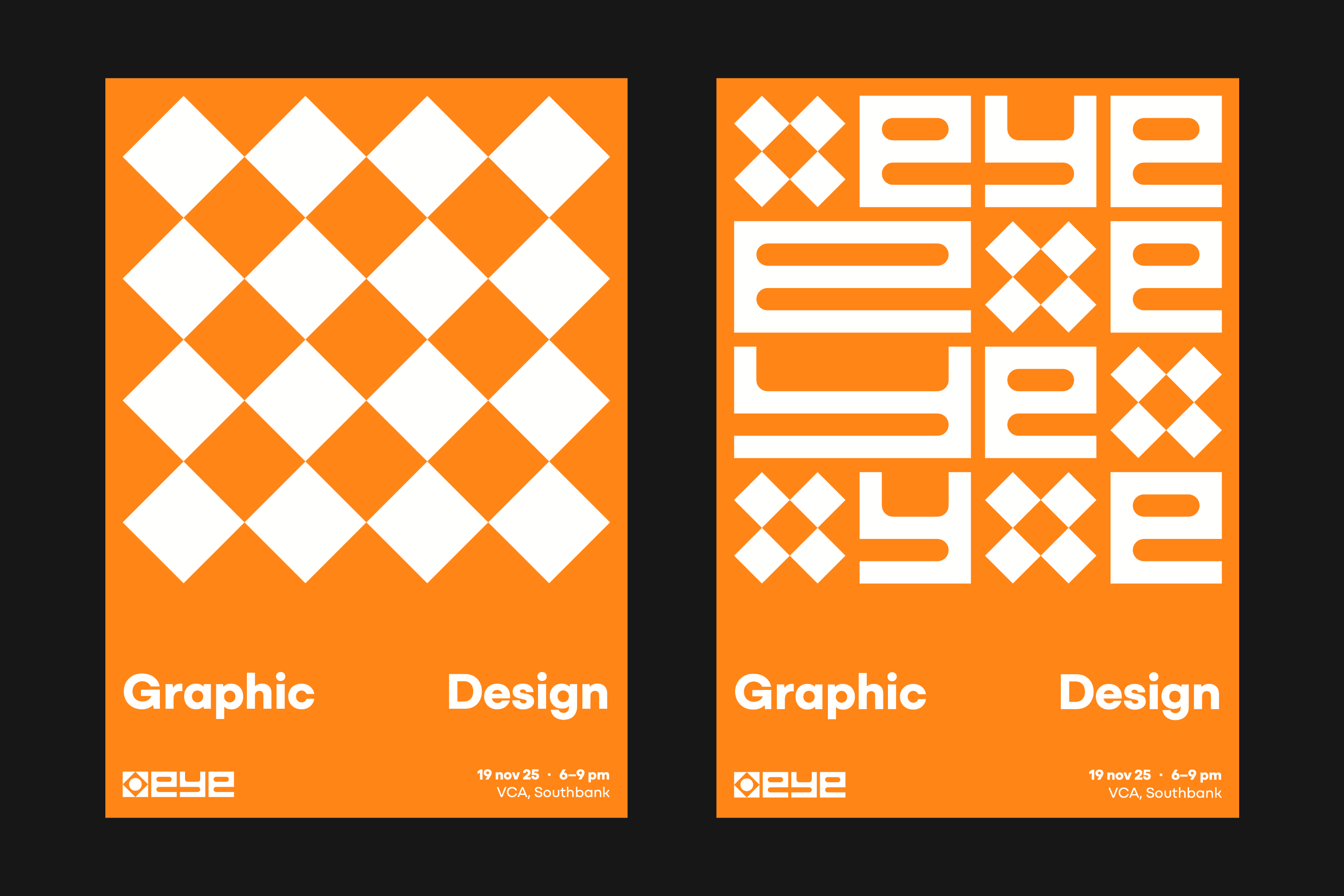
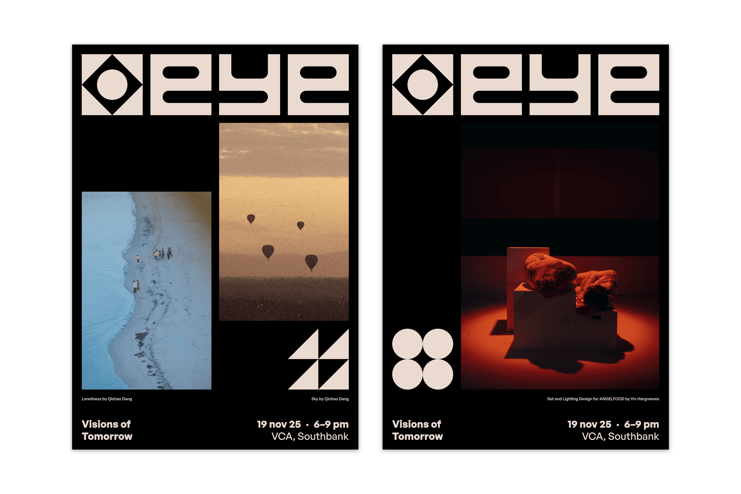
Our identity, Visions of Tomorrow, uses a flexible system built around a geometric logo and grid. Its clean, simple aesthetic is simultaneously bold whilst allowing student work to shine through.
The EYE is the Victorian College of the Arts’ annual graduate exhibition, showcasing work from Graphic Design, Performance Design and Costume Design.
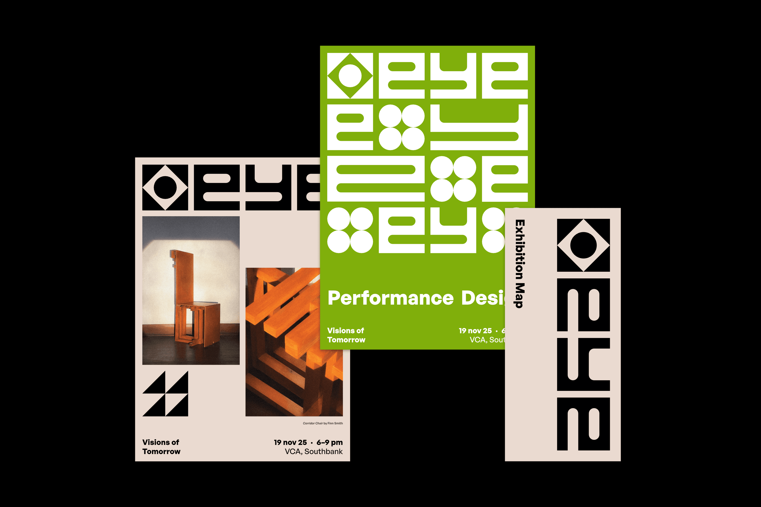
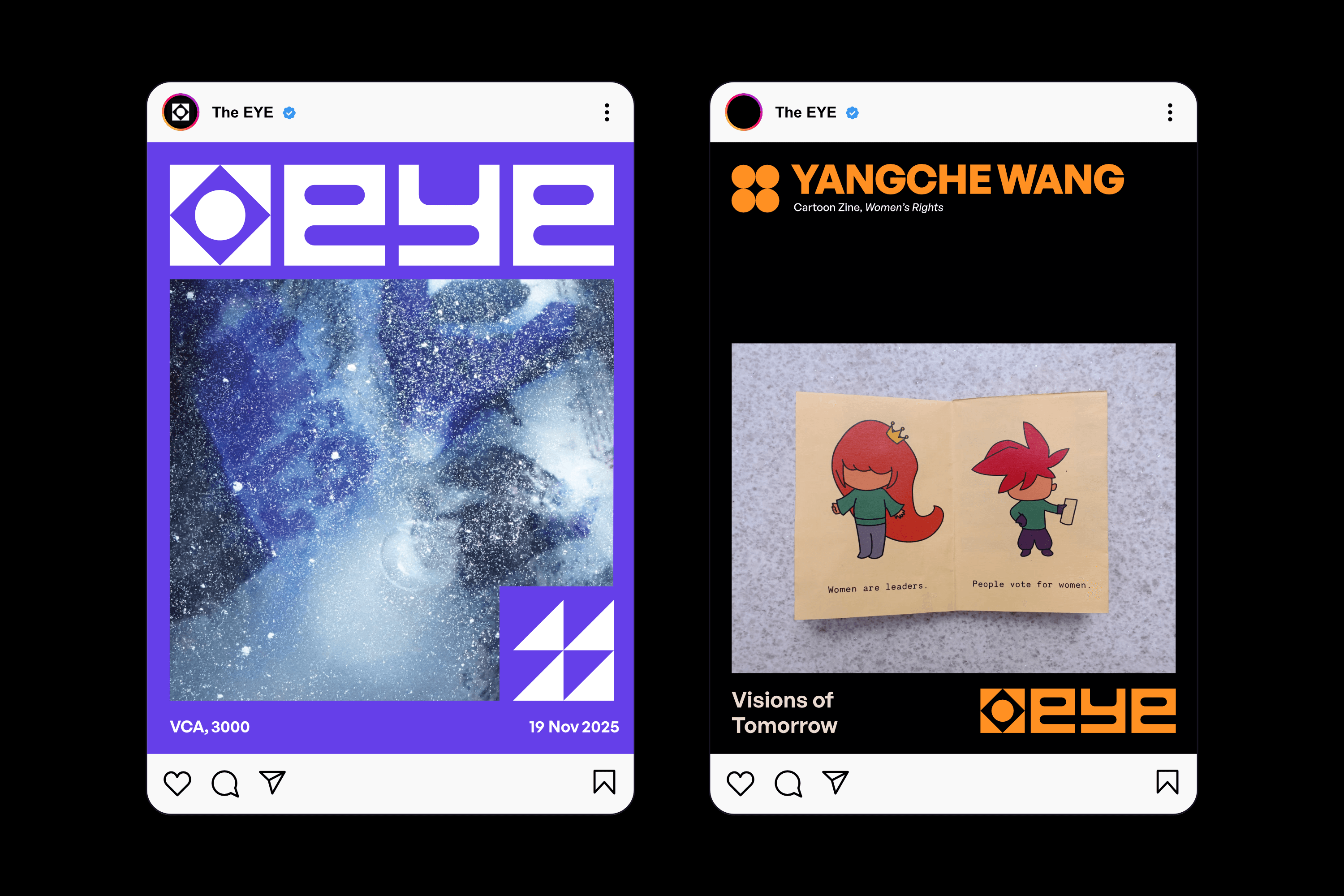
The identity had to promote the exhibition across print, digital and environmental applications.
The identity had to appeal to students, industry professionals and the public alike, all while presenting three disciplines as one cohesive exhibition.
A flexible identity system that gives each discipline its own visual language whilst reinforcing a memorable exhibition brand.
Contemporary gallery identities revealed how professionalism and vibrancy can simultaneously emerge through strong systems rather than decorative graphics.
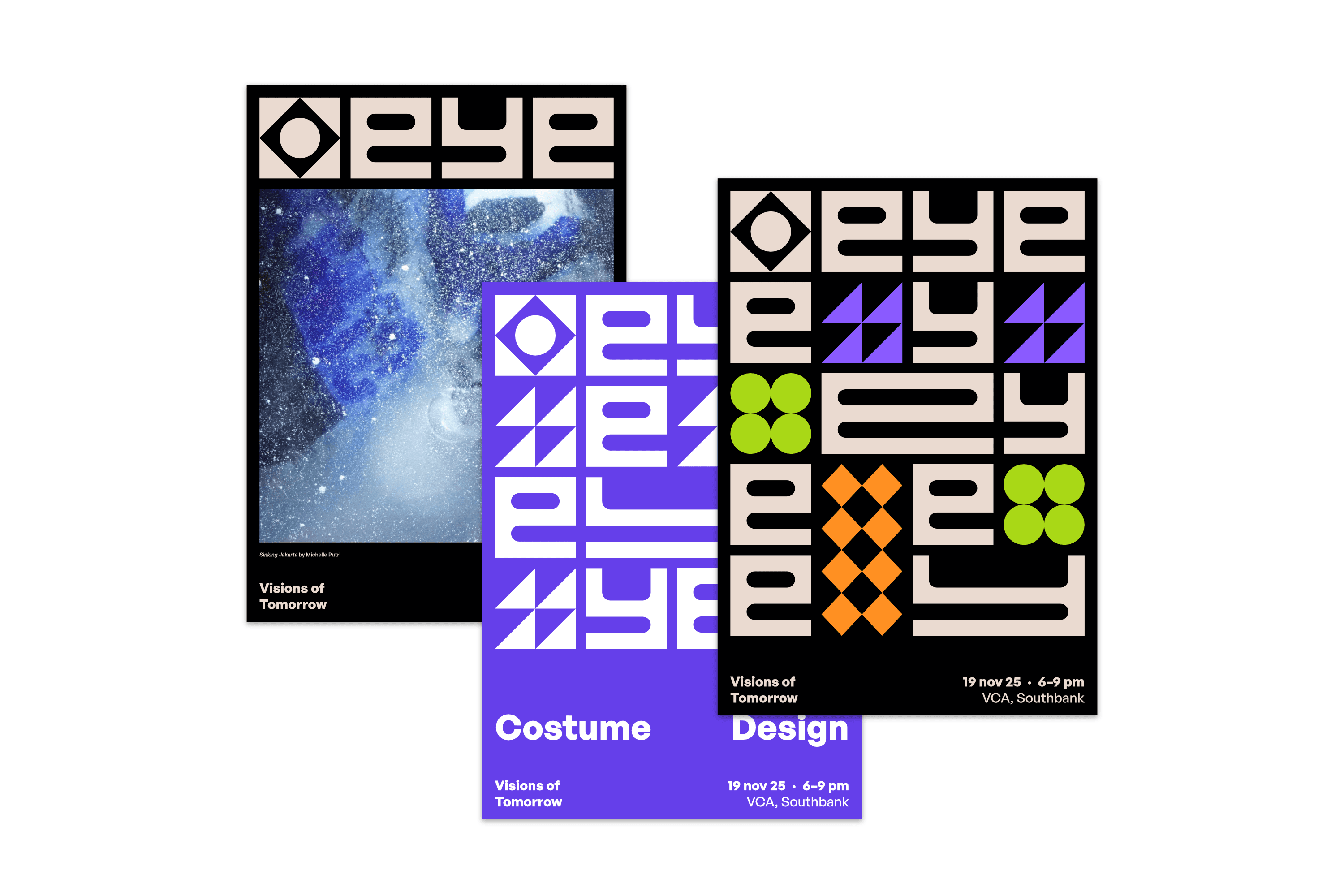
Modular grids, repeated graphic elements and adaptable layouts create flexible identities that scale across print, digital and environmental applications.
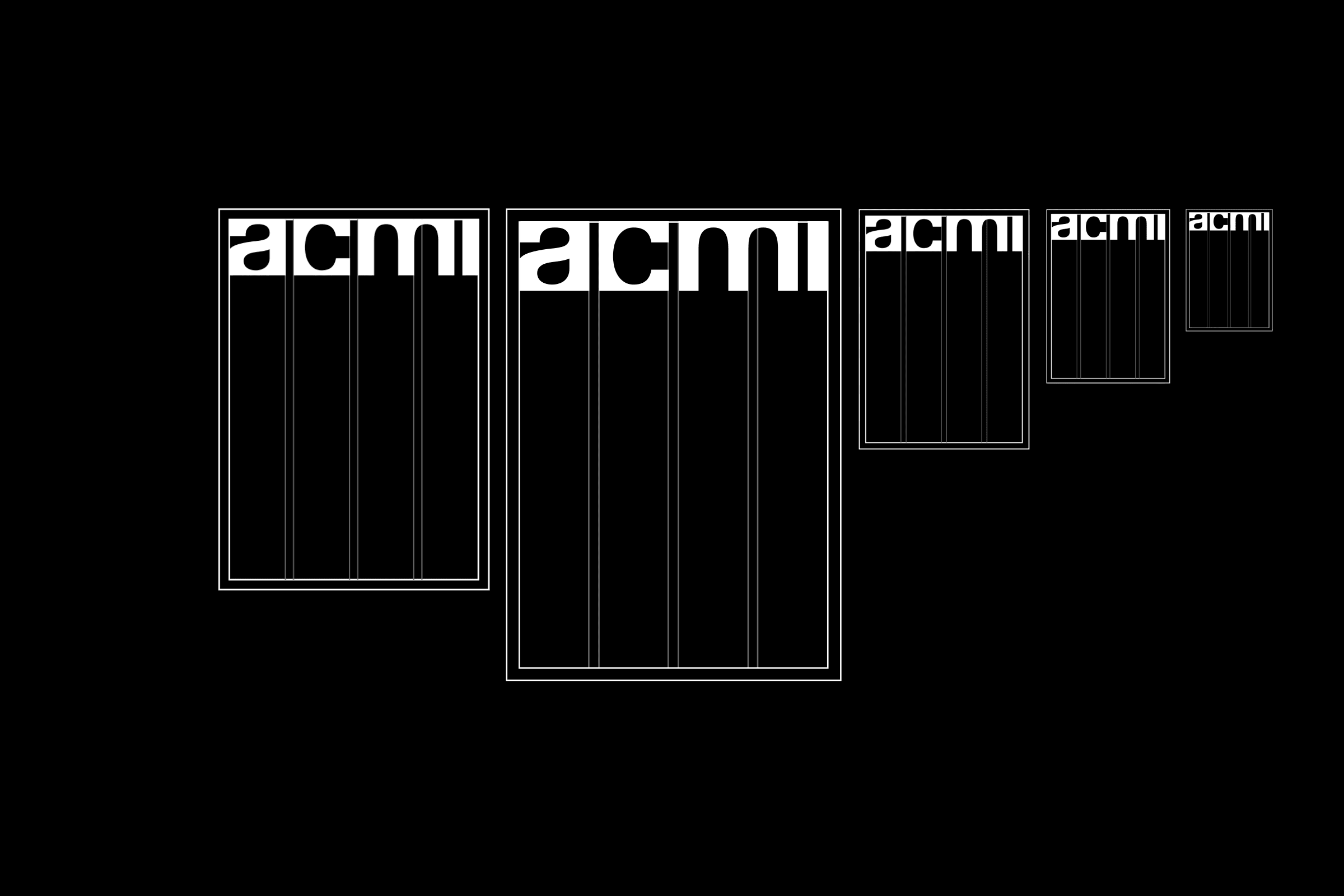
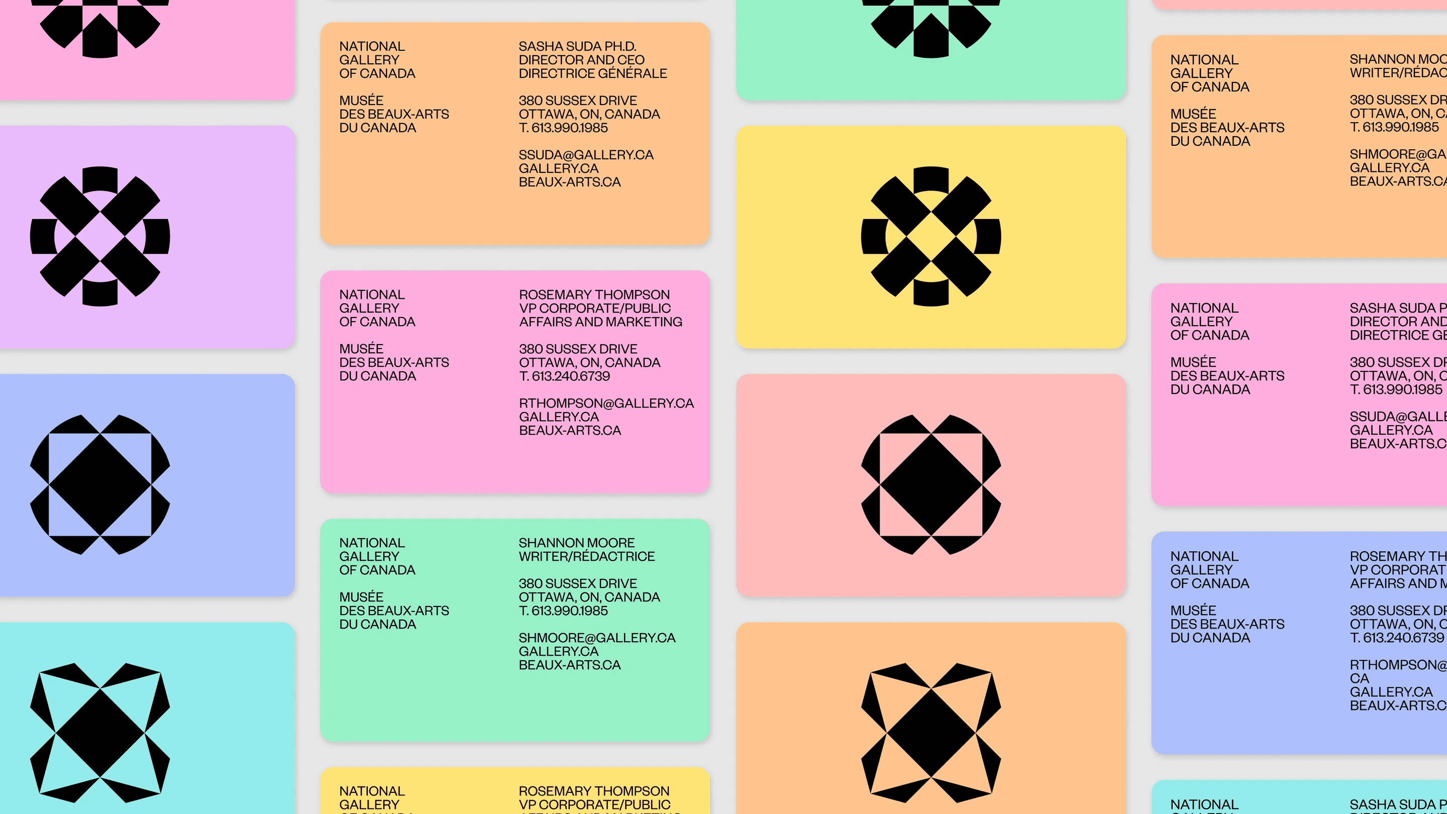
Bold geometric forms and limited but vibrant colour palettes demonstrated how simple visual elements can create memorable, highly versatile brands.
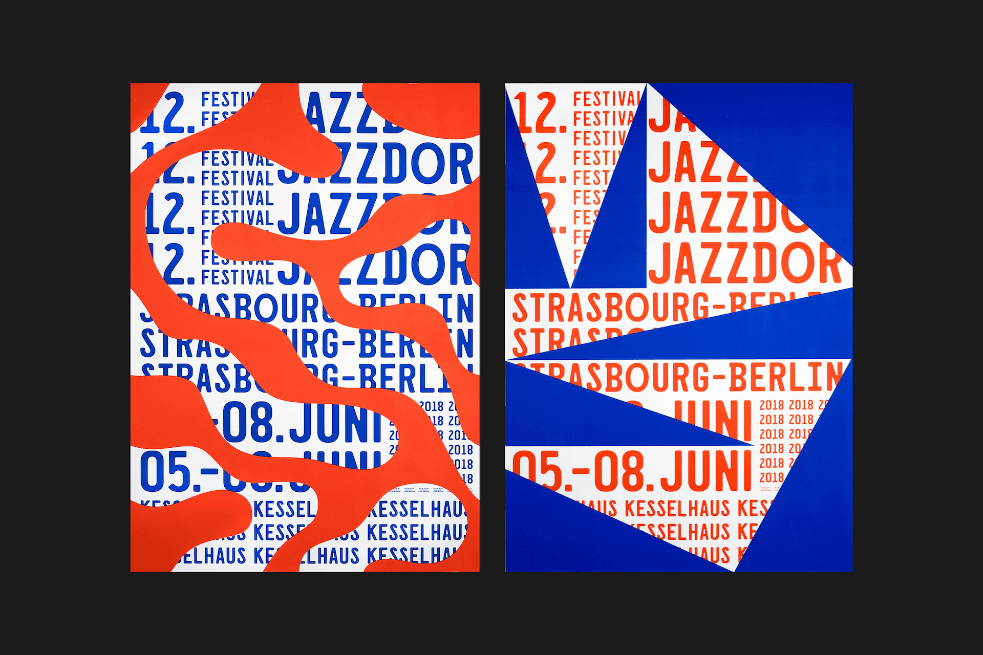

The EYE has 2 target audiences with competing interests: Industry Professionals and the General Public.
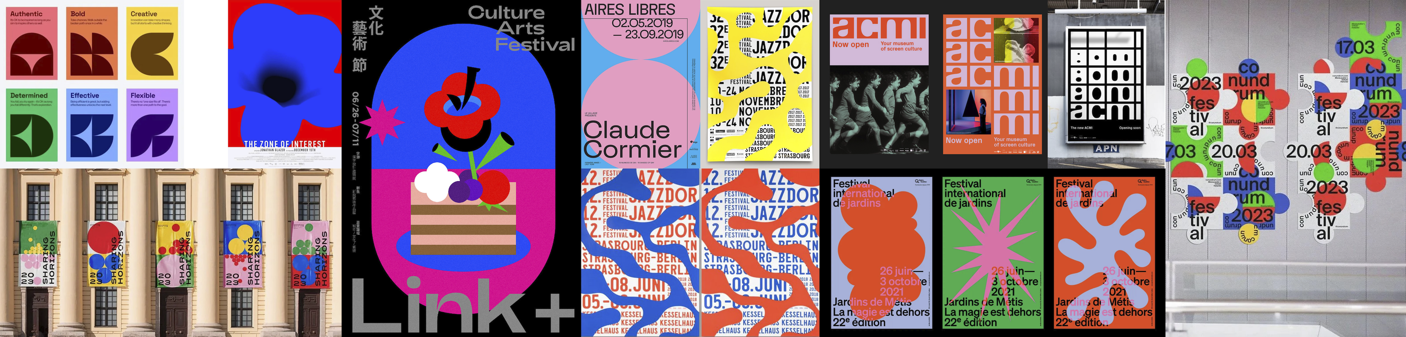
Art galleries cater to a similar range of audiences, hence why we took such heavy inspiration from the likes of ACMI and the National Gallery of Victoria.

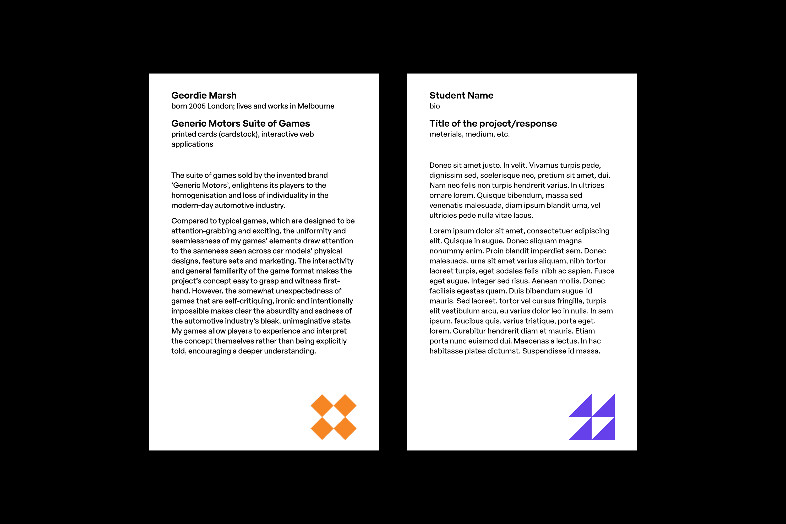
Each discipline has its own colour and shape identity, aiding in wayfinding and sub-brand recognition.

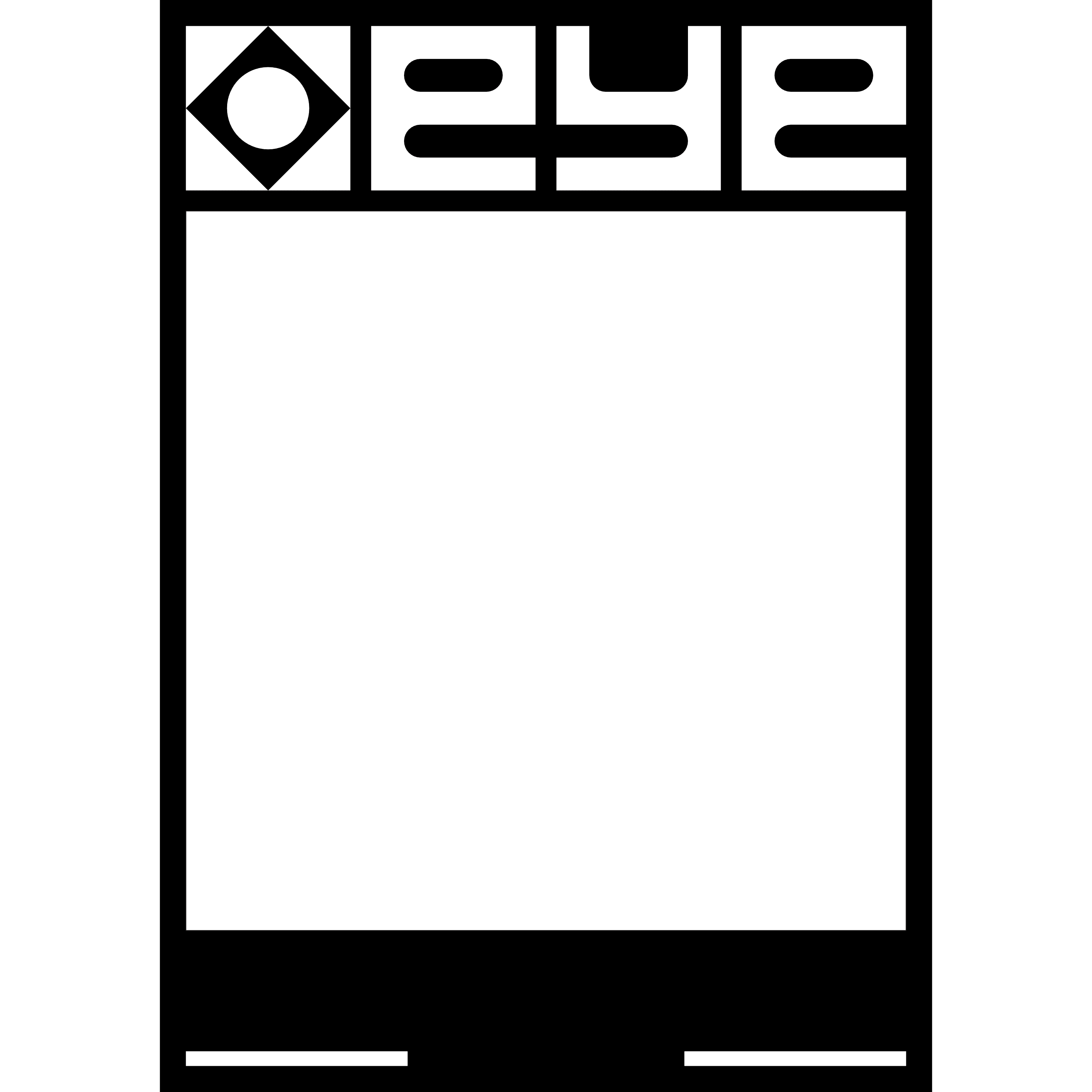
The grid easily adapts across page sizes and creates a simple system to input elements.
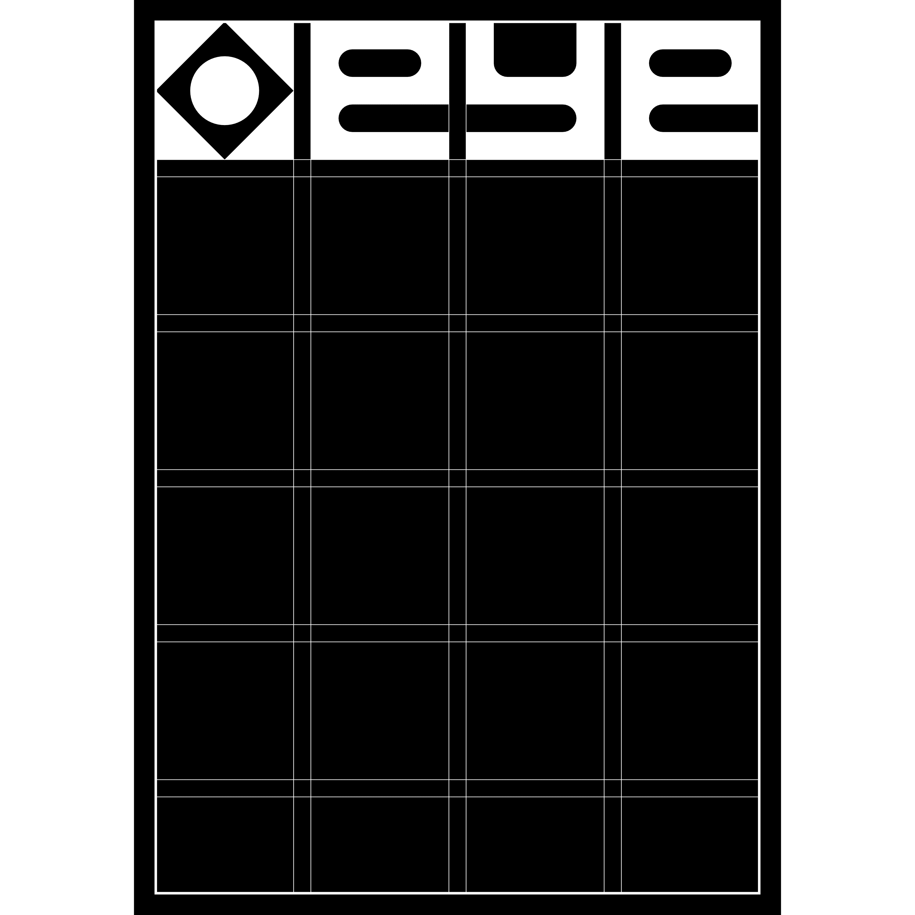
The identity allows student works to speak for themselves; student work is the selling point of the exhibition, so the identity should always remain secondary to it.
We explored 3 visual directions before committing to this vibrant, geometric system.
We found this style balances professionalism with experimentation, allows artwork to shine through, and is tried and tested in existing gallery brands.
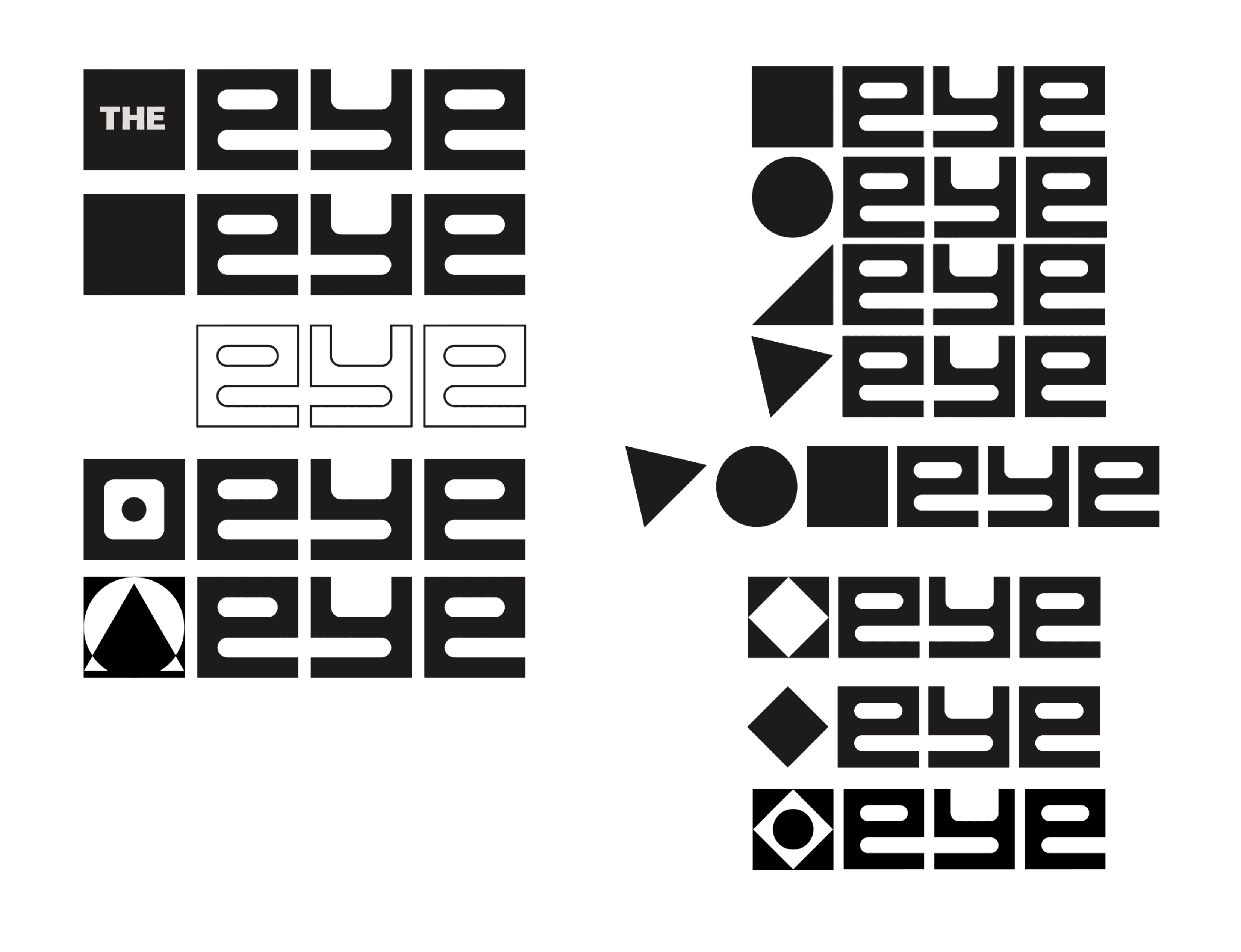
The final logomark was formed through the combination of each discipline’s mark: the triangle, square and circle.
We used a triadic palette, as the equidistant colours communicated each discipline being distinct but still part of a whole.
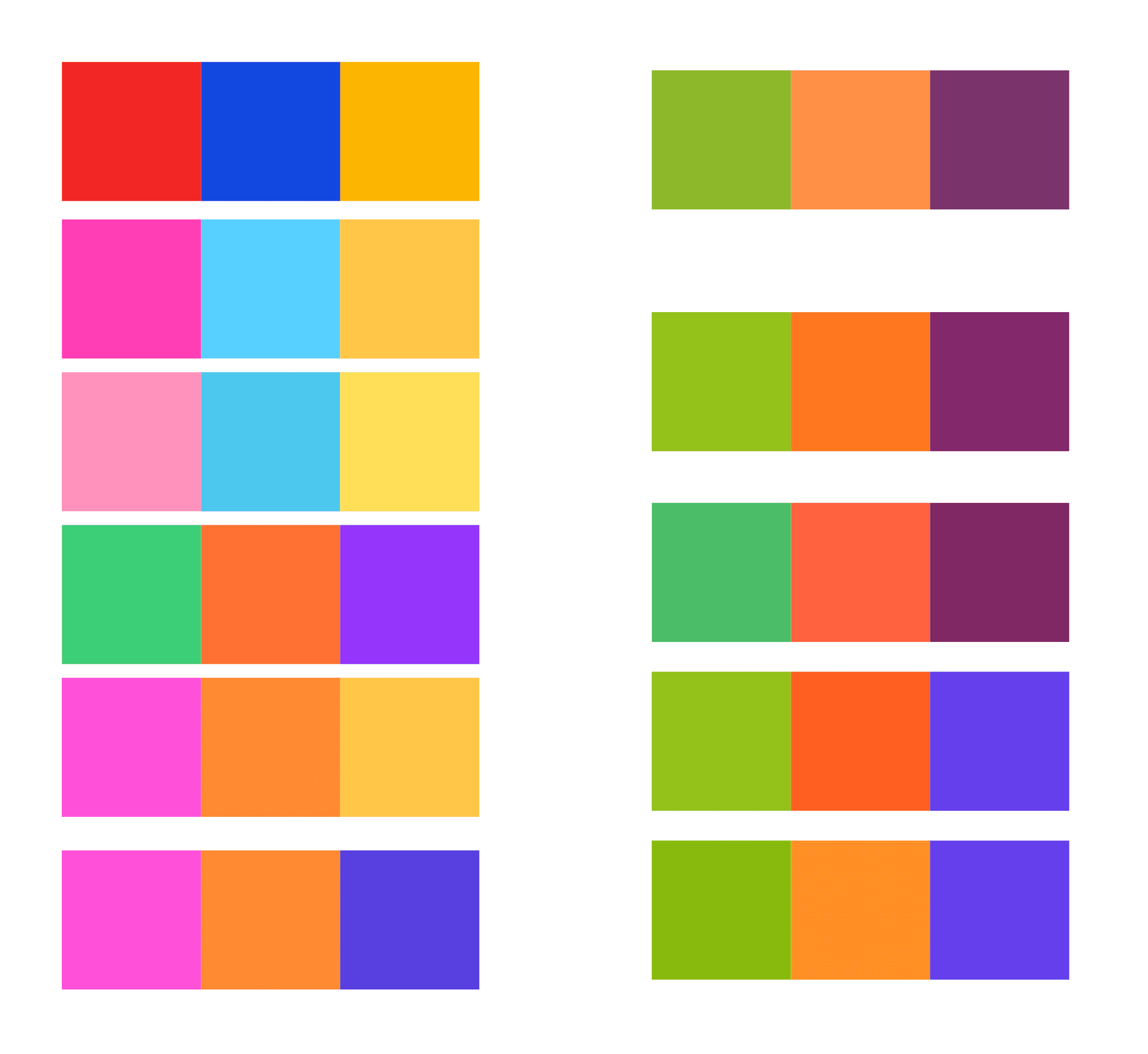
Having established the elements and grid, we created a 'patchwork' aesthetic.
We kept this design language consistent to maintain a recognisable, cohesive brand.

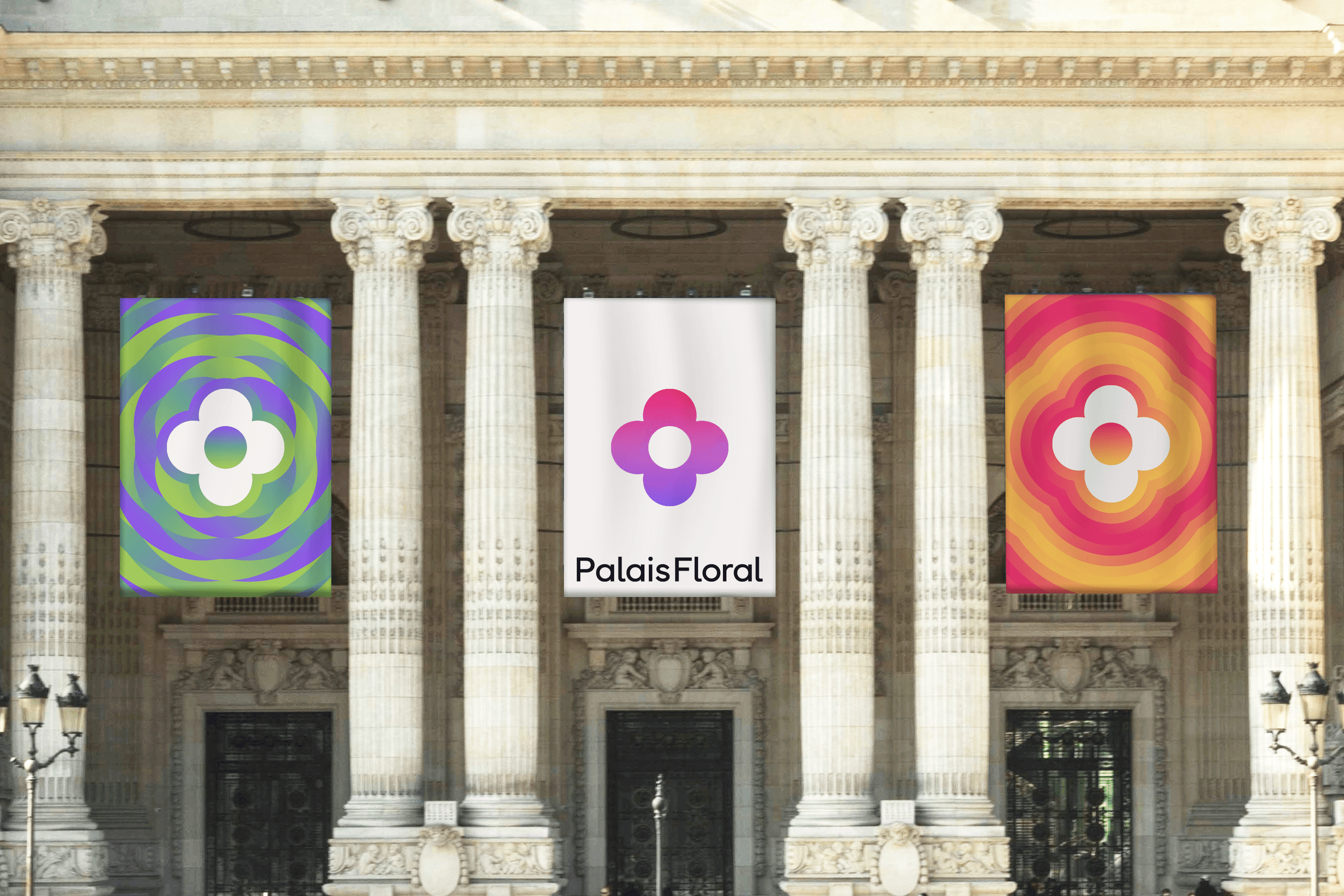
Branding, marketing and environmental peripherals for a Parisian artistic flower show.
Visual identity
Branding
Environmental design
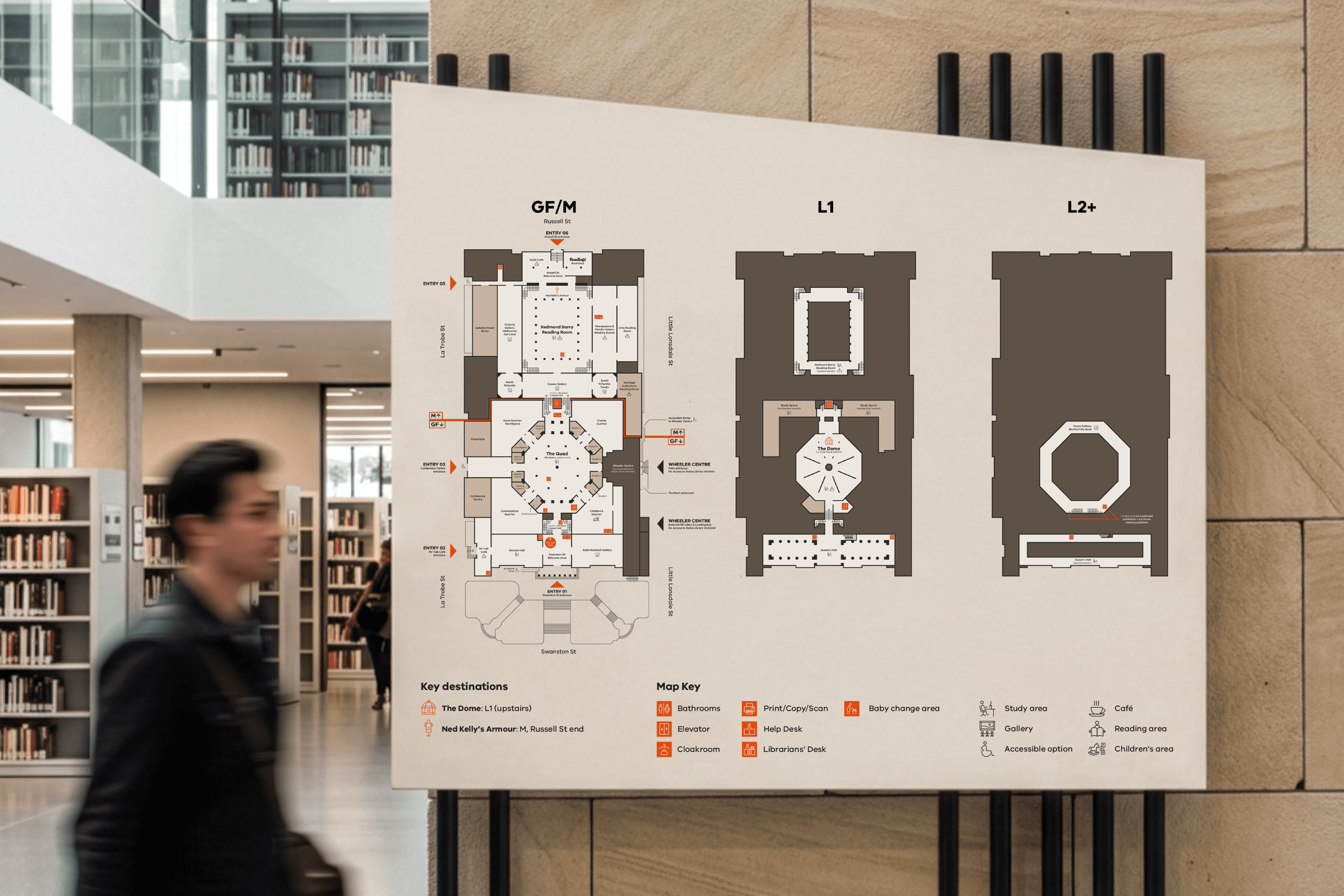
Reimagining the wayfinding system for the State Library Victoria’s complicated layout.
Signage & Wayfinding
Visual systems
Environmental design